TAKEAWAY: So The New York Times may be planning a special edition for the 20-something set. How effective will a Times Junior be?
Youth is wasted on the young, said the playwright George Bernard Shaw.
Not so sure Shaw was correct, but I do know that in the publishing/media world today seducing the youth consumes a great deal of time and efforts. Specifically, every publisher I know wants the magic formula to attract those very elusive mega digital natives between the ages of 20 and 30, the ones with the big appetite for information along with a great desire to get it free as often as possible.
The latest news in this area comes from The New York Times, which is testing some kind of “entry-level” product aimed at a younger audience, perhaps a New York times “light” that it may call New York Times Junior.
New York Times CEO Mark Thompson last week hinted at a possible version of the Times geared specifically for the college and twenty-something set.
Sounds like perhaps a plausible idea, although I am a firm believer that the highly educated 20 somethings the Times is aiming for may find all they need and want in the “senior” version of the NY Times, and may find it a little condescending to read a product called “junior”. But, who knows? A question will be if this Junior product will appear in print at all?
The age group the Junior edition appeals to may not be the most print friendly, so I am going to assume that this will be an all digital product to be consumed in mobile devices mostly. Or, is it?
Can you picture that ambitious Type A 20 something Ivy League educated reader walking into Starbucks, or the office, carrying a copy of a newspaper called New York Times Junior?
Perhaps a customized package?
A piece written by Laura Hazard Owen for paidContent offers what I think might be some plausible ideas about customization:
Maybe some twenty-somethings really love the Styles section and couldn’t care less about the book review. So why not offer a customizable package that allows an “entry-level” reader to select the content — by section — that he or she wants to pay for?
Maybe each section of the paper could be assigned some dollar value: The stuff that normally appears in the A section of the print paper (or in the International/U.S./Politics sections online), for instance, could be $5 a month; all the Arts coverage could be another $5, or could be broken out by type (books, music and so on) and charged for that way; the Styles, Dining and Home sections could cost $2 each per month; the magazine could be $3… This might be tough to put in place technologically, but the idea is that the user would then have access to all of the sections he or she chooses online and through apps. The other sections might fall under a metered paywall or simply not be available to those who aren’t paying for them.
Our own Reed Reibstein, (24) art director/project manager for Garcia Media, agrees:
Owen’s idea is appealing. Today we download bits and pieces rather than the whole, especially with television. Allowing young readers to customize their edition, balancing comprehensiveness with cost, could make a Times subscription a real option for those who might not be willing to pay for a full subscription,“
It’s all about content—regardless of target age group
I am sure the Times’ smart marketing folks know what they are doing and we look forward to further developments here. I have always felt that the way to attract this tough youth market is through content: include stories, images, commentary that the young can engage and relate to. You don’t need a special edition of your publication to do so. It’s more organic when it appears as part of the overall content of the publication.
In this case, to paraphrase George Bernard Shaw, my initial thought is that perhaps the Times’ efforts should not be wasted on the young.
Financial Times celebrates 125-year anniversary today
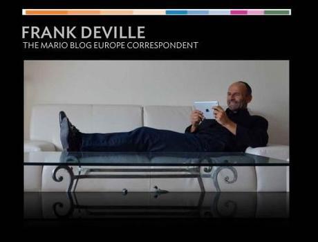


We get this from Frank Deville, our Europe blog correspondent: the Financial Times turns 125 today, and to celebrate the occasion, today’s editions sport the old original logo.
Of special interest
Hearst: Women finally embracing online magazines thanks to 7-inch screens — paidContent
http://paidcontent.org/2013/02/12/women-finally-embracing-online-magazine-thanks-to-7-inch-screens-hearst-president/
The Elephants of Typography
http://www.incidentalcomics.com/2013/02/the-elephants-of-typography.html
This is good fun!
Financial Times editor Lionel Barber: ‘News now is not the newspaper’
http://www.guardian.co.uk/media/2013/feb/10/financial-times-editor-lionel-barber
Highlight:
“Our business is changing,“ he says. “We don’t need to update the paper through the night, so we don’t need so many people working anti-social hours producing a newspaper for real-time news. That’s the equivalent of the steam age. News is now updated on the website.“
So there will be fewer London staff working at night, fewer page changes and a more efficient commissioning regime. The FT editions in the US, Asia and Europe are now running the same “international” front page, though the UK issue does differ.
Brand Perfect NYC Conference
Day 1:
http://brandperfect.org/index.php/knowledge/articles/360-designing-for-publishing
Day 2:
http://brandperfect.org/index.php/knowledge/articles/364-adventurers-assembled
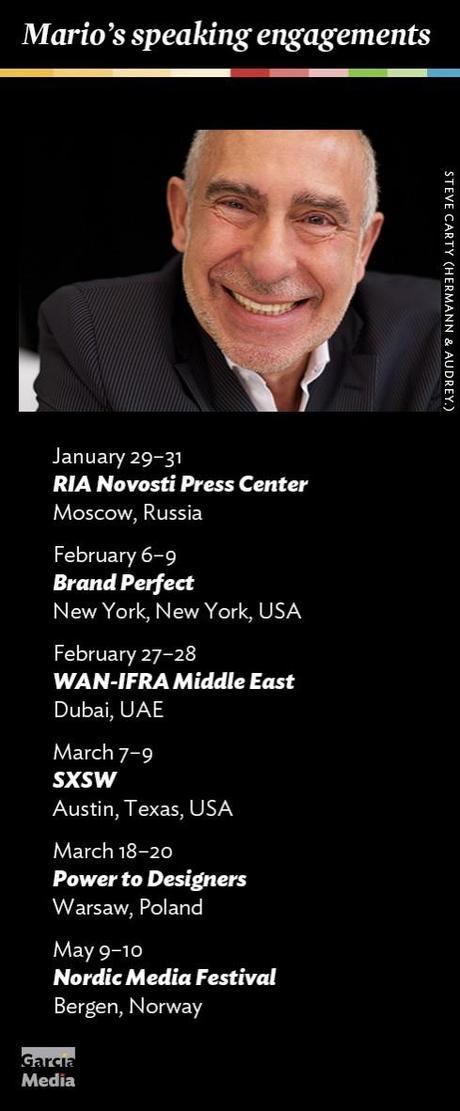
Where’s Mario until March 2, 2013?

Mario’s upcoming speaking engagements
Take advantage of our iPad Design/Ad Lab workshops

Do you want to take your brand to the next level by creating a tablet edition? Garcia Media can help. We now offer one- to two-day iPad Design Lab workshops on demand to jumpstart your presence on this exciting new platform. We also offer iPad Ad Lab workshops to develop engaging advertising models for your app. Contact us for more information.

Purchase the book on the iBookstore
iPad Design Lab has been given the QED Seal

The QED (Quality–Excellence–Design) Seal is bestowed by the judges of the Publishing Innovation Awards after “a thorough, professional 13-point design review with an eye towards readability across multiple devices and in multiple formats.“
Learn more about the QED Seal here.
The EPUB version of book is HERE:
Now available: The EPUB version of iPad Design Lab: Storytelling in the Age of the Tablet, ready for download via Amazon.com for Kindle:
Here is how you can get iPad Design Lab book:
The original version of the book is the multitouch textbook version available on the iBookstore for iPad (iOS 5.0 and up):
https://itunes.apple.com/book/ipad-design-lab/id565672822
This version includes video walkthroughs, audio introductions to each chapter, swipeable slideshows, a glossary and a sophisticated look and feel.
Apple only sells multitouch textbooks in certain countries at this time, unfortunately. Copies are available in at least the following countries: Australia, Austria, Belgium, Canada, Finland, France, Germany, Great Britain, Greece, Italy, Latvia, Luxembourg, The Netherlands, Poland, Portugal, Romania, Slovakia, Spain, and the United States.
For those in other countries and without an iPad, we have made the book available in a basic edition for other platforms. This basic edition includes the full text of the original, along with the images and captions, but lacks the other features such as audio and video. It is available on the following platforms in many countries:
Amazon Kindle:
http://amzn.to/SlPzjZ
Google Books:
http://bit.ly/TYKcew
Take a video tour of iPad Design Lab
“iPad Design Lab” trailer on Vimeo.
Read the Society of Publication Designers’ review of The iPad Design Lab here:
http://www.spd.org/2012/10/must-read-ipad-design-lab.php

Keep up with Mario Garcia Jr.. via Garcia Interactive: helping transform online news since 1995.
http://www.garciainteractive.com

