TAKEAWAY: This is part two of a series of five blog posts to discuss and to analyze the role of advertising in tablet editions of newspapers and magazines. We should think beyond those banners to which we have directed a blind eye, and move towards better storytelling that engages the audience with the product and the brand.
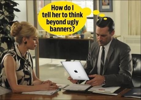
Scene from Mad Men, the TV series—graphic by Miguel Gomez (Gulf News, Dubai)—source: http://gcia.co/TIpKfo
Let’s face it, if you have seen a banner ad, you have seen them almost all.
Banners made a big splash on the screens of your desktops years ago: the way to advertise on line. Whether you moved those banners to the top of the screen, the middle of the screen, or the basement of the screen, they became the standard bearers of online advertisement.
Today, most of us users suffer from banner blindness.
A banner is a click away from oblivion, which is why it is so anti climactic and difficult to understand how they are sneaking their way into the tablets so frequently and in such horrendous state of disrepair.
Not that aesthetically pleasing banners would do any better: even the pretty ones don’t get looked at. Period.
Banner ads may have lived well in their semi original habitat (I still think banners are a carryover of print advertising), but definitely not on the tablet canvas.
What research tells us about ads in the tablet
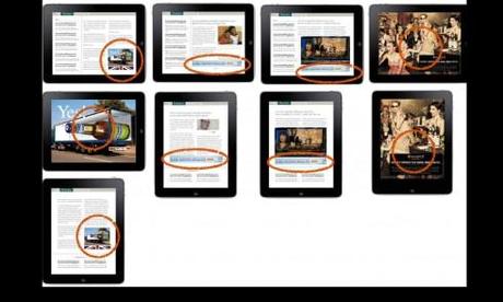
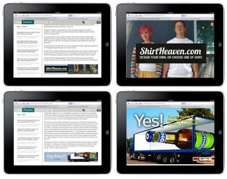
Screens from the prototype created for the Poynter Institute for Media Studies EyeTrack Tablet study completed recently. All the ads were static.
In the recent Poynter Institute EyeTrack Tablet study, with which I was honored to be involved, along with colleagues Sara Quinn, who directed the study, and David Stanton , of Smart Media Creative, and Jeremy Gilbert, assistant professor of media product design,Medill School of Journalism & Segal Institute of Design, Northwestern University, it was noticeable that the subjects in our test did not pay much attention at all to the static ads.
“We’ve created banner blindness though low-value display ads and incessant page-view-bolstering tactics. We’ve trained users that the ads are an afterthought, so we can’t be upset when they ignore,“ says Stanton, who handled the quantitative part of the research.
“There was little interaction with ads in our prototypes. Ads were glanced at, but not really engaged…..Interestingly, ads were seldom looked at and not tapped at all,except once or twice by accident in the four live sites our participants looked at in the early part of the testing, either,“according to Quinn.
For designers of editorial apps, it is worth noting that banner blindness extends to rectangular shapes used for editorial purposes that users may mistake for advertising. Watch this carefully, we see this all the time with regular features which people were looking for but didn’t see because they looked like an ad. What happens is that they see a shape that is elongaged (as in a banner), or as a one column square, and they ignore it thinking it is an ad.
That is the extent of banner blindness. Instead of looking at this editorial content, users run away from it.
The effectiveness of ads on the tablet versus online
Research from Pew and The Economist Group suggests that tablet ads are more effective than online ads. The study found that about half of all tablet news consumers notice ads when reading news on their device.
Noticing is one thing, engaging is something else—-that is where storytelling comes in, the good headline, the story that weaves itself around the ad. According to the Pew study, the number of people who actually engage with an ad is much smaller. Only 14 percent of the 50 percent of people who notice ads click on them, which puts the total percentage of tablet news users who say they click on tablet ads at 7 percent.
The case for banner blindness
We have grown inmune to banners, the so called banner blindness.
Banners become mere space takers or decorators on the tablet screen.
In 1997 Jakob Nielsen used eye tracking to identify a characteristic of web use: people simply don’t look at ads. But 15 yerars later, Nielsen still thinks that the ad industry is in denial about the fundamental underlying problem, that the web is an interactive medium, not a passive consumption medium.
The display ad industry, he says, is still dominated by one-way communication.
Perhaps the best spokesperson for the “stop the banners in the tablet” movement is Jay Lauf, The Atlantic’s publisher, who has made it clear that he thinks banner ads are a waste of space for all involved.
“I would love to eliminate banners because I think most of them don’t work,“ said Lauf,“There”s a need for scalable solution for certain advertisers. What I’m advocating is more relevant, engaging content.“
Lauf’s The Atlantic is moving away from banners and on to the what many refer to as the next wave of tablet advertising: native ads, which have the a look and feel of The Atlantic’s content, but which create engaging content by making the ads linkable, sharable and discoverable.
This is done through the power of storytelling. The product, a story and the audience are linked through emotion, where the product does appear prominently, of course, but it is presented beyond a slogan, a logo and a short message of where to find it.
The Where Design Meets Technology ads launched into a story based on the question: Can cutting edge technology define good design? The rest of the product (Porsche) presentation followed from that story line.
The banner that leads to a video

In case you have not done so already, take a look at the Cartier: Winter in Wonderland native ad in The New York Times app. It’s a wonderful example of the narrative in the ad
For some in the industry, the banner is justified if it leads to a video—-as in a video similar to those we may see on television, or in YouTube, for example
YouTube offers plenty of videos, in fact, search and you will find almost anything your heart desires, or something close to it.
But is the story that will seduce you, capture your attention and keep you looking thru the ad. Difficult to tell the ingredients that contribute to all of the above.
It begins with catchy words that intrigue, and visuals that pass the 10 second test. Anything too crowded, or too ethereal, is not going to do it, which is why I like Cartier’s Winter Wonderland as seen in The New York Times app.
Of course, one gets to see the gorgeous Cartier products, but they are secondary to the tales the creative team weave around the winter themes. (More about this ad and others like it in coming segments of the iPad Ad Lab)
“The tablet is the perfect advertising medium,”, says Jane Barratt, chief operation officer for mcgarrybowen international. “It has all of the wonderful immediacy of print, all of the interactivity digital and all of the inmersiveness and emotions of audio/visual”. But , she adds, the device is really “more about content than an ad placement vehicle”.
Jakob Nielsen agrees:
They could look at content in new ways. If you can integrate the advertisement well with the content, it becomes almost more like a customer service than advertising in a traditional sense. They should screen out advertisers who are not credible, which means not just taking any advertiser with money, but credible advertisers that have passed some level of screening.
Indeed, the ideal tablet ad is all about content. I would say think outside the traditional banner and video. If songs can tell complete stories in a few bars, advertisers should take notice and start telling stories in a few seconds through multi touch, multi sensory treatments to engage us.
We need those smart, creative Mad Men (and women) more than ever.
Coming up in the IPad Ad Lab series
Thursday: Rules of engagement
(how can we make them stay and not hit the x at the top of the box)
Friday: Those comfy advertising suites
(Showcasing some who get it right) Plus: Taking a proactive role for better tablet ads (tips for those of us on the editorial side, for the ad agencies, and for the brands)
Previously in the iPad Ad Lab series:
The iPad Ad Lab #1: Wrap that Ad Around a Story
http://www.garciamedia.com/blog/articles/the_ipad_ad_lab_1_wrap_that_ad_around_a_story
Take advantage of our iPad Design/Ad Lab workshops
Do you want to take your brand to the next level by creating a tablet edition? Garcia Media can help. We now offer one- to two-day “iPad Design Lab†workshops on demand to jumpstart your presence on this exciting new platform. We also offer âiPad Ad Lab workshops to develop engaging advertising models for your app. Contact us for more information.

Purchase the book on the iBookstore
The EPUB version of book is HERE:
Now available: The EPUB version of iPad Design Lab: Storytelling in the Age of the Tablet, ready for download via Amazon.com for Kindle:
http://tinyurl.com/8u99txw.
Take a video tour of iPad Design Lab
“iPad Design Lab” trailer on Vimeo.
Read the Society of Publication Designers’ review of The iPad Design Lab here:
http://www.spd.org/2012/10/must-read-ipad-design-lab.php

Keep up with Mario Garcia Jr. via Garcia Interactive: helping transform online news since 1995.
http://www.garciainteractive.com
Here’s a gift you don’t have to wrap!

It’s official. The Christmas/holiday shopping season is here.
Here is a suggestion for someone on your list, the digital book iPad Design Lab: Storytelling in the Age of the Tablet. No need to stand in line, no need to buy wrapping paper. Just send it to someone you think might enjoy a book about this magnificent new platform that is the tablet, and how to maximize its potential for storytelling.
Here is how you can get the book:
The original version of the book is the multitouch textbook version available on the iBookstore for iPad (iOS 5.0 and up):
https://itunes.apple.com/book/ipad-design-lab/id565672822. This version includes video walkthroughs, audio introductions to each chapter, swipeable slideshows, a glossary and a sophisticated look and feel.
Apple only sells multitouch textbooks in certain countries at this time, unfortunately. Copies are available in at least the following countries: Australia, Austria, Belgium, Canada, Finland, France, Germany, Great Britain, Greece, Italy, Latvia, Luxembourg, The Netherlands, Poland, Portugal, Romania, Slovakia, Spain, and the United States.
For those in other countries and without an iPad, we have made the book available in a basic edition for other platforms. This basic edition includes the full text of the original, along with the images and captions, but lacks the other features such as audio and video. It is available on the following platforms in many countries:
Amazon Kindle: http://amzn.to/SlPzjZ
Google Books: http://bit.ly/TYKcew
Scribd: http://bit.ly/PQTwla

