This is the weekend edition of TheMarioBlog and will be updated as needed. The next blog post is Monday, June 30


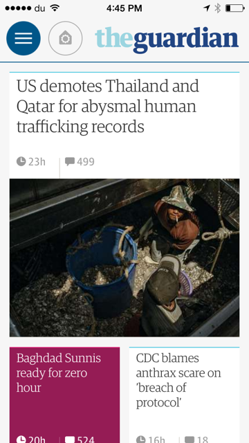
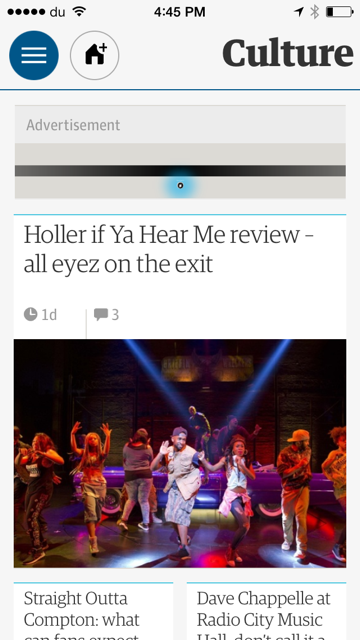
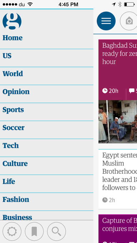
If you have not done so yet, I invite you to download the new The Guardian app on your smartphone. It is functional, attractive and easy to use. It is also, perhaps, one of the apps that is a result of extensive research and testing prior to its implementation.
I read all about it here, a narrative published by The Guardian's Developer Blog, which details the three prototypes created and tested.
While I invite you to read the piece yourself, I recommend that we zero in on some of the lessons learned by The Guardian team, which may be useful to those of us creating newspaper apps in the future.
Some takeaways from The Guardian's new app experiece
1. Forget the timelines: The timeline-based feed prototype received very negative feedback because presenting stories by time didn't accurately reflect their editorial importance.
2. It's all about hierarchy: We knew that this was the case when laying out news pages for print, where, of course, it is much easier to create levels of hierarchy than on the very small canvas of a smartphone's screen. However, The Guardian's new app manages to do that successfully, in my view. Users want us to relate the significance/importance of stories. Here is how one of the app developers put it: "The consistent feedback from these prototypes and from the conceptual work prototypes showed the team that the Guardian's assignment of varying importance to different stories was our unique differentiating area."
How The Guardian team handled the issue of hierarchy:
"While we had no intention of replicating the newspaper on a digital device, we wanted to find ways to give readers more visual clues about the relevance of each story. We took forward an idea from the initial conceptual work where individual stories were represented as cards on front pages, but expanded the idea so each card could have different sizes that reflect the editorial importance of the story and rich styles that express the story content type (e.g. an article, a liveblog, a video)."
3. The personalization feature: Obviously, readers want to have the ability to customize/personalize their home screen, but without too many complications in the process. At The Guardian, about 50% of all users of their existing apps had already personalized their screens. Here is how The Guardian approached it with the new app:
"We knew from our analytics data that personalization was an important feature to readers. Around 50% of them had customized the Home screens of the previous application with their favorite sections.
"Starting with this insight we tested various personalization concepts with readers, which explored different mechanisms for personalizing the Home screen and the navigation. Based on the readers' feedback we built a simple prototype of the strongest concept, which focused on personalizing the Home screen using a consistent add/remove call-to-action available throughout the application, and tested it to refine the usability of the feature."

