
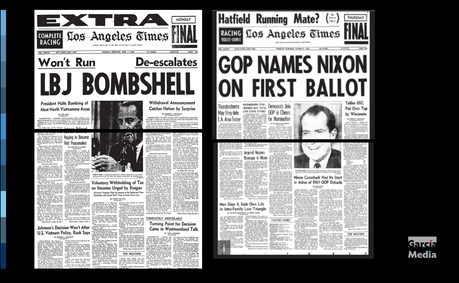
In the old days, if the editor did not like a candidate, the photo of that candidate would likely end just about where the page folds, thus guaranteeing an ink blot on the candidate's nose!




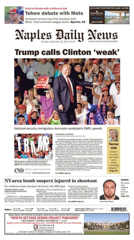


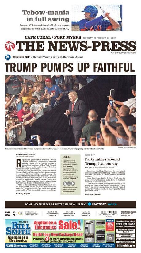






Coverage of the election keeps us entertained
It’s fun to look at print newspaper editions and coverage of the US Election. Just recently, I was following a Facebook streaming discussion on whether Florida newspapers were given more ample coverage on Page One to Trump over his competitor Clinton.
I leave that discussion to the pundits. However, reading about it brought to mind the US Presidential election of 1968, when Nixon ran against Humphrey. I was a journalism student, and an intern that summer at The Miami News. Newspapers were more inky in those days. The ink stayed on your fingers, your sheets, and every place else. And I once heard an editor tell me that newspapers that did not like a particular candidate positioned his photo right at the fold of the page, so the ink would smear on the candidate’s face.
Today’s smears are more profoundly journalistic, usually via a headline (see some of the examples here).
I figured that I would add this tidbit of “design” trivia for those who are too young to remember.
With fewer than 50 days to go before the Election of 2016, we are not through yet with this coverage. Send me any pages that you think excel in one way or the other in coverage of this unforgettable race.
Digital Design Challenge


A Project to Create New Visual Models for Digital News Publications
Sponsored by William R. Hearst III
Join us in October as we address the design challenges of digital news. In a unique two-day event, you’ll hear industry experts address the reasons for success and failure of the look and feel of news on the web and in apps. And you’ll meet the designers who will tackle these challenges in a unique project that launches with our October event in New York.
Roger Black is the project’s director.
Industry experts features:
Megan Chan, Director of Digital Operations at The Washington Post.
Susan Mango Curtis, a Pulitzer Prize winner, educator, designer and consultant.
Dr. Mario R. Garcia, CEO and founder of García Media and Senior Adviser for News Design / Adjunct Professor at the Columbia University Graduate School of Journalism.
John Temple, Managing editor, Investigative Reporting Program, University of California, Berkeley.
Chrys Wu, journalist, strategist, and coder, is currently Developer Advocate for The New York Times, where she leads internal and public-facing projects that advance and highlight the technology made by developers at the Times.
Poynter Challenge designers are:
Jared Cocken, Chief Product Officer at Fitocracy.
Lucie Lacava, President of Lacava Design Inc.
Kat Downs Mulder, interactive designer and the Graphics Director at The Washington Post.
Mike Swartz, a Partner at Upstatement, a design and engineering studio in Boston.
Jeffrey Zeldman, founder of A List Apart Magazine and the design studio Happy Cog.
We will challenge the designers to address these issues:
Session duration: What can make a richer experience so readers stay with a publication?
Stickiness: If readers arrive at a story from a link, what can make them want to go on to the next story?
Advertising: How can advertising be less ugly and disruptive, so that readers no longer use or want ad-blockers, and publishers can sell effective positions?
Sponsored content: How can advertorials be designed to be compatible with a publication but clearly distinguished?
Loyalty: How can readers make a publication a habit?
Apps: If users like apps, can we increase the integration with publishers’ efforts on the web and social media.
User Interface: Is scrolling the way to present the narratives?
The designers and experts will gather again in January to share their concepts and hear feedback around each proposal. (Watch for details about how you can join the January event in St. Petersburg, Florida.)
Seating is limited for the October event, so we encourage you to register now.
Date: Monday, Oct.17, and Tuesday, Oct. 18, 2016
Time: 10 a.m. - 4 p.m.
Location: Columbia University School of Journalism, Pulitzer Hall, 2950 Broadway, New York, NY 10027
Cost: $150
http://about.poynter.org/about-us/events/poynter-digital-design-challenge

