TAKEAWAY: What makes the design of The Economist so effective? It’s all about its functionality and simplicity.

From time to time I get an email request, or a question (usually from a student somewhere in the globe) that inspires more than an answer or exchange with the person doing the asking.
Such was the case this past week, when a student named Audrey, wrote to ask:
Sir, what do you think makes the design of The Economist so effective?
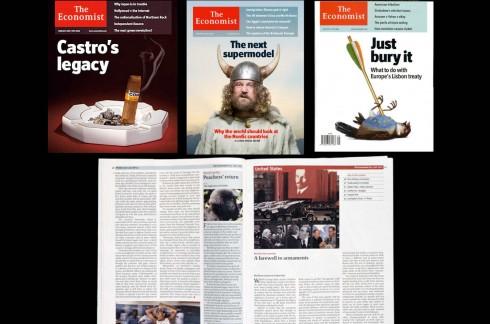
I decided to take three issues of the well known financial magazine (The Economist calls itself a newspaper, by the way), and review it. I am a loyal reader of The Economist as I feel that it is essential to be exposed to its timely and insightful content.
But, back to your question, Audrey: what makes the design of The Economist so worthy of praise is that it is minimalist and totally functional, but also aesthetically pleasing.
Everything in it from the selection of type, to the size of headlines and secondary elements, to the intelligent and judicious use of white space, is there to showcase The Economist’s always vital content.
At The Economist the design seems to be based on a philosophy in which design takes a back seat to content, but without getting neglected.
Bill Emmott, editor at The Economist at the time of the redesign, summed it up best:
The clarity of our own language and analysis is now perfectly matched and assisted by the clarity of our layout and graphical presentation. Existing readers will find the editorial stance and approach unchanged, but in a paper that is easier to navigate. New readers, who have often told us that they find The Economist rather forbidding, will now find us easier on the eye but just as stimulating to the brain.
The sense of great visual storytelling for The Economist starts on its cover, where clever headlines and illustrations simply seduce on impact. In addition, there is an economy of language (and space) to tell stories. For students of visual storytelling, a key to the success of this magazine that is worth observing is the way content is edited, and how headlines and visual images seem to speak the same language, one that loyal readers understand well and come back to week after week.
TheMarioBlog post #1285

