I’m back at work on my graphic novel. Some of the panels are fairly simple, others are more ambitious.
Here’s one of the ambitious ones. My hero gets to roller skate across an urban landscape that features some of the familiar mainstays of “modern civilization.”
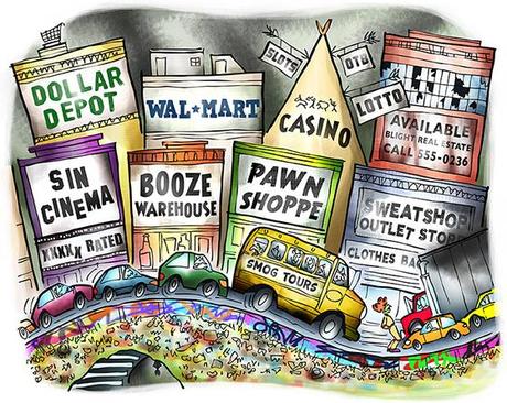
Here’s a detail image.
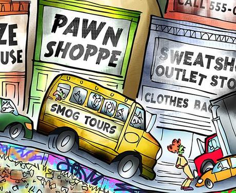
I thought this might be a good opportunity to pass along a few Photoshop tips.
I usually start out by laying in areas of flat color.
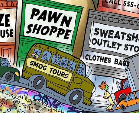
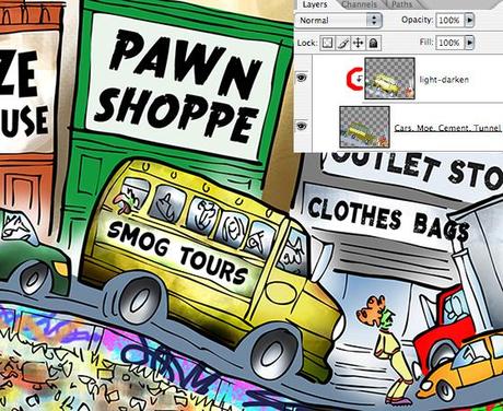
I apply lighting effects to my flat colors on a separate clipped layer. I apply the effects using soft brushes at reduced opacity. I set brush mode to Linear Dodge, Color Dodge, or Screen to lighten colors. Conversely, I use Mode = Color Burn, Linear Burn, or Multiply to darken colors.
The little arrow in the Layers Window (below), indicates a clipped layer. Any lighting effects I apply to a clipped layer will only affect the corresponding pixels on the layer it’s clipped to.
At first, I liked the way the bus turned out– kind of a sickly yellow. But ultimately I decided I didn’t like the greenish cast. Fortunately, it’s something that’s easy to remedy.
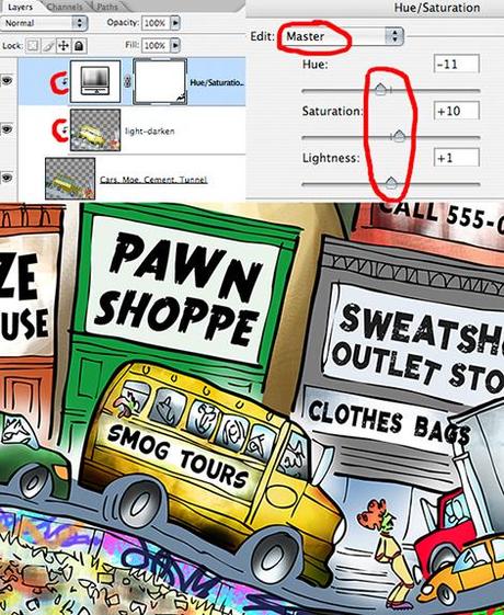
I created a second clipped layer– a Hue/Saturation Adjustment Layer. It has its own window containing three sliders, which are preset to zero. You can adjust all colors simultaneously (Edit: Master), or individually (Edit: Reds, Edit: Greens, etc).
I used Edit: Master, and applied very small tweaks to the sliders. The change is subtle,
but I think you can see it (below): the bus is still grungy, but instead of having a greenish cast, it’s now an orangish-yellow.
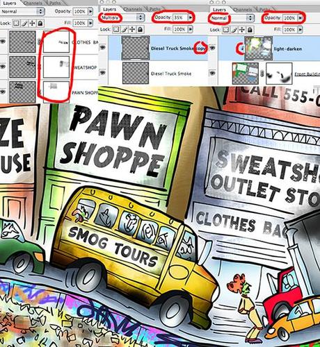
In the final, the store names look blotchy and faded. Very easy effect to achieve: just add
a mask to each text layer and brush on some black at low opacity (left Layers Window snippet below).
I used a smoke effects brush to add a cloud of diesel smoke to the truck on a separate layer. To darken the smoke, I simply duplicated the layer, set the Layer Mode to Multiply, and adjusted the Opacity slider to fine-tune smoke density (middle Layers Window snippet below).
I used the same clipped layer technique to add lighting effects to the buildings. I always use Mode = Normal, and Opacity = 100% for these clipped lighting effects layers (right Layers Window snippet below).
I use different Brush Mode settings (e.g., Screen, Multiply) to lighten and darken pixels on the flat color layer below the clipped layer.
Here’s the final of the detail image again:


* * * * * * * * * * * * * * * *

Did I miss anything? Any other vital 21st century institutions that I should have included?
Did anyone find the Photoshop tips helpful?
Have you ever tried roller skating on a freeway??
Hope you’ll leave a comment.
If you enjoyed this post, please click the Like button below.
If you’d like to share this post with others, please click Tweet or Facebook or StumbleUpon or one of the other Share buttons.
