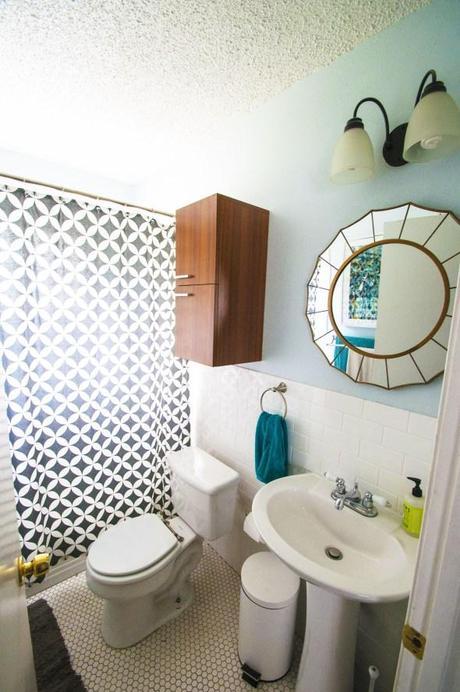
Our unplanned bathroom renovation has come to a close and I’m thrilled with how it turned out–not only from a design perspective but by how quickly the whole thing came together (despite my month lag in posting). We had always figured we’d get around to doing a reno ourselves at some point, but truth be told I’m grateful for our little pipe bursting fiasco because the pros got it done faster, cheaper and better than we ever could have. It’s just like the bible says: there’s a time for everything– a time for DIY and a time for LOPDIFY–Letting Other People Do It For You.
Previously, on the doodle house…
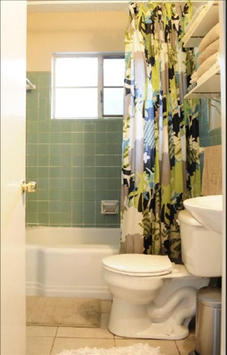
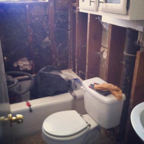
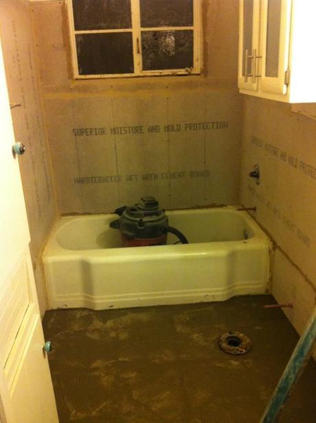
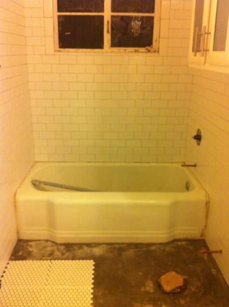
The contractors got in and out in just over a week (though the week living in our house without a working toilet was not one of my favorites) and did a masterful job. The final product is not too far off from the first-and-only mood board I created a few months back when I first started day dreaming about a restroom redux, though their are some key differences between the vision and the reality.
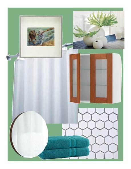
What stayed from the original plan?
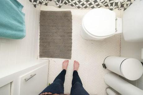
Hexagonal tiles: I clung tight to my original plan to use hexagonal tiles on the floor. I’ve always thought it was a classic and clean look but still had plenty of character and dimension. I also like how they fit in with the era of the house and appeal to my tendency to gravitate toward anything with an entrancing repetitive pattern (see stencil wall). No, I never deviated from wanting those in any bathroom renovation we would undergo. There’s no denying, that look is pretty dope.
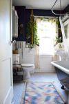
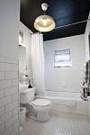

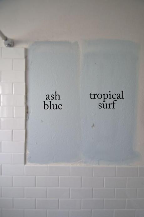
Blue and white color scheme: I love all shades of blue (especially anything in the teal/turquoise family, as is evident by the nagging urge I experience to paint everything from tables, to dressers, to walls in one shade or the other) and I wanted to bring it into the bathroom as well, though initially, my vision was for it to come through mostly via accessories–a variation, I’ll note, I had no qualms with. The wall color we chose? Ash blue by Valspar.
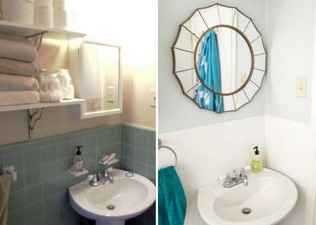
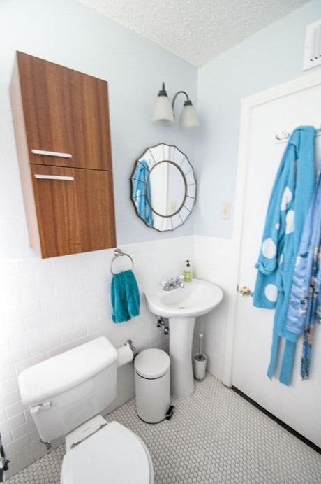
Round mirror: Most everything else in the bathroom is angular, so I wanted to invite some playful curvature to provide contrast to an otherwise predictable space. We got ours for $40 at Target.
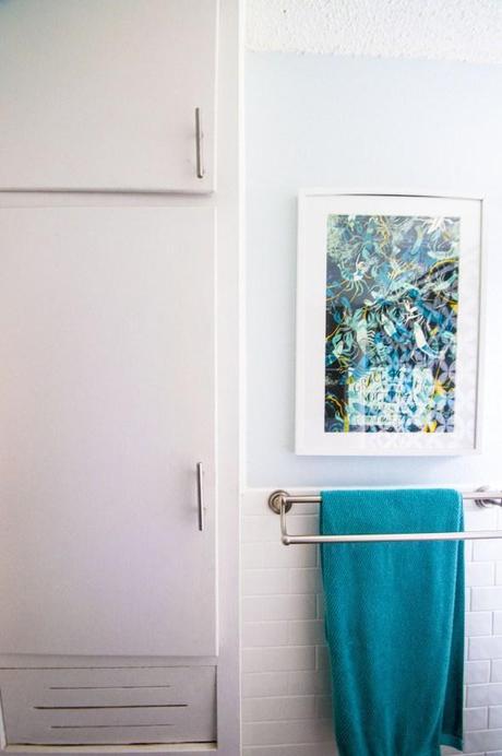
Wooden accents: In our kitchen, we try to blend modern design elements (counters, light fixtures, cabinet hardware) with things that are a little more true the home’s original design (knotty pine cabinets). I wanted to do the same in the bathroom–update the space, but without losing some of the warmth and richness that can come when you modernize. I figured incorporating some soft wood accents would help accomplish that. Our towel cabinet (Home Depot) gives a nod to our knotty pine kitchen but still has some of that sleekness that ties it into the rest of the bathroom and house. Though, to be honest, I’m still weighting whether or not it’s dimensions are right for our very small space. Though, I dare not try to make my own after our last DIY kerfuffle.
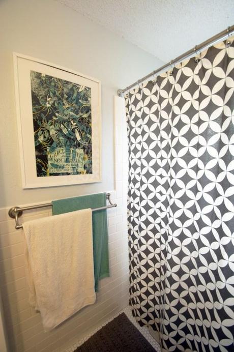
Water/animal-themed art: I knew whatever art ended up in the bathroom I wanted to be water themed because, get it? Initially I thought about something with dogs, and then briefly considered this goofy otter pic from Etsy, but when we spotted this Grace Potter and the Nocturnals poster by LandLand at a renegade craft fair, it seemed like a winner. It had all the shades of blue I was after, featured water creatures (crawfish) and, you get cool points cuz it’s a band poster–a band we’ve seen before. High fives all around.
What changed?
Wall tile: it was old, and the grout desperately needed to be redone, but I was fond of the bathroom’s original celadon green tiles. Like blue, I’ve always also always been drawn to green, and since I’m a gal on a budget and not tremendously opposed to letting my retro hang out, I assumed if we updated the bathroom, the green tile would probably hold steady. Of course, once the experts came in and said the whole thing would have to be demolished, I started singing another tune. Because the space is so small, I opted not to replace the tile with something similar, but to go bright and understated. White subway tiles fit the mold and go oh-so-well with the white hexagonal flooring.
Shower curtain: I originally planned for white to try to keep the already small space from feeling too busy. But in the context of our white walls and floors, a white shower curtain made the space a bit boring, and that’s not in compliance with doodle house code. I briefly considered spending way too much on some of the perfectly marketed curtains on Anthropologie, but wound up spending only $10 at Marshall’s for a print that I think turned out to be perfect for the color, size and tone of the space.
What makes me happy?
All of it!
