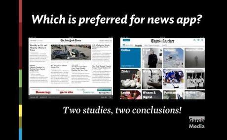
TAKEAWAY: Two studies about the behavior of news app tablet users, two different outcomes, and some points of similarity. How do Poynter EyeTrack Tablet and one by by Visiolink,in collaboration with Aarhus University,compare?
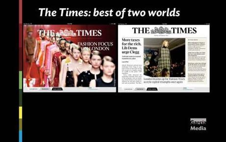
Perhaps the new Times of London tablet app offers us the best of two worlds: entrance thru what is definitely curated material for this edition, but one click away from the more familiar Times print edition.
As studies go, usually there is more than one result, and often, as we review research data, we even see contradictory conclusions. This is always welcome, as it stimulates conversation and debate, and makes us think before we apply what we have learned in a study or jump to conclusions too quickly. This is also what keeps us from becoming research addicts or fanatics of its results. My tip: look at all views, draw your own. It works for me.
I believe such is the case with a recent study involving news app tablet users, conducted by Visiolink in collaboration with Aarhus University in Denmark. One of the major conclusions derived from the study is that readers are drawn by familiar newspaper formats to the iPad.
Those newspapers that combine a familiar layout with online news and interactive features are most popular with iPad readers…. The study also shows that the closer a digital paper resembles the printed edition, the more readers are willing to pay
The study found that readers prefer the version that most resembles the printed paper, primarily because it offers security, familiarity and an overall perspective.
As you may recall, the Poynter EyeTrack Tablet research presented users with three styles of news apps: traditional, carrousel and Flipboard, all of which are shown here. Users felt that the traditional, newspaper page iconic screen was not their favorite. Instead, they preferred the carrousel, with photo navigation as key. Here is how Sara Quinn, who directed the Poynter study, wrote about that area of the study:
The traditional prototype was the one most similar to what people usually looked at on their tablets. Fifty percent of the readers preferred the carousel design, they said in an exit interview, while 35 percent preferred the traditional prototype, 15 percent liked the Flipboard.
This was quite consistent with a majority of users in the Poynter study. I, for one, believe, based also on focus groups on which I have participated, that a non traditional, photo-driven navigator, is more appealing, and faster to make the finger click.
Interactivity: one point in which the two studies coincide
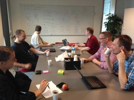
The “Publishing in a digital future” team brainstorming last week at Aarhus University. Jens Funder Berg is number two from the right. /Photo by Martin Brynskov.
I was happy to see this one element of both studies where users reacted similarly: they would like for more interactivity in their news apps. Or, as Sara Quinn put it in her description of the Poynter study results: “….touch … well, that’s the new factor in keeping a reader engaged.“
In the Danish study, here was a conclusion about the importance of interactivity:
Despite readers having given the 1:1 version of the newspaper higher marks than the web-based newsreader, there remains a general wish that the digital potential could be better exploited: not only when it comes to interactivity, but also for the possibility of regularly updated news and more multimedia content, such as video and photo galleries. At the same time, readers would like the option to ‘share’ articles via social media sites.
“Interactive content is still lacking. iPad gives me some extra options, but they are not being used. It’s really irritating when links don’t work. The same goes for QR codes.“
Reader quote on the 1:1 app
As someone who promotes pop up moments, and who keeps saying that “you must keep the finger happy and busy”, I am hoping that this conclusion will inspire designers to incorporate more engaging moments in their news apps. It does not have to be the elaborate, interesting and well though out pop ups that we are accustomed to seeing in Germany’s Bild. It can a simple button that reveals a mini story, as opposed to a caption, as part of the information provided by a photo, or a short video, or an audio moment.
Attracting young readers
I found a part of the Visiolink study to include an area of great interest to publishers everywhere: how to attract those young readers who seem to be so elusive. According to initial statements about the study, “it is quite possible to draw younger readers into digital newspapers, if the readers are exposed to the paper and its value – even though what creates that kind of value is highly individual.“
“The competition for readers’ time means however that the challenge for media houses is to create formats that allow for shorter newspaper moments rather than working on longer, unbroken newspaper time, as the classic newspaper does. We must service both new and old readers in a controlled transformation from print to digital format – for example with hybrid-apps, which combine familiar newspaper content with digital content in the form of related articles, picture galleries, video reportage, etc,“ says Jens Funder Berg, CEO of Visiolink.
Taking a look at research
I hope we continue to see more studies conducted about user behavior when engaging with news apps. For now, we can learn much from both the Poynter and the Visiolink studies. Both are authentic, well prepared and executed studies that provide us with the only scientific evidence we have to guide us as we design news apps.
There is more research to come. In the case of Poynter, my colleague Sara Quinn has announced that her team will continue the EyeTrack Tablet study this summer, when Poynter will release results on how touch and interactivity help people understand and remember what they’ve read.
The best way to maximize our utilization of any research findings is not to take them too seriously, to analyze the goal of each study at the onset, and then draw our own conclusions.
In the business of design, research is an important component, but not the only tool in the box. That thought has served me well for four decades. Hope it helps you too.
Some questions for the Visiolink researchers:
Jens Funder Berg is CEO of Visiolink, Dr. Martin Brynskov, teaches at Arhus University.
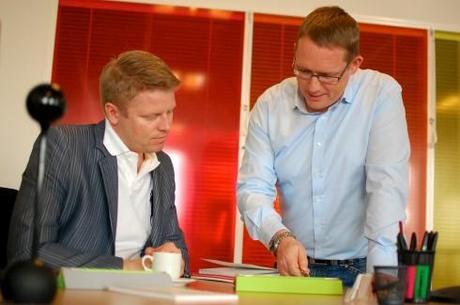
Jens is standing in the right, next to Kenneth Boll, COO at Visiolink.
Your study came to the conclusion that i-pad versions of newspaper are more likely to be accepted by readers when they graphically resemble the print version of the same paper. Why is that so? What are the reasons?
Jens:
Readers want editorial prioritisation. A printed newspaper has a beginning, middle and end, and readers who peruse printed matter feel they’re being guided through the day’s most important news, as selected by the editorial staff. However, readers of online editions are deprived of this sense of overview, as they are given snapshots instead of the newspaper in its entirety. That is why, when the newspaper’s tablet version resembles the online edition, readers find that they are unable to get a handle on the full content. The traditional newspaper layout, on the other hand, provides a feeling of safety and an overview.
Martin:
In our work, which includes the Visiolink pilot study, we look at news formats as “products”, i.e. comprehension and feature design,and as “social objects”, i.e. having value in facilitating social relations, and the relation between the two functions. One of the biggest problems of new media forms is to manage expectations, to tell people up front what they get. The 1-to-1 versions are easy to understand as quality news products, and they also serve as practical social objects, because the reader can rely on other readers having read the same version of the story. That seems to be why we see a lot of readers who are quite happy with the format. They understand the story format as well as its life-cycle.
**The study also showed that readers are more likely willing to pay for an I-pad-version if it resembles the print version. Why?
**
Jens:
This is true because, first and foremost, the classic layout conjures up an idea of value and an authoritative voice. For two hundred years readers have been accustomed to paying for printed newspapers, which is still the case today. Meanwhile, though, media houses have gotten readers used to the idea of being able to access online news content for free. As such, if the tablet version of a newspaper’s paid content resembles its general online layout, readers will expect to have free access – or to pay very little.
Martin:
The downside of the current 1-to-1 formats are that they are limited in their functionality compared to more dynamic web services and social media. They appear much too static to those who have experienced the dynamism and tailorability of aggregator services such as Flipboard and social media browsers. And daily editions don’t grasp the quick news. So a big challenge, our main challenge in fact, is to find the sweet spot between product-ness and dynamism. The pilot studies are a way to feed into a design process more than it’s discovering the truth about reader behavior and preference once and for all, because they will change quickly over time. But the principles of product and social object are more stable.
What are your experiences – what do readers expect from an i-pad-version of a newspaper?
Jens:
A recent study showed that readers value content above all else. Next on the list were ease of navigation and a feeling of safety. Fancy design and functionality were the least important – and maybe even a drawback.
Specifically, readers expect, that beyond having a connection to the newspaper’s printed content, they will gain access to the possibilities offered by new technology. From an editorial standpoint, this means they expect to see additional photo galleries for a given article – and, preferably, video content as well. Furthermore, from online searching in general, readers have grown accustomed to finding links to related articles; as such, they enjoy being able to access additional and more in-depth information on a given subject. The study also indicated that readers value ‘sharing’ functions that allow them to post articles on Facebook, LinkedIn and Twitter. There is also demand for a table of contents, just as readers expect a limited amount of interactivity.
What should newspapers absolutely avoid when producing an i-pad-Version?
Jens:
Media houses must avoid taking huge leaps and bounds all at once. They must remember that the printed newspaper is the essence of their brand. For this reason they need to understand how to effectively transfer this brand to digital platforms – while providing readers with all of the possibilities brought about by digital media.
Martin:
The thing is, newspaper “producers” aren’t just looking to meet reader expectations. They want to make a living by supplying a product that enough people want to consume, not necessarily by meeting every expectation, especially not in a competitive market. So this would include managing production and delivery cost. Newspapers of tomorrow, or today really, must have a very good grasp of the three parameters of
productness, social object value and production costin order to move ahead step by step, not in a big-bang, giant leap fashion. And, If you ask me, they must in fact change their organization to support the emerging formats, including working with trends and strategy in a much more designerly way.
More about the studies:
The Poynter EyeTrackTablet research
http://www.poynter.org/how-tos/newsgathering-storytelling/visual-voice/191875/new-poynter-eyetrack-research-reveals-how-people-read-news-on-tablets/
The Danish study: Visiolink in collaboration with Aarhus University
http://www.visiolink.com/news/result.htm?nid=488
Poynter EyeTrack Tablet presented at South by Southwest
http://www.poynter.org/author/quinndunlap/
Jens Funder Berg , CEO , Visiolink -
Email:
Martin Brynskov, Associate professor and researcher in mobile media, Department of Aesthetics and Communication at Aarhus University
Email:
My previous blog posts about Pop Up moments:
Creating some basic pop up moments in your tablet
http://garciamedia.com/blog/articles/creating_some_basic_pop_up_moments_in_your_tablet/
Defining those pop up moments in the iPad
http://www.garciamedia.com/blog/articles/de1
Bild’s iPad app: true “pop up” moments in a newspaper app
http://garciamedia.com/blog/articles/bild
iPad Lab 19: Pop ups don’t have to be complicated
http://garciamedia.com/blog/articles/the_ipad_lab_19_pop_ups_dont_have_to_be_complicated
Bild’s 3.0 version of app:it’s a pop up fest
http://www.garciamedia.com/blog/articles/bilds_3.0_version_of_app_its_a_pop_up_fest
TheiPadLab: the art of the simple pop up
http://garciamedia.com/blog/articles/theipad
From print to tablet: dissecting and creating
http://garciamedia.com/blog/articles/pfrom_print_to_tablet_dissecting_and_creating_p

