TAKEAWAY: It is a decision that must be made early, how will your tablet edition look when the user’s eyes first land on it?

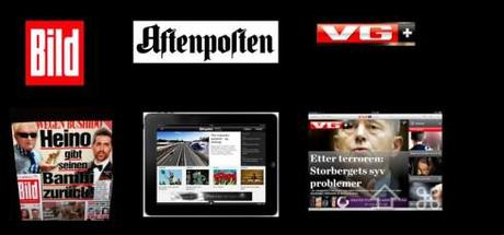
Three different ways of presenting the tablet design: Bild (Germany) uses the printed page as springboard for material; Aftenposten (Norway) uses a more curated edition; VG+(Norway) a curated edition that resembles the look and feel, and headline sizing, of the printed product.
When it comes to the look and feel of a tablet, especially one for a popular, more mass circulation newspaper, there are two ways to go: either the content comes out of a newspaper page template that looks like the printed product, or you go with a total curated edition, where elements are selected, but do not necessarily come out of a traditional newspaper page.
This is a philosophical question that the development team needs to discuss seriously before designing an app.
We find ourselves in the middle of that process with one of our clients at the moment, which prompts my discussing the topic today.
Both can be correct, it is a matter of intent, the impact one wishes to create, and how we feel the DNA of the printed product best translates. It is also a matter of human resources and the technology available to sustain it and make it all happen daily.
More to come.

