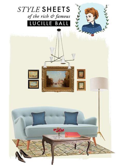
I'm super stoked to present a new collaboration with 2 very talented ladies. Here's how the story goes: Jessica Williams and I (I talked about her last week on the blog) interned together in NYC one summer at Jonathan Adler 5 years ago. She's now the global display coordinator at Kate Spade in NYC and she's an uber talent. We've been chatting about collaborating together and decided to do a monthly column called "Style Sheets" based on these clever interior collages she does. I thought it'd be cool to do a series based on popular and design icons and re-imagine how they would live now. THEN, I thought it'd be so nice to bring in an illustration to complete the ensemble. Enter illustrator Michelle Christensen, who I'm working with on this Saturday's SLC Pop-up Shop (are you coming?!). I just adore everything she does (like this sweet story). Didn't they rock it?!
It's that time of year when I love to come home from the office, open the windows and wind down with my favorite episodes of I Love Lucy. Lucy and Ricky are a youthful and vibrant couple, but their apartment is a bit more on the traditional side. The organized grouping of frames above the desk is one of my favorite style moments in their space, which I was inspired to do in this style sheet. The show was filmed in black and white but I imagine soft blues and bright red accents would have been fitting. The modern pendant chandelier is a twist for their traditional setting but it certainly speaks to the unpredictability of Lucy's wild ideas!
text and style sheet by Jessica Williams illustration by Michelle Christensen

