If you’re looking to stand out in the job application process (and it goes without saying that we all need to make sure we do) then short of turning up in a clown outfit and juggling fire for attention, the absolute best way to get noticed is with your resume.
Thanks to the recession, many vacancies are receiving up to 100 applicants – and that’s for the ‘skilled’ jobs. Other roles, such as shop work, waitering and bar-tendering are reporting up to 200 applicants per vacancy. Assuming the poor person designated the role of sorting through all those resumes will be giving each one only a brief glance, you have to make sure they’re going to notice yours.
How to do this?
You could try a pink background (tacky), a jazzy border (distracting) or a funky font (really distracting).
If you really want to impress though, how about turning your plain old resume into a super-funky, easy-to-read and straight-to-the-point infographic?
Need some inspiration? Read on for our top five without-a-doubt going-to-get-you-the-job infographic resumes!
Christopher Brown
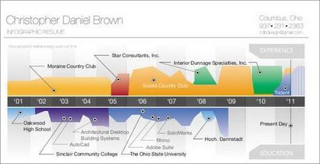
Why it’s great: the timeline is a very clever idea and in this case is very well executed. The ability to tell potential employers at a glance what you’ve achieved and when is invaluable.
What could be better: it’s too long. Infographics need to provide a concise and accessible way to absorb information, yet this resume just has too much going on. It also tells us nothing about his personality, except that he likes making graphs.
Hagan Blount
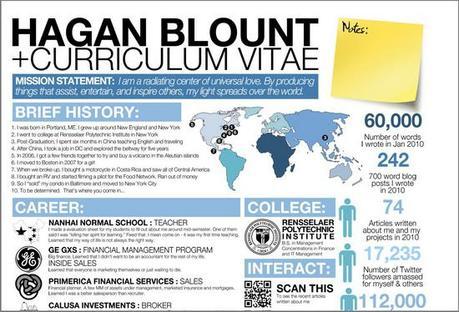
Why it’s great: it’s packed with personality and information. Featuring praise from previous clients is an excellent idea.
What could be better: it’s too ‘busy’. Yes, I realize I said it’s great that there’s so much information, but at the same time, I think it’s a little over the top.
A few random facts to help the employer get to know more about the real you is great. The ten point ‘brief history’ probably takes it a bit too far.
Kristian Leigh Walsh
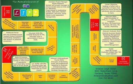
Why it’s great: it’s so original! Even an employer who had been inundated with infographic resumes would still sit up and pay attention to this one!
What could be better: it’s a bit tricky to understand what calls for the most attention. Information that should probably be given a great deal of emphasis (such as career objectives) is offered no more prominence than anything else.
Kevin Burton
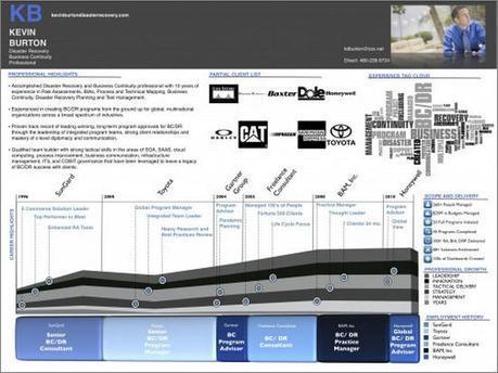
Why it’s great: the clear, easy to understand layout. Nice use of headings to ensure no-one’s left wondering what each section refers to.
What could be better: although creative in itself, it’s still quite a formal infographic (which may well however, be ideal for the roles he’s applying for) that lets very little of Kevin’s true personality shine through.
Elliot Hasse
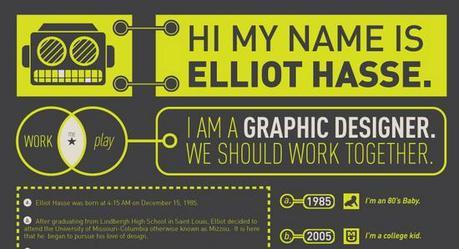
Why it’s great: it’s clear, concise and full of personality. Within a couple of seconds we know who the resume belongs to and the candidate’s field of expertise.
Elliot plays on the fact he’s a soon to be graduate and emphasises the skills and experience he’s gained in college.
We also learn some random yet endearing facts about the budding graphic designer such as he likes beer and in 2009 went through a tank top wearing phase. In essence, irrelevant, but when an employer receives countless applications all citing the same skills and qualifications, you need to show a little personality to stand out.
What could be better: in my opinion, nothing. Elliot, you’re hired!
Is an infographic resume for you?
While creative industries will probably lap-up the effort and innovation that goes into an infographic resume, fields such as accounting and business might not be so taken.
It’s worth learning a little about the company itself and their interview process before deciding whether infographic applications are the right move.
Still want to jump on the graphic bandwagon?
Mashable featured a great article last year that looks into the pros and cons of four easy to use infographic resume tools.
Tagged as: career tips, career woman, resume tips, resume writing

