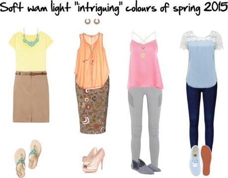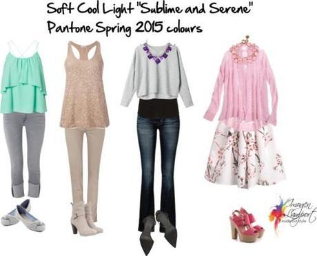
The Pantone Spring 2015 colours are softer than they have been in awhile. There are some soft warm colours that work really well with our Intriguing swatch and some cooler that relate to our Sublime and Serene Swatches. So after our recent seasons of very bold bright colours, it’s great that those with smokier and softer colouring will find clothes in their colours in the near future.


“Many feel compelled to be connected around the clock because we are afraid we’ll miss something important. There is a growing movement to step out and create ‘quiet zones’ to disconnect from technology and unwind, giving ourselves time to stop and be still. Color choices follow the same minimalistic, ‘en plein air’ theme, taking a cue from nature rather than being reinvented or mechanically manipulated. Soft, cool hues blend with subtle warm tones to create a soothing escape from the everyday hustle and bustle.”
Leatrice Eiseman
Executive Director, Pantone Color Institute®

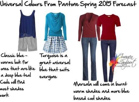
There are also some universal colours that can be worn by all in your right intensity.

