After last week's French look—Audibiche, it hit me that I should just push the envelope—pretty shouldn't necessarily be the only goal.
Ika nga ni Steve Jobs via Mona Simpson: "Fashion is what seems beautiful now but looks ugly later; art can be ugly at first but it becomes beautiful later." more here
(oh di ba? um-effort maging relevant?)
It's easy to forget that school is the place to stretch the mind and test limits. Because the outside world can be really limiting. <end bratty tantrum>
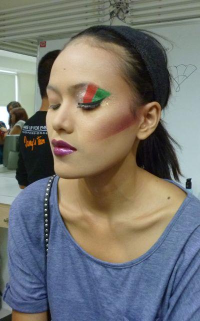
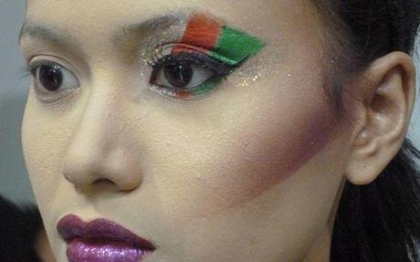
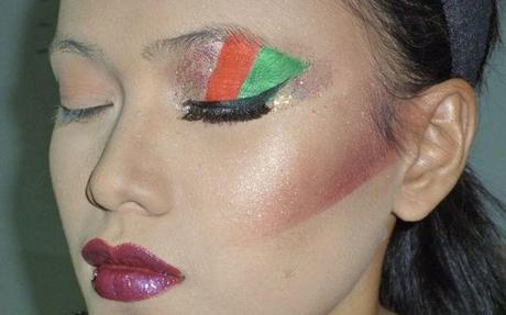
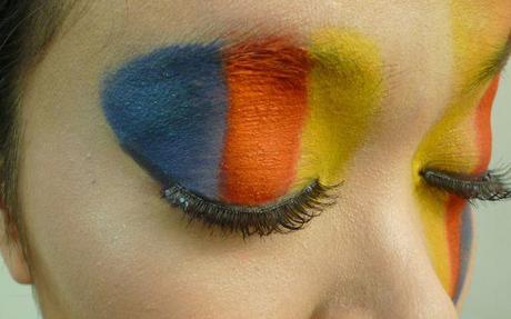
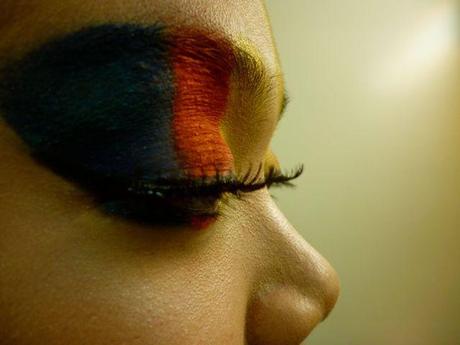
Anyway, the look for Day 12 was Evantrail Eye. An Italian make-up look, it resembles a fan with its three colors (light, medium and dark) painted on side-by-side. Mega colorblocking ang mode. Though you can definitely go for a monochromatic treatment which might prove to be the most wearable version. You can also go very graphic (unblended, bold!) or blended, and stay with the shape of the eye or just go hog wild. (Guess what I tried to do? )
Here's Sir Mio Robo's evantrail eyes, pay close attention to the lip color. That's customized mixing!
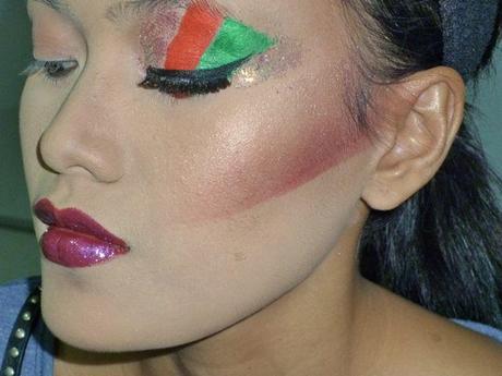 More images,
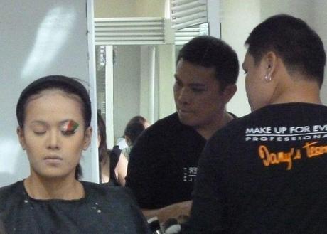
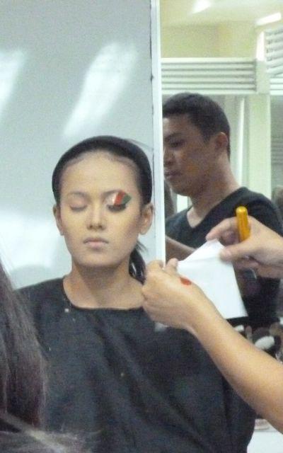
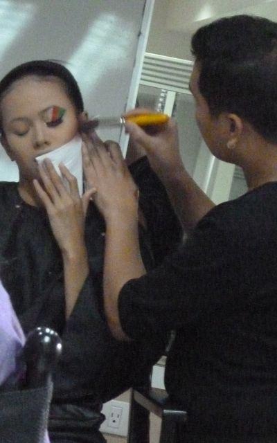
 See the full gallery on Posterous
If you're wondering how they create those sharp lines—that's not purely brush skill. Hahaha. So try it out. Sir Mio suggests tissue paper instead of the tape method because at least the tissue doesn't leave adhesive.
 See the full gallery on Posterous
Things to consider
- try using a foundation that's half a shade lighter so that there's more focus on the eyes, the strong lights will even things out. (obviously, this isn't really for makeup to be seen up close) Also stick to a matte finish with a heavy coverage—you want to be able to put shimmer where you want it.
- contour should be strong, at least 3 shades darker since the half-blind lady at the back of the room has to see that the model has bone structure that can cut paper. (sumisigaw na cheeekbones and nose line, GO!)
- say hello to color!!!
- Wing out the eyeshadow and eyeliner—think fan. Like pamaypay for realz. Either abanico or those wooden ones—extend the eye a bit.
Before I introduce Kara, my model. Here was my inspiration, my final work looks nothing like it.I've discovered that my ideas of high fashion are more sesame street than high street. Even when I try to be edgy, it ends up looking like finger painting.
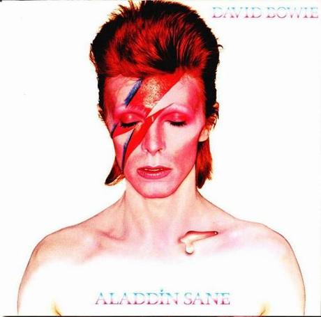
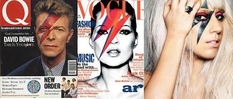 See the full gallery on Posterous
(images are from here)
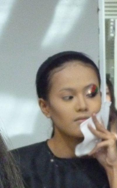
Here's Kara.
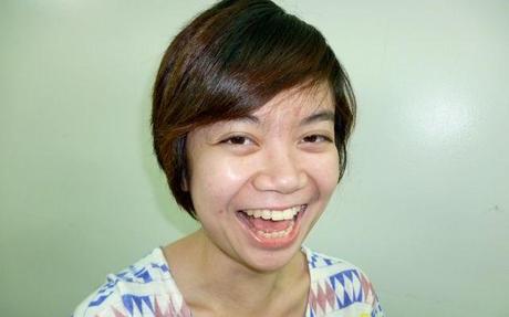 K and I used to work in the trenches of a design firm. Our favorite things there were dreaming up other things we wanted to do. Things we came up with:
- To utilize Kara's great ability to do the hipster broken doll model pose, we'd throw her into run-of-the-mill situations in a tutu and a rubber duckie inflatable ring.
- TDB: Every hour at the top of the hour, all work stops and everyone just does a whole minute of booty-shaking. Our song of choice then, my song of choice now.
- A show that would utilize my supposed talent to just faint, mouth agape.
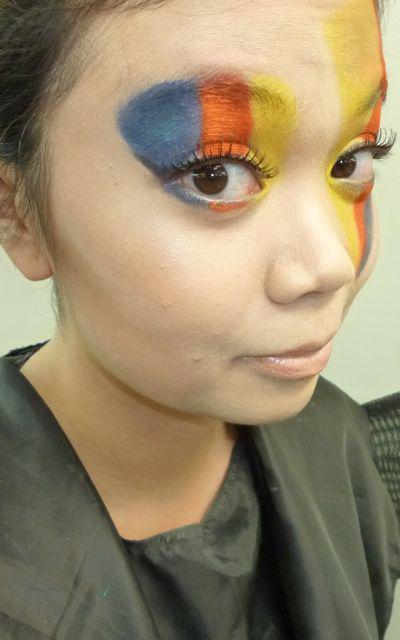
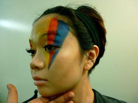
And here she is with the war paint on:
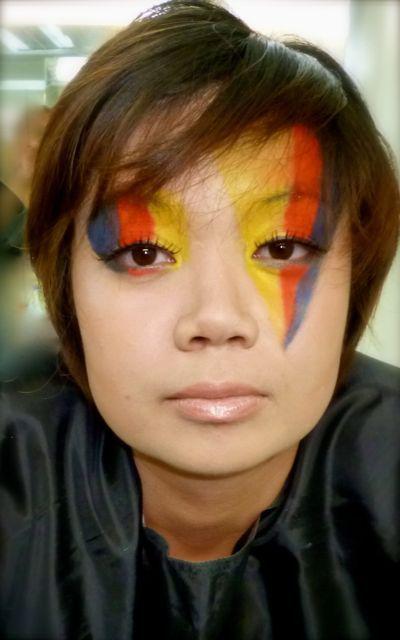 She makes hooliganship chic ano?
 See the full gallery on Posterous
Kara's eyes just make the high fashion look pretty! Those lashes were perfect!
 See the full gallery on Posterous
And here we are at the end of the everything (before we wash everything off!)
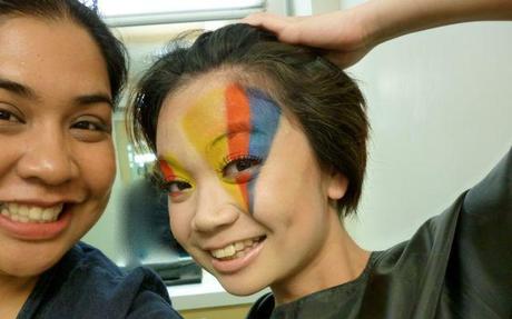 I feel like we could have still pushed things futher, like one-sided graphic blush and maybe a rectangle of lipstick on her bottom lips. But it really was fun! Hahaha.
Though I don't mind if my children's show tendencies ran more towards this:
Permalink | Leave a comment »
