I’ve been doing some work for The Rumpus, which features a diverse mix of essays, profiles, and interviews.
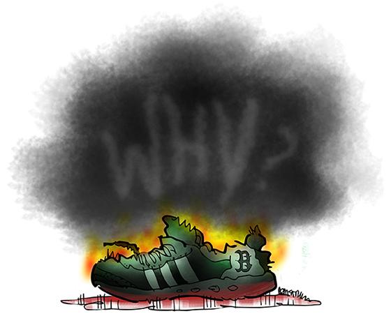
The illustration below was for an essay which referenced the recent Boston Marathon bombing, and reflected on the fact that while tragedy travels fast via social media, truth and understanding come slowly, if at all.

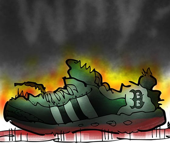
A close-up detail:

Photoshop users have access to lots of fancy fonts, but I actually drew the word “Why?” with a mouse, using a “smoke effect” Photoshop brush. I used the same brush for the
black smoke.
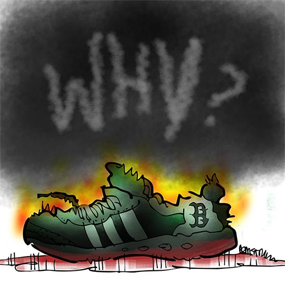
Here’s what it looked like originally. I decided it was a little too small, sharply etched,
and easy to see.

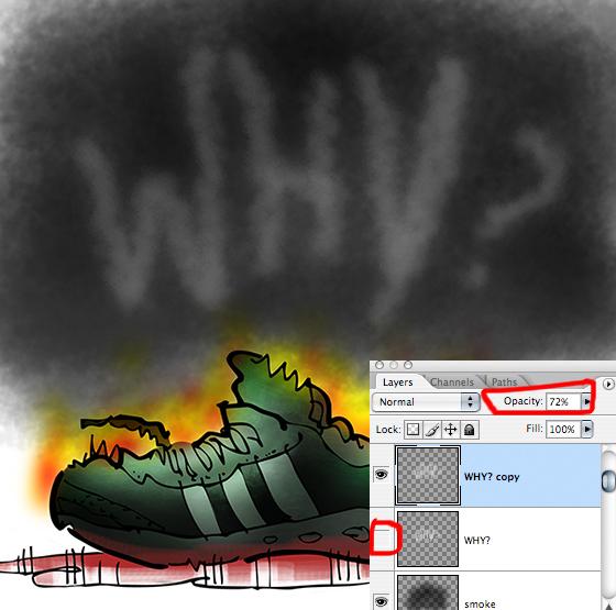
So I duplicated the layer, hid the original, and used Edit>Scale to enlarge the writing. Then I reduced the opacity of the layer to fade the writing and emphasize the point that it’s difficult to perceive the truth, the Why, behind the smoke and noise of a tragic news event.

Here’s the same again, with the relevant portion of the Photoshop Layers Window:


* * * * * * * * * * * * * * * *


Do you rely on social media sites like Twitter for “news bulletins”?
Do you think the lines between fact, rumor, and opinion get more blurry every day?
Hope you’ll leave a comment.
If you enjoyed this post and would like to let me know, please click the Like button below.
If you’d like to share this post with others, please click Tweet or Facebook or one of the other Share buttons.

