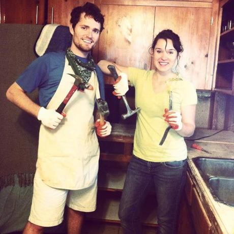
I suppose it’s time to make good on my promise to share all of the juicy (or rather saw dusty) details of our kitchen renovation. Honestly, nothing would give me greater pleasure.
Renovating the kitchen has been on our to-do list for quite a while—practically from the first moment we saw the old girl. It had good bones, but not a lot of personality, and we’re all about charisma in these parts.
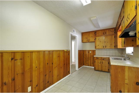
It is spacious enough for what we need, and the cabinets weren’t in shabby condition, but overall it doesn’t inspire much creativity, a quality that should be mandatory in a space from which spectacular culinary masterpieces are expected to be born.
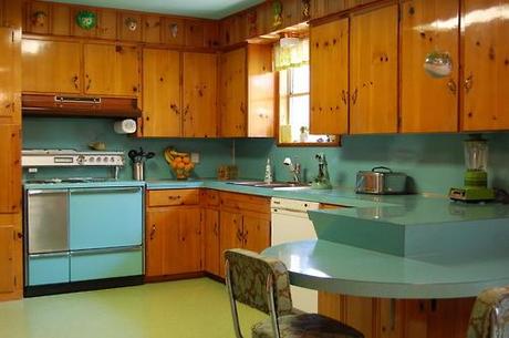
We had big, big plans for how to improve the looks and the functionality of this narrow knotty pine nook. We started small, first by painting the walls in a shade of green called spritz of lime…inspired by photos that brilliantly display the appealing divergence of the warm, honey-colored pine and the vibrant and verdant green.
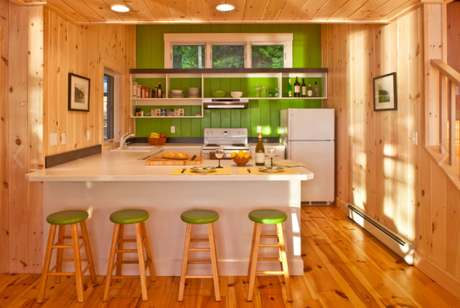
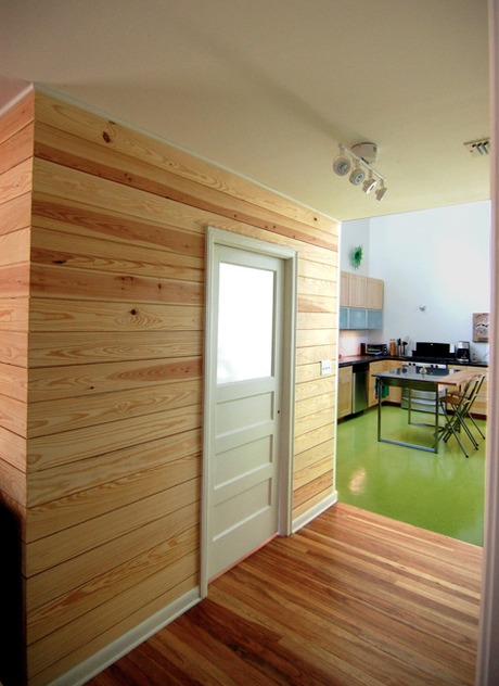
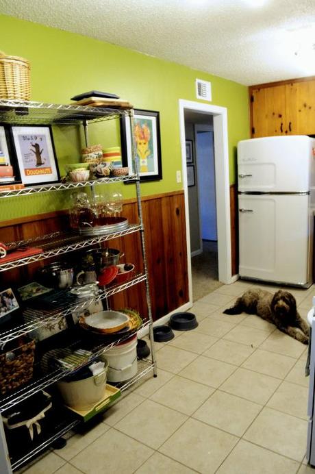
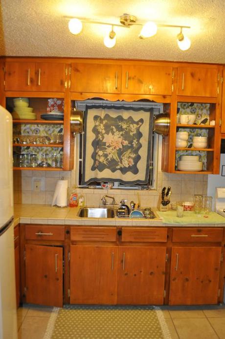
The update was much needed and greatly appreciated but still our cooking space was far from what we hoped for in our dream kitchen, so next we opted to tackle removing the wood paneling from the walls and add some open shelving for increased storage.
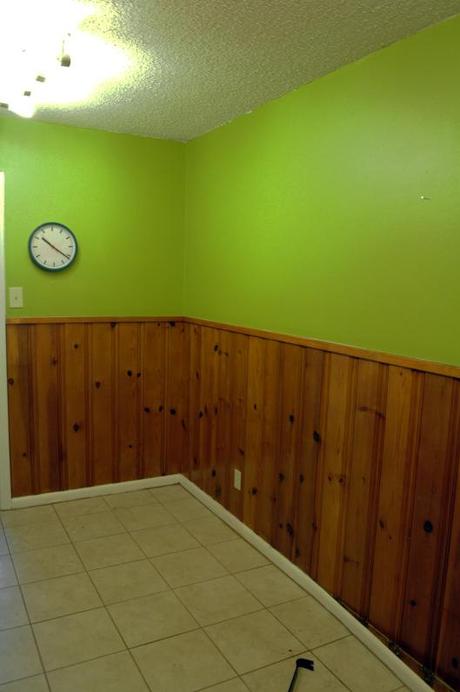
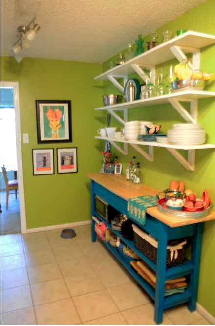
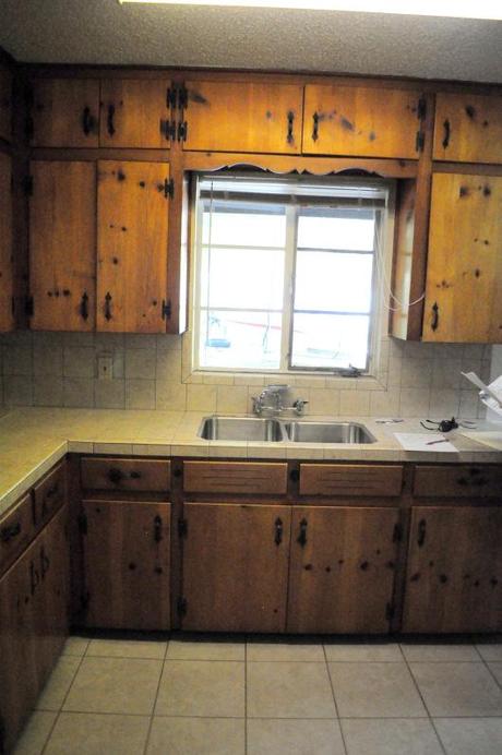
Still, what was and continues to be missing, is an update to the counters and back splash because poorly installed beige ceramic tiles just won’t do. This weekend, we took a sledge hammer to the terrible, TERRIBLE tile work and began the demolition, preparing for new shiny white counter tops.
We weren’t sure what would lie beneath the tile. The original laminate perhaps? Or rotted plywood? Your guess was as good as mine.
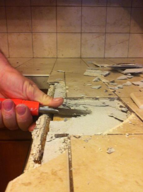
Pulling up the tile was easier than I thought it would be. Perhaps that is because it was rather cathartic to smash into the surface I had so long despised—making the project feel less like work and more like play. Before I knew it, after just a little sweat and chiseling we, with the help and expertise of Heath’s family, completely scraped the countertops and backsplash free of the tile I found so appalling. In just a few hours we were able to remove all the tile AND salvage our deep stainless steel sink. A big money saver for we thrifty folk.
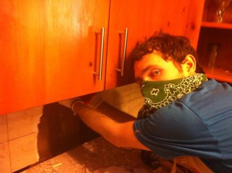
Heath tears down the wall.
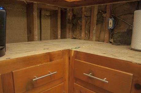
What we found underneath the tile was dry plywood, which ended up being a lifesaver, enabling us to still be able to use the kitchen counter and sink for the next two weeks while we wait for our white solid-surface countertop to come in. Though it’s not much to look at, I’m grateful for the interim surface.
We also (drum roll please) had a plumber replace our kitchen faucet, both a cosmetic and functional improvement
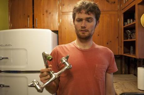
Heath wonders how we lived so long with the leaky original.
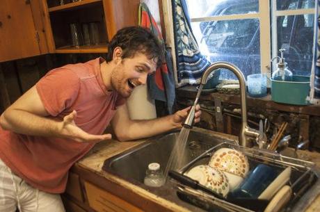
The new one has a spay nozzle, more mobility and much improved water pressure. Winning!
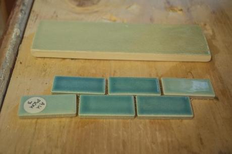
And now that the tear-out is done and we have nothing to do but wait, we are busying ourselves with comparing our options for the backsplash. So far it’s between a light blue subway tile and mini rectangular tiles in varying shades of blue. While I wasn’t keen on mini tiles at first, as of now I think it’s our front runner.
The kitchen remodel has definitely been our longest-running home improvement project to-date, and it’s still a ways off from being complete, but I feel like we turned a corner with this week’s demolition. And I’m excited for how much it’s going to change for the better in the very near future.
