The month leading up to Alt Design Summit was the month of the blog redesigns. The people of the blogging world were getting their virtual space cleaned up and ready to be seen by the attendees of the conference and let me tell you... those bloggers didn't disappoint. There have been so many good redesigns, and so many unique approaches to the problems that we all face with our blogs, that I wanted to share a few of my favorite facelifts with you and pass along a few tips from each for you to use on your own blog!
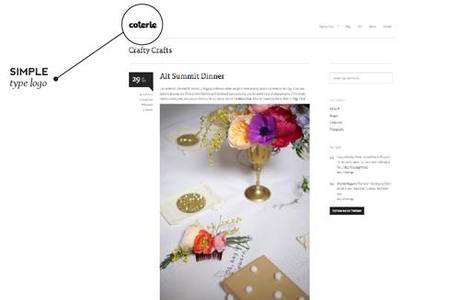
First up is the Coterie blog

You also can't help but be inspired by the design. When I was in design school, the one things my teachers tried to drill into my head was that simplicity was king. Create something and then simplify it as much as you can before it loses its meaning. It's a fine line and Heather has hit it right on with her new design (and the help of her designer husband :).
Want take a page out of heather's book and go for the ultra simple look? One simple way to do this that doesn't require vast graphic design knowledge is to stick with a type-based header. There are so many beautiful fonts out there that can help you create the look you're going for, while keeping your site looking nice and clean. Try mixing multiple fonts and playing with the arrangement of the words. Brittany here has a header that does just that and feels totally put together and complete.
Here are a few great font round-ups to help you find the perfect font for your header! One from Emmadime, two from Breanna Rose, three from A Subtle Revelry
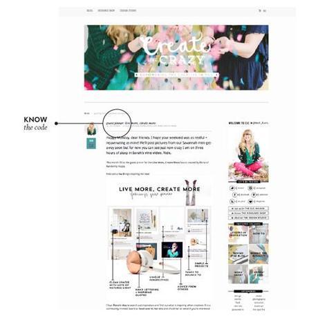
Next we have Create Like Crazy

Again, her blog is very simple, but she adds interest in simple ways that you can recreate very easily! First, take advantage of things you can control, like photography. A post full of beautiful pictures can do so much for the look of your blog. Second, pick great colors and roll with them. I love how the color of Jordan's date tab matches perfectly with her profile picture and the image from her header. You can also adjust the colors of your sidebar headers and text links to fit with your look. Third, don't be afraid to mess with the code. Just go into the backend of your site, copy and paste the existing code in case you mess up and want to start fresh, and experiment away!
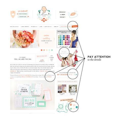
Finally there's Grey Likes Weddings

Second, they weren't satisfied with the standard options. All of their buttons and icons are customized to fit their look and brand, they've left nothing out. From their search form, to their page links, to their social media icons, they have their hand in every piece of the site. While it's not easy and a lot of bloggers don't know how to do all that coding, here's an easy way to customize your site: you Use free Illustrator-like programs such as Gimp to create custom buttons and page links and upload your images to Picasa Web Albums. Once you've done that, right click on your image, copy the page location and then stick customize the following code:
<a href="PUT YOUR LINK HERE"><img border="0" alt="THEN NAME IT" src="AND ADD THE IMAGE LOCATION YOU COPIED FROM PICASA" /></a>
All you have to do is stick that piece of code into a HTML widget on your site and you're set! Make sure that you create the right size of buttons (if your sidebar is 300 px wide, make sure your image is too!) to make sure everything fits!
While it's difficult to create the blog of your dreams without the help of a professional designer or coder, but these simple tips can help you create a space that's a little more you and a little less cookie cutter. It's a road that involves a lot of trial and error, but you'll be happy you tried! Good luck and once you're done, please share your links so we can see!
Thank you Tori! Noted!

