This is the weekend edition of TheMarioBlog and will be updated as needed. Because of the Memorial Day Weekend celebration in the United States, my next blog post will be Tuesday, May 31


Which of these covers would seduce you to buy---or at least to take a second look?


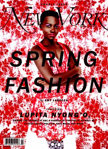


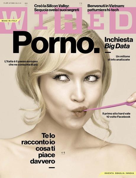


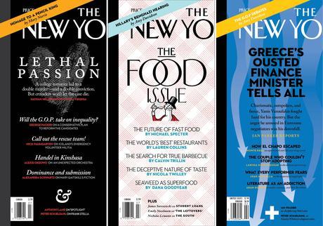


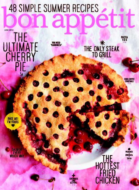


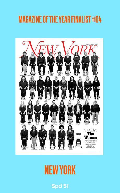
Cover story: Does the front page of a magazine still matter?
That is the title of a piece that I found resonating with me last week.
No question about it: the seduction process between publication and reader begins with a visual. We react to an image, our interest is aroused and we stop to look—and, hopefully, to buy.
Ironically, in the digital world that surrounds us, when, as we have discussed here, the home pages of both newspapers and magazines is going the way of the fax machine ——with audiences coming to read a specific article and often NEVER coming to the publication’s home page—there is no doubt in my mind that whatever a publisher puts on the cover of a magazine is still important, if not crucial.
I live in New York City where, fortunately, we still have many “press kiosks” at various corners throughout the city, and, especially, down in the catacombs of the subway. I am a people watcher and I have particular interest in the attraction that all those print magazines and newspapers pose to the throngs of commuters who are too busy with their iPhones, tablets and other mobile devices.
At the 116th (Columbia University) Metro station, for the #1 train, I am always particularly keen to see how many of the young students waiting for the train actually look at the dozens of magazine covers on display. While I have never seen a student actually buying a magazine from the vendor, I always see several of the young millennials reviewing the covers, taking in the headlines and probably (who knows?) making mental notes of pieces they would like to tackle online when they get on the train.
Of course, this does not do much for the publisher who wants to transact business with the reader, but if it leads to an online subscription, then the impact of the print cover did the job.
What the experts say about magazine covers' impact today
Here are some quotes from the magazine experts cited in this article about the impact of magazine covers today:
Brad Merrett, creative director at Team Rock
“There are only 12-13 published a year, which intrinsically adds value, and creates demand for that prime real estate. In an age where even the relevance of a brand’s homepage is being questioned, we may find that the rectangle of paper held between forefinger and thumb can more than hold its own as a tactical pawn for a publishing business.”
Terri White, editor-in-chief of Empire magazine, who compares the magazine cover to a shop window:
“If you’ve dressed your mannequin in nasty-looking shorts and a questionable crop top, no one’s going to want to come in and shop.”
“Me and my senior team spend a great deal of time on our covers - from negotiations with studios and filmmakers, to going on set to shoot, to working with the printers and production house - and that’s for a very good reason.”
And how about printing multiple versions of a cover, a trend that has taken off lately?
Terri White, editor-in-chief of Empire magazine
“When you have a movie with multiple cast members of note, it allows you to cover all bases, reach more of the audience and represent the film more accurately. But it also definitely generates buzz - we recently released nine covers for X-Men: Apocalypse, aided and abetted by the cast who unveiled ’their’ cover on social media.
“The golden rule is to never use the split cover as a get out clause if you’re torn between two covers (’Oh god, I can’t decide! Let’s just do both!’). There has to be either: an equal audience for both/all; a likelihood that a reader would want to buy multiple covers or a conceit that required you to produce separate covers as part of a larger campaign. If it ain’t one of those, then you just need to put on your big girl knickers and make a tough call.”

