TAKEAWAY: My Scandinavia reports continue. Today, the new look of Sweden’s newspaper, Dagens Nyheter; in Norway, the financial daily, Dagens Naeringsliv, introduces its first app edition
A mild change: nice , easy, but no wow
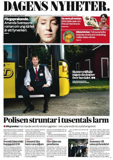
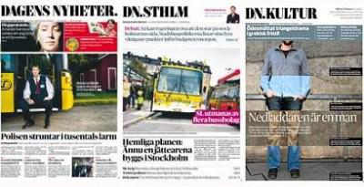
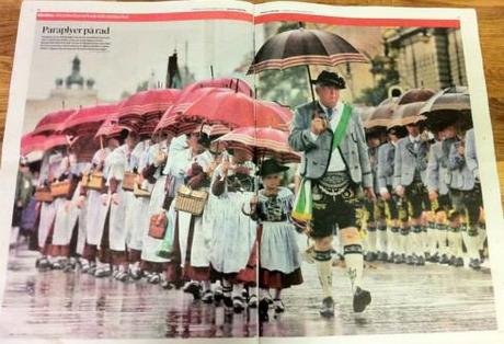
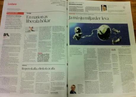
In Sweden, Dagens Nyheter introduced a new look this week.
It is a newspaper we know well, and that we redesigned once. As most Swedish newspapers, DN is orderly,clean, well groomed and easy to read. It always has been and I guess it will always be.
This redesign advances the “clean and well groomed” status of the newspaper, and it uses the beautiful typographic combination of Publico and Guardian Sans, which provide each page with elegance and a sense of gravitas.
Overall, however, and I have only seen one edition, I wonder how much was truly changed here. More importantly, how did this redesign advance the DN design to the next level?
The front page is poster like for the most, except that text hurries in at the bottom of position, sort of in a last minute effort not to miss the train.
Photos are well used, and, of course, as Scandinavian newspapers do so well, white space brings us that Nordic fresh air relief that so many American newspapers are missing these days.
Although I am not wowed (and who says that newspapers need to wow us with the foundation of their design?), I just ask the question: When is a redesign necessary? When is it an exercise in pleasing editors who simply “got tired” of the old look (which was not bad to begin with)?
First iPad app for Norway’s Dagens Naeringsliv
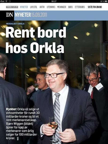
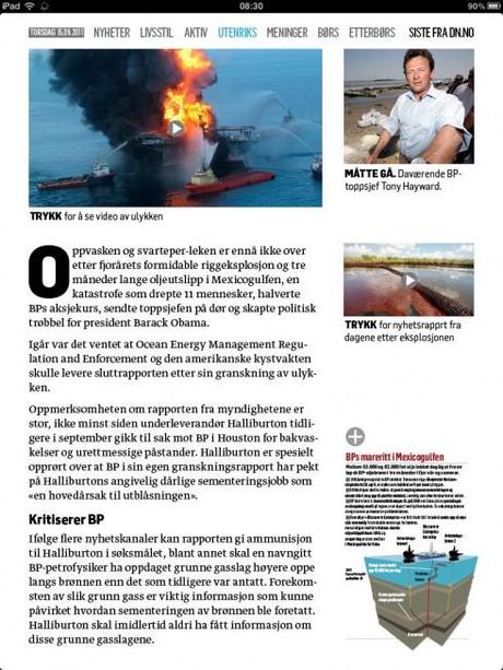

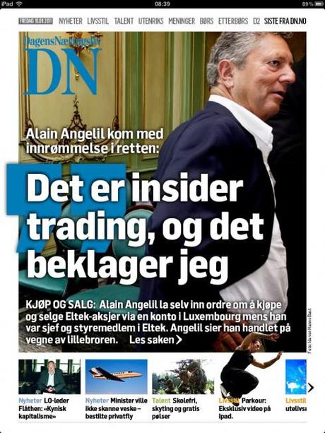
In neighboring Norway, the other DN introduces its first iPad app, and it is a great start for this 2.0 version. It has personalilty, it respects the DNA of the newspaper to a T (those poster front pages are replicated here), and the texture of the article reading pages is exquisite, as is the translation of the weekend magazine to the tablet format.
What is missing here, and it is very early in the process, are the pop up moments, the more tablet-oriented functions. We do a lot of reading and turning of the pages here, but I know that in the future we will begin to see more tablet moments.
We wait for that, knowing that in Norway, the DN guys are innovators.
The Bild poster of the Pope unveiled
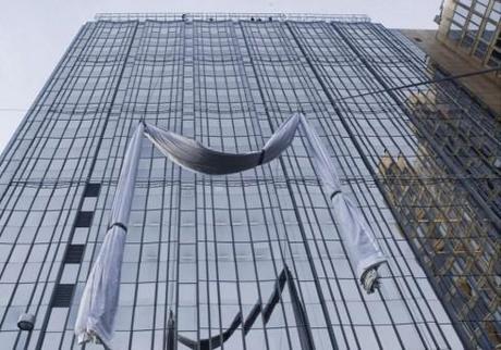
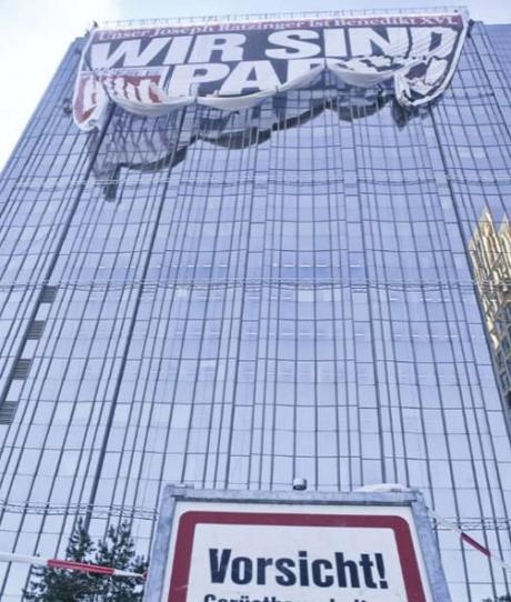
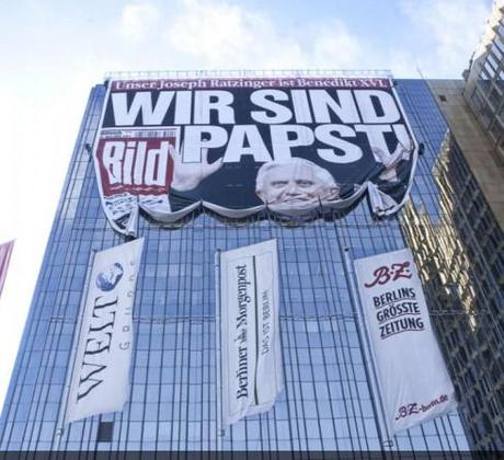
Yesterday we showed you (scroll down for that post) how, Bild, the German daily was welcoming the visit of Pope Benedict XV! to Berlin by displaying a giant (19-story-high) poster of a smiling Pope on the memorable front page that read: We are Pope!
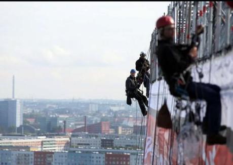
Here Frank Deville updates us with a video of the unfolding of the poster, and some new photos.
TheMarioBlog post #859
For Bild of Germany: turning the Pope’s visit into a giant poster event!
TAKEAWAY: When Pope Benedict XVI comes to Germany, Bild zeitung prepares well, and, as it always does, it is over the top——in this case a giant poster of the smiling Pope covering 19 floors of the Axel Springer Building, Bild’s home, in Berlin.
A welcome fit for a (German) Pope

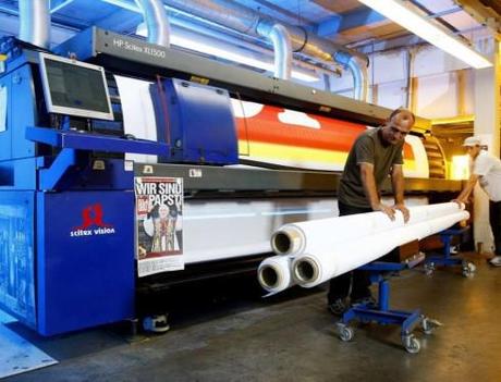
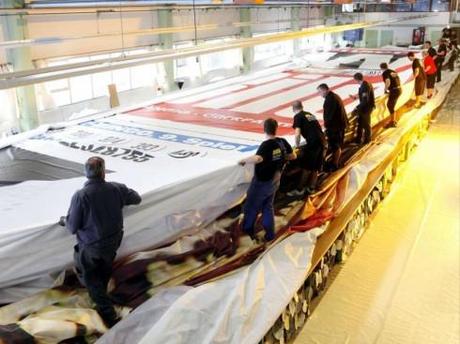

Watch the video as the poster is set up for positioning over 19 floors of the Axel Springer Haus in Berlin
Frank Deville sends us this set of pictures from today’s Bild.
When the announcement was made that German-born Joseph Ratzinger
had been named Pope, the always fun and irreverent Bild shared the pride of every German on its front page with a headline that read: We Are Pope!
It was a front page that resonated with the readers, and with the media colleagues—-we saw reproductions of that front page everywhere.
Well, now Pope Benedict XVI is coming to Germany for a four-day visit, including one day in Berlin (home to Bild) and, typical of the larger than life approach to things that the ever popular Bild takes, it is unveiling a giant poster to welcome the Pope. The poster will hang on the side of the Axel Springer building in Berlin, covering 19 floors, with a replica of that famous We Are Pope! front page.
When you talk about a newspaper establishing links with its community, doing things over the top, and expressing joy, all at the same time, nobody does it like Bild.
It is no surprise that five million read it daily.
Poster facts: It measures 45 by 64 meters. It took 8 days to put all the strips of the poster together; a specialized group of engineers worked on putting the poster together; and it will take one day to hang the poster, with the smiling Pope image, as he arrives in Berlin.


