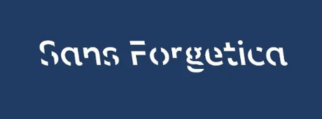
A fascinating
piece from Taylor Telford in The Washington Post describes a new font devised by psychology and design researchers at RMIT Univ. in Melbourne...
...designed to boost information retention for readers. It’s based on a theory called “desirable difficulty,” which suggests that people remember things better when their brains have to overcome minor obstacles while processing information. Sans Forgetica is sleek and back-slanted with intermittent gaps in each letter, which serve as a “simple puzzle” for the reader...The back-slanting in Sans Forgetica would be foreign to most readers...The openings in the letters make the brain pause to identify the shapes.
It may be my imagination, but I feel my brain perking up, working harder, to take in theis graphic:

The team tested the font’s efficacy along with other intentionally complicated fonts on 400 students in lab and online experiments and found that “Sans Forgetica broke just enough design principles without becoming too illegible and aided memory retention.


