Notice that I said “rethinking countertops?” and not “rethinking countertops!” That question marks means I am in the thinking stage. Not in the doing or acting stage or I-have-definitely-made-up-my-mind stage.
Here’s the deal.
When we bought the house, one of the first things we thought HAD TO GO was the kitchen countertops. First off, they are hideously ugly. They aren’t even ugly in the sense that the style is dated because the tile isn’t even original ’50s tile. It was installed before we moved in by whatever out-of-touch realtor told the homeowners that people like beige and want to live in a neutral beige universe. The entire house was redone in beige. The carpets, the walls, the floors, the countertops. It was a beige nightmare. Secondly, they are poorly installed beige tiles, with uneven corners and unfinished sections. It’s bad. Real bad.
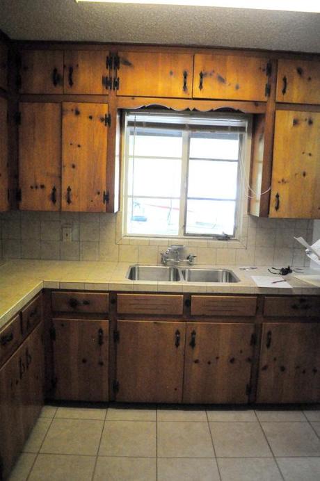
The kitchen- pre doodle house
I think if you told someone to imagine a bland kitchen, they could not have come up with something this drab. Fortunately, we have picked things up a little since this photo was taken: refinished the cabinets, painted the walls and created some open shelving. Still left untouched, however, are the countertops.
The original scheme was to put in some pearly white quarts countertops (to match our Big Chill fridge) and pair it with some teal or turquoise subway tile for the backsplash. That scheme, I felt, would give the kitchen a look that’s classic (the cabinets), yet modern (the countertops) and fun (the backsplash) while still being cohesive.
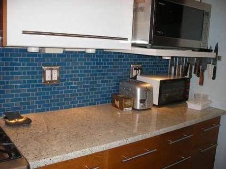
Knotty pine cabinets + neutral counters + blue backsplash
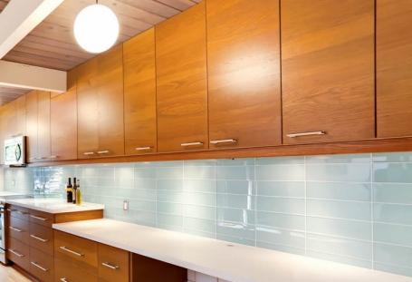
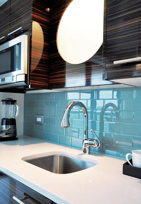
The problem with this little operation, like with most things, is the price. To get ‘er done we’re gonna drop probably around $3,000, and that doesn’t even include the actual necessary must-have upgrades like a dishwasher and garbage disposal (we need a new electric box for that, which is a whole other blog post). So I’m starting to think that I need to either be really, really, really patient (which I am really bad at being) and wait a few years until I can do my upscale remodel, or I can start thinking of more affordable alternatives. (Before you tell me to be patient, I will once again refer you to photo one and ask how long you could exist comfortably in that kitchen.*)
*Note to self: you are so lucky to have the kitchen and house you have and you should probably stop complaining about it on the internet. You’ve been to India. You know what “existing comfortably” truly means, so buck up.
One alternative is to replace the existing tile with tile that’s a bit more colorful and perhaps more professionally installed. Where, say, the tilers (Heath and me) opt to actually attempt to finish placing tiles around those “hard-to-get-to” spaces like electrical outlets.
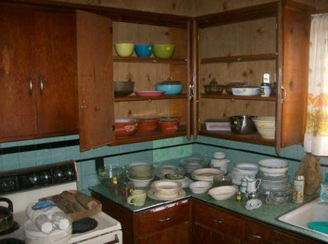
So, not a great picture. But you can see how the color scheme would work well in our kitchen.
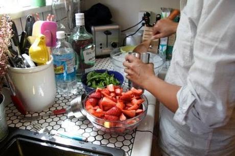
Hexagonal white tiles. Still pearly and white and with a little more character than the shiny bright we would get with quarts.
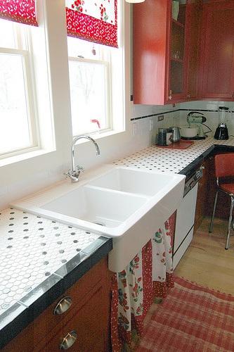
More hexagonal white
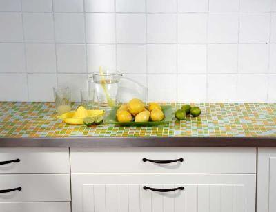
Mini square tiles in greens and blues…pretty well matching our existing color scheme.
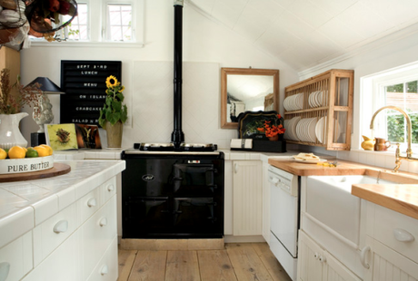
More white tiles. Like.
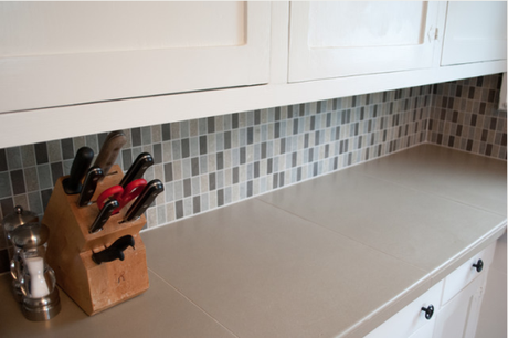
Large tiles instead of small. Interesting. Very interesting.
And I feel like we can’t talk about ’50s kitchen remodels without considering Formica. Come on. That’s classic ’50s business.
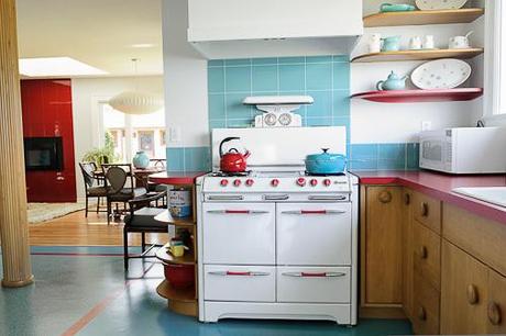
From Retro Renovation, a really cool example of formica used well with natural wood cabinets and white appliances.
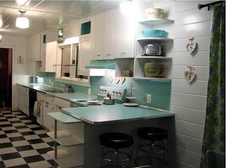
Formica cabinets in turquoise, also from Retro Renovation.
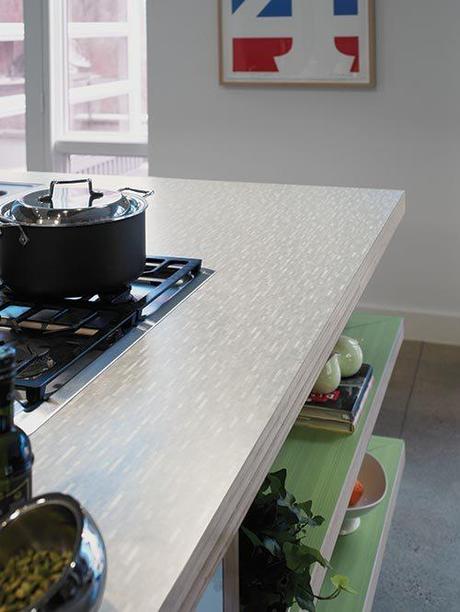
Formica in a cool retro but subtle pattern, from the Formica design studio.
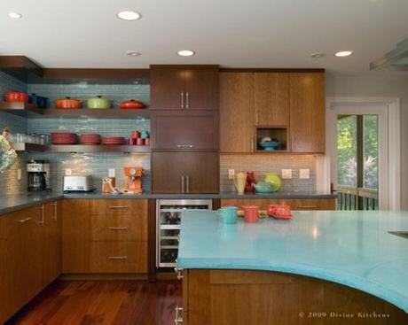
Cabinets with a similar finish to ours, paired with a really cool turquoise Formica and tile backsplash.
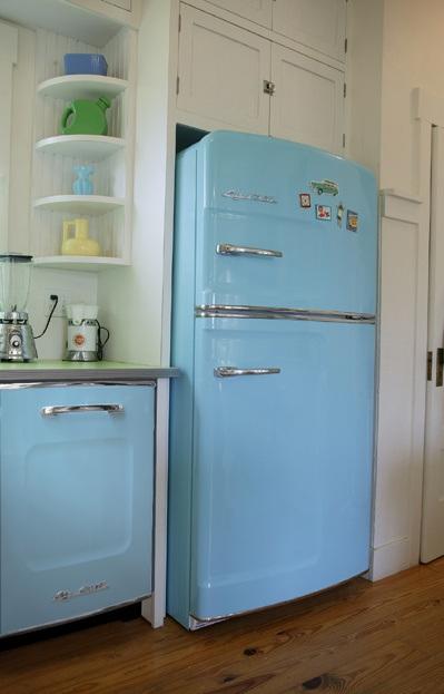
Green Formica with a metal edge. It might look good with our Big Chill too.
From what I see, it looks like (while perhaps not as crisp and upscale as my original vision) Formica or tile counters can be a really good option for homeowners on a budget. And since I’m not willing to forgo our annual anniversary vacations (to places like San Francisco, Mexico City, and this year Seattle and Portland), a budget kitchen reno may very well be in the cards. So, rethinking countertops? Or rethinking countertops!

