


I first flipped through the pages of the Columbia Journalism Review in 1968 when I was a junior journalism student. Our editing professor assigned us to read an article about journalistic ethics, introducing CJR as "the authoritative voice of journalistic commentary."
Forty-seven years later, that is still an apt description. That is why we at García Media and I personally are so honored to have been invited to collaborate with Editor in Chief and Publisher Elizabeth Spayd and her team on this redesign of CJR.
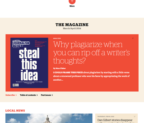
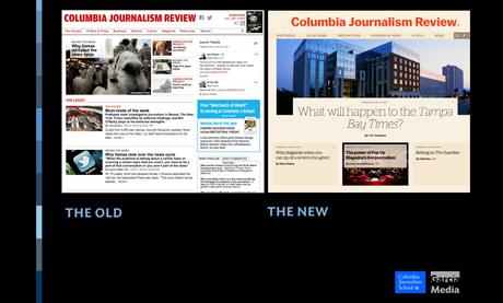
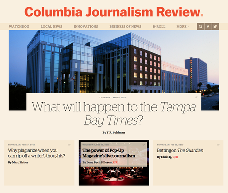
While readers will notice many changes to CJR's look and feel, this is not a mere facelift. With the new website, we aimed to reimagine CJR for the needs of readers consuming stories on a variety of platforms and channels, with particular attention paid to mobile.
Working with our art director and project manager Reed Reibstein and senior art director for García Media Europe Constantin Eberle, we began this rethinking with a journey through the proud history of CJR. We then translated what we encountered to a new concept for the digital age. Here are some of the key elements of the new CJR:
—a more dynamic homepage, combined with streamlined sectioning to facilitate navigation to important stories;
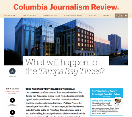
—a distinctive typographic palette for this text-driven publication from the type foundry Commercial Type, with large headlines set in gorgeous light weights of Stag and body text in the highly readable Lyon Text;
—a sophisticated color palette, with swathes of tan and touches of vermillion, to mark the serious nature of the content;
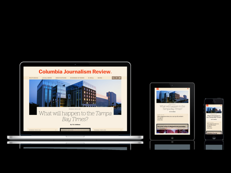
—and a responsive design that optimizes the reading experience across every screen. Reed created the core HTML/CSS for the new design, working closely with CJR's developers Michael Murphy, Dean Pajevic and Jen Braun to integrate the design into the website.
As with all projects, we began with a thorough briefing, which included this statement from Liz:
"We want the new CJR to be like the world we write about in the magazine."
I believe we have accomplished that. The CJR you are now reading retains the authoritative voice that my professor introduced me to almost half a century ago. But it also becomes a showcase for how to make content easier to find and more pleasurable to read and share. This is a CJR for a new generation, a bridge between a distinguished and proud history and a present in which media analysis has never been more urgent and important.

