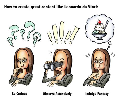
I featured the Mona Lisa Triplets in a recent post. Here’s the original illo:

I’m bringing them back because they’re perfect for an object lesson; namely: you can always get more mileage out of an illustration.
The New Yorker has a cartoon caption contest on the last page of every issue. They print an old cartoon and delete the original caption. They challenge readers to submit their own captions for the cartoon.

The same idea can be applied to illustrations.

Brands commission custom illustrations because they want something unique. Something specially crafted to support the brand.
It makes sense to repurpose those illustrations to maximize their value.

Brands need to look at every illustration and ask: how can I get more use out of it?

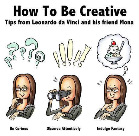
I decided to turn “Triple Mona” into an infographic and upload it to my online store. All I did was tweak the header text:


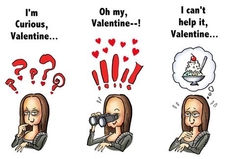
It occurred to me that I could create three different cards by tweaking the three Monas and coming up with inside greetings for each card that would serve as punch lines.

Here’s what I came up with for the front of each card:


But essentially, the images are the same.

Bottom line: you can always get more mileage out of an illustration. Always. Don’t settle for one-time use.

A few additional suggestions:

1. Think about maximizing image use ahead of time. Make it part of your content strategy.

2. Discuss it with your illustrator when you commission an illustration. Ask the illustrator to design the illustration with maximum use in mind.

For example: Ask the illustrator to put some white space between the various objects and people in the illustration. That way, each element can be broken out and used as a separate spot illustration.
3. A lot of times all you need to do is add new text: new header text, new caption, new dialog in word balloons.


