TAKEAWAY: This weekend we all stop to remember 9-11, the one day when we learned the infamy of man made horror. It was a day of change, the type that marks us forever PLUS: TIME magazine produces a 9-11 special app
The most memorable launch day of my career
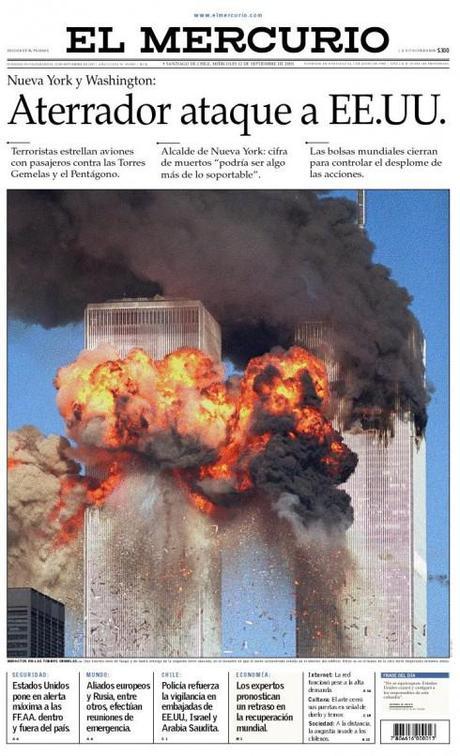
Here is the front page of El Mercurio, 9-11-2001, first day of the new design (courtesy of El Mercurio, thanks to Marco Gatica, design director)
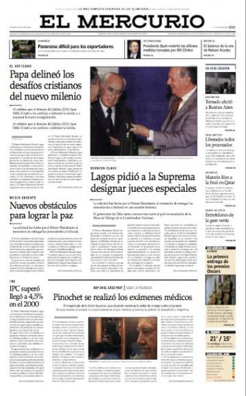
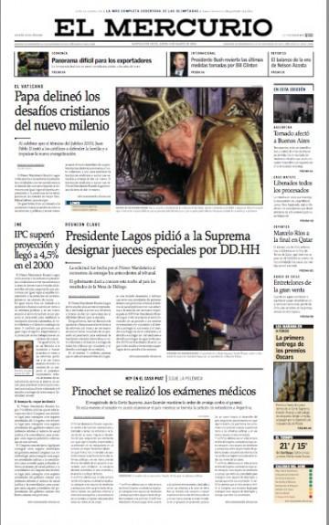
Front pages of El Mercurio following the 9-11 event: the more conventional style that was adopted prevails here
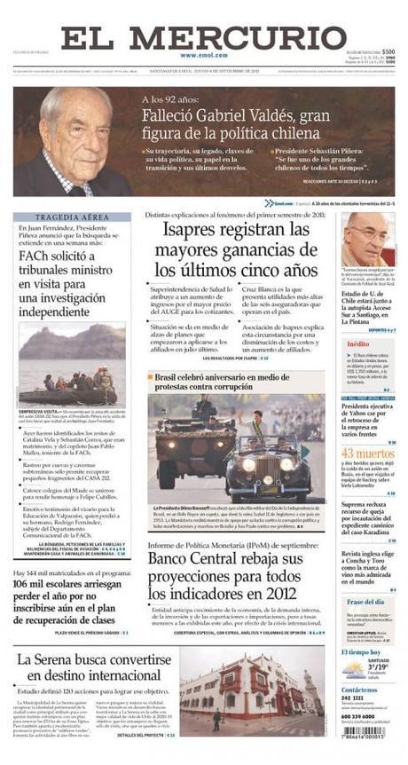
Today’s El Mercurio: one still sees traces of what was launched that fateful day 9-12-2001
I had change in my mind the morning of September 11, 2001 when I woke up.
I set out in my usual morning run, this day in Santiago de Chile, the scenic view of the Andes in front of me, a sunny day, but fresh. It was launch day for our project at El Mercurio, Chile’s leading, most traditional newspaper.
So I was thinking of change: why is change so difficult to accept?
I have spent an entire career as a sort of change salesman. I arrive, I put change on the table, and ask for tasters. Some taste with gusto. Others want to, but are afraid.
Of course, the moment they call a consultant, the people in the organization are aware that change is in order; accepting it later is a different story.
At El Mercurio it was no different. We presented one prototype after the other, starting with the most adventurous, daring and contemporary (which was quickly taken off the walls of that grand library of the newspaper, where we were doing the presentations; then came a modern, but not so daring prototype, but, oh, the photos are too big, what happens to our longer texts? Ok, back to the drawing board.
Finally, we had it: a mere face wash of the existing El Mercurio, nothing much had changed, the lead photo would be small, the text abundant, and so we were ready for launch September 12, 2001.
The WHAT IF page
One cannot complete a redesign project without preparing for the uncertainty of that WHAT IF page: the one where the unimaginable happens. How would we handle the WHAT IF……in this new style?
In Chile, at El Mercurio of 2001, the big WHAT IF was: What if Augusto Pinochet dies on the day of the launch?
Oh, God, that is so true: what to do?
And, what happens if Pope John Paul II dies on the day of the launch?
Oh, God, that is so true, his death is imminent, we must prepare.
And, said one editor, what happens if the Pope and Pinochet die on the same day of the launch.
Oh, God, said I; that is easy, split the page in two, with simple headlines: Saint. Evil
(Lesson: don’t joke about religion or politics!)
The WHAT IF page to stop all WHAT IF pages
The morning of September 11, 2001, after I finished my 37 minute run thinking about the perils and nervousness of change, I returned to my room. I turned on CNN on the television, and proceeded to do my stretching on the floor. Suddenly , the woman anchor said something about breaking news: a plane has hit one of the Twin Towers in New York City. That was that. Was it a small plane? Nothing firm yet, she said. Developing story.
I emerged from the shower a few minutes later to become aware of the full horror of the story.
Then I knew that once we got to the newsroom we had to get into WHAT IF mode of the kind nobody had prepared us for. This was not an anticipated death of someone famous or infamous.
This was, indeed, the WHAT IF pages of all pages.
I knew that it would not be a small page on Page One of the first day of the “new” El Mercurio.
I remember sitting in front of the computer, looking at photos to pick for the front page, tears running down my cheeks. I was the only American in the room, and it all hurt badly.
Change ruled the day. Change ruled the next few days. Change ruled the decade. Change that still haunts us in many of the things we do everyday.
PS: By the way, when editors today wish to discuss what they would do if the big story breaks, they no longer say WHAT IF, now they say, what would the NINE ELEVEN PAGE be like? It is, I hope, the page we never have to do again.
TIME’s 9-11 special tablet edition
A Special TIME App to Remember 9-11
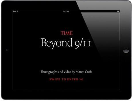
Take a look here and you will see what the tablet allows us to do, giving stories like the remembrance of 9-11 longer legs, via multi genre storytelling.
Joe Zeff, who worked with the TIME team for the creation of this app, tells us all about it in his blog.
http://joezeffdesign.com/a-special-time-app-to-remember-911/
First paragraph: The current issue of TIME magazine’s iPad app represents a departure from its traditional format — a multimedia-rich experience to commemorate the tenth anniversary of 9/11, designed and developed by Joe Zeff Design.
At the Gulf News: an interesting 9-11 page
As I have been reporting from Dubai this week, I show you here a page that was part of the Gulf News’ week-long coverage of 9-11. The page is contributed by Miguel Gomez, Gulf News Design Director.
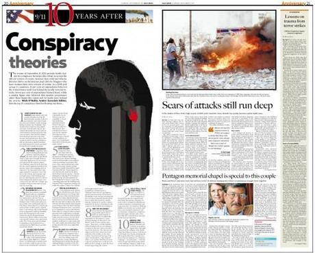
Illustration by Luis Vazquez, of the Gulf News Graphics team
Graphics departments’ survey
My good friend and colleague, Jeff Goertzen, of the Denver Post, is conducting a survey with newspapers and magazines around the world to get an idea of the state that visuals departments are in. Obviously, they are getting smaller, Jeff reports.
“But how bad is it?,“ he asks. “That is what we wish to find out. The information we gather will help us redefine the future of visual journalists and the skill sets they will need to possess in order to survive. I would very much appreciate it if you could send information about your departments.“
Those interested in getting the survey can write to Jeff Goertzen directly as follows:

