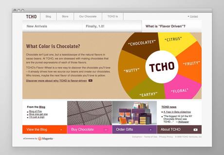
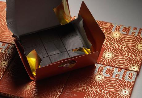
Edenspiekermann have created a strong visual language for the chocolate brandTCHO that hails from San Francisco. Every aspect of the branding has a uniform design approach, from online and offline design to logo, colour scheme and typography right through to packaging. The corporate design incorporates all printed products – from press kits to flyers – as well as advertisements, posters, conference presentations and the tcho.com website with its integrated online shop.
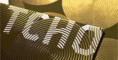
The challenge for Edenspiekermann was to give the chocolate gourmet’s experience a face. They did so by breaking down the brand into smaller aspects and then giving every aspect has a uniform design approach, from on– and offline design to logo, colour scheme and typography right through to packaging. The corporate design incorporates all printed products – from press kits to flyers – as well as advertisements, posters, conference presentations and the tcho.com website with its integrated online shop.
The visual identity for the brand is clear and strong and conveys the message of modern day high quality chocolate that TCHO wishes to convey. The packaging design won the Academy of Chocolate Gold Award in February 2009 and a Gold European Design Award in May 2009.
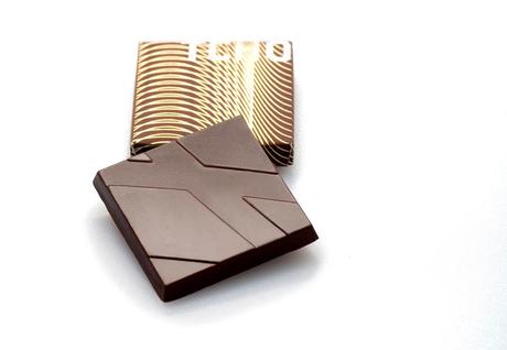
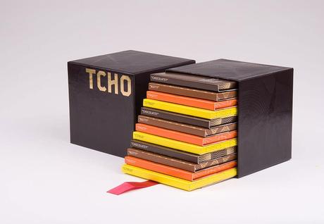
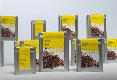
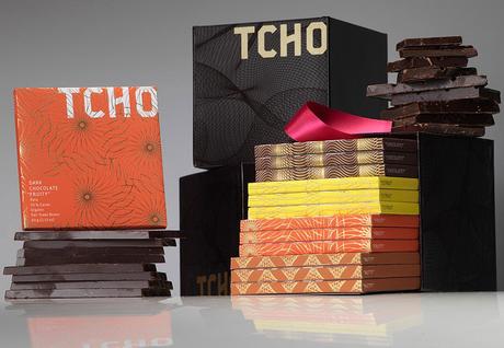
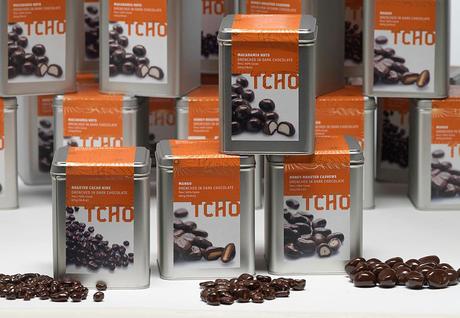
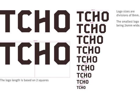
In 2011, TCHO decided to launch milk chocolates to cater to a wider chocolate-loving audience. The challenge this time was to attract the attention of milk chocolate lovers without abandoning TCHO’s dark chocolate roots. Edenspiekermann did so by relying on the design values practiced for four years and injecting them with a bold visual direction. So two new sub-brands, SeriousMilk and PureNotes were introduced with a packaging that showcased their heritage yet helped these products to stand on their own.
SeriousMilk
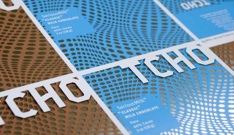
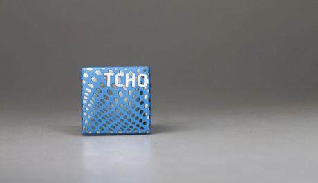
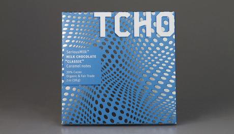
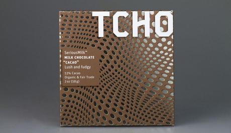
The design for SeriousMilk is hypnotic, drawing one into the rolling optics that say creamy, smooth, you have to try me, I’m different. The illusion appears to move and flow because of the precise mathematically based composition. These “tessellations” fill the visual plane leaving the viewer wanting to move around the box edges looking for more.
PureNotes
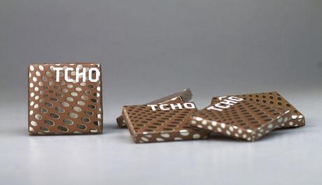
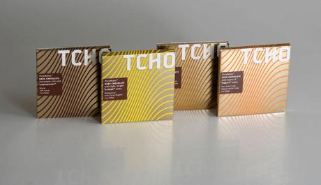
The design for PureNotes takes the guilloche patterns of the original dark bars and enlarges and simplifies them to create a stronger line look and helps to clarify the dark chocolate flavor story along with a stronger connection to the newly introduced milk line.
TCHO’s Website Design
