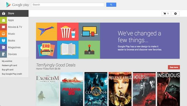
After teasing about a new user interface for the Play store at I/O 2013, Google has finally rolled out the new redesigned Play Store on the web. New upgraded Play store for Android is simply beautiful, sleek, and also fast to navigate. I actually felt like I was on Google+.
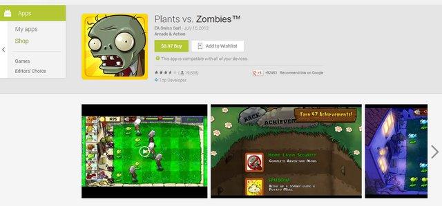
It’s hard not to notice that the new Google Play interface looks a lot like the old Google+ UI. Even the app pages look like profile page from G+. Well, I still like it. Because it’s easier to navigate. Now, you get bigger app screenshots, has more space for app description, reviews also looks cool and there’s a floating navigation bar on the left so you can hop out anytime. My favorite feature of all is that now I can view app pages quickly and smoothly within the same page without having to entirely load in a new page.

The new upgrade is not just about the beauty. According to Cnet, it also brings support for Google Glass. It hasn’t been fully tested yet. But, I’m sure that soon, all those Glass wearers will be saying “Glass, Install that App” a lot.
You may also like : Best Free Addictive Android Smartphone Games of 2013.. So Far
(All the images, trademarks, logo’s shown on this post are the property of their respective owners)
Roshan Jerad Perera

