TAKEAWAY: It’s a new look for Diario Uno. See case study and sample the pages with the new design.

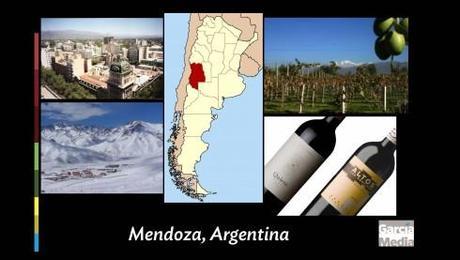
Mendoza, Argentina: wine region, growing city

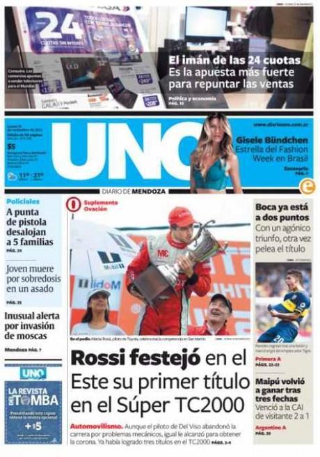
The new Diario Uno look: November 12, 2013

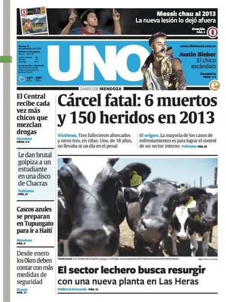
The new Diario Uno look: November 11, 2013
It’s a new look for Diario Uno, of Mendoza, Argentina. That is the wine region, where some of the best wines in the world come from (think Malbec). Mendoza is a growing city, at the feet of the Andes, where the population tends to be young and mobile, and where international renown is gained with every wine bottle exported to the global markets.
Our Garcia Media Latinoamérica office in Buenos Aires has just completed the latest redesign for UNO, which premiered the new look Monday, November 11.
Under the project leadership of Rodrigo Fino, president of Garcia Media Latinoamérica, with art direction from our Paula Ripoll, senior art director, the redesign is a refreshing for this tabloid, and one where a decision was made to maintain the same typographic fonts that had served the paper well. While many redesigns start with a change of typography, Rodrigo, Paula and the internal team felt that, as Rodrigo put it, “a good typography does not deserve to be changed.“
So readers of UNO will continue to see that beautiful Gerard Unger font, Gulliver. The challenge, said Rodrigo, was to find it a compatible sans to accompany the Gulliver: Freight Sans to the rescue. It is elegant and vibrant.
Take a look at the new UNO, where the team also worked hard to renew the content flow and how UNO adapts to presenting information across platforms.
Flip through a Sunday edition of Diario Uno
Flip through supplements of Diario Uno
About Gulliver (in the words of its creator, Gerard Unger)
To read Rodrigo Fino’s blog in Spanish:
Rediseño de la Evolución
http://www.garcia-media.com.ar/blog/post/rediseno-de-la-evolucion/220
Of related interest:
Mendoza
http://www.turismo.mendoza.gov.ar
Malbec wines
Gulliver typography http://www.gerardunger.com/fontstore/store-gulliver.html

