This is all a consequenceof a recent discussion in one of the forumsI belong too - whether to use a plain whitebackground or using props in your photos
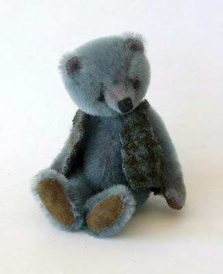
diverted from the fact that Etsy requireplain white background to have a chance ofbeing chosen for the frontpage.
What works the best for the items and shouldn´t it beup to the artist to set the scene
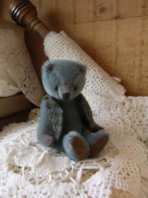
it turned out most wanted to use propsin the photos and liked those photos with a satfeeling and atmosphere.
I´ve always used plain white backgrounds for my photosor as white as possible, as those white ones offen turns outblueish or greyish.
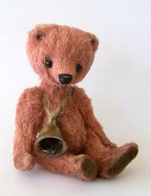
so I thought I would give it a tryand see what happened.
Personally I like the photos with the white backgrounds the best.That works best for my imaginationif I was to buy the item and let me think how itwould look in my home.
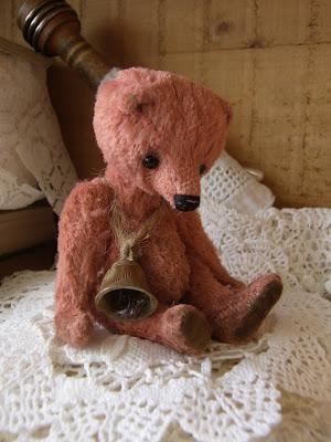
I would be afraid, that MY setting of the moodand atmosphere would turn people awayif they didn´t like it
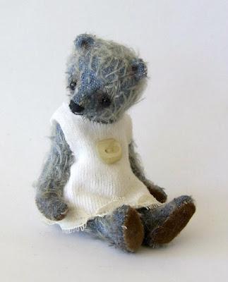
this is where you, my sweet readers come in.
What do you think?if you were the buyer - what attracts you?would you be drawn to the photos with a set moodor do you prefer plain background?Does it help your imagination if the scene is sat?
I would love to hear your thoughts about this
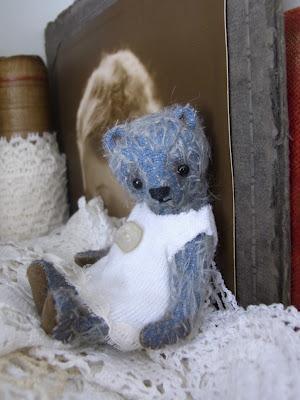
This last little one is NessShe´s available over at Ebayuntil SundayHere´s the link if you would like to have a lookhttp://www.ebay.com/itm/NESS-3-5-inch-little-bear-from-Tina-Jensen-of-Tinybear-/190676122032?pt=LH_DefaultDomain_0&hash=item2c652eb9b0
Wishing you all a wonderful friday
Tina ♥♥♥

