My last post featured an illustration for an essay about social media. Here’s a second illustration for the same essay.
Main point: social media sites like Twitter are good at sound bites and breaking news,
not good at communicating the complex truth behind events.
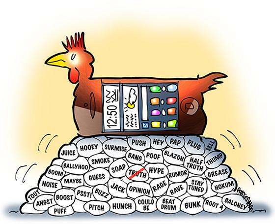
A chicken smart phone– now there’s something to cluck about. Here’s a close-up detail image:
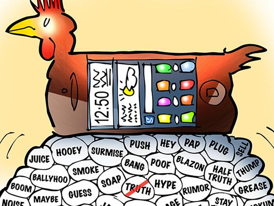
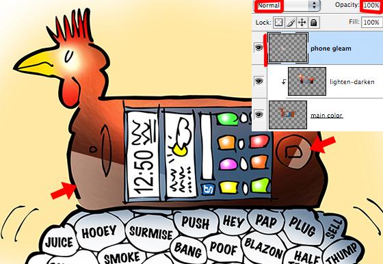
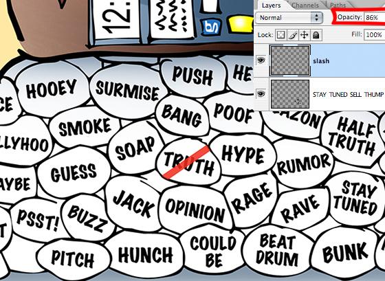
There were two effects I was especially pleased with: the light reflection off the glass surface of the phone (red arrows below), and the semi-transparent slash thru the word TRUTH.
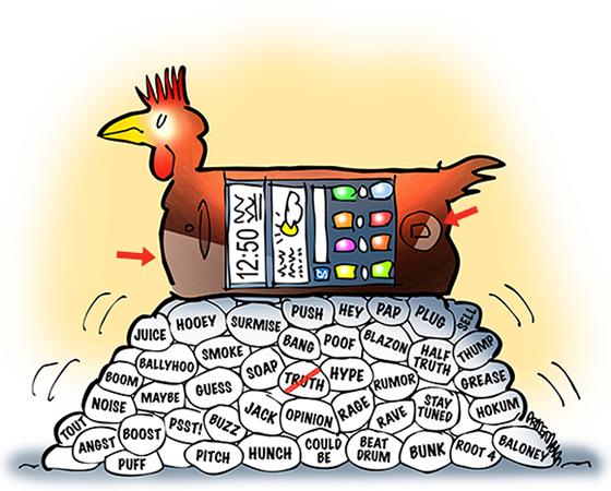
Let’s take a quick look at how these effects were achieved.
I’ve learned to use non-destructive techniques in Photoshop: I mask (hide) things rather than erase them, and I apply lighting effects on separate layers so I can experiment freely and undo anything that doesn’t work.
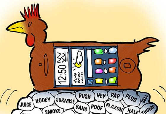
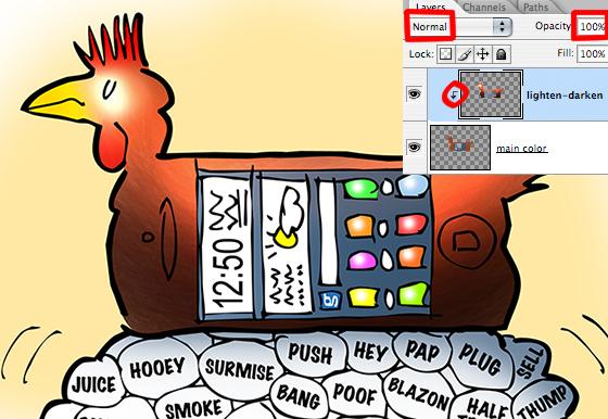
Here’s what the chicken phone looked like prior to the lighting effects. I applied the brown-red-yellow with a camel’s hair PS brush, so there’s a bit of grain, but it’s still basically flat color.
I created a separate layer for my lighting effects, and clipped it to my flat color layer. The indented arrow seen in the relevant portion of the Layers Window below indicates the two layers are clipped together.
This means that any brushstrokes I enter on the top (lighting effects) layer will only impact the flat color layer beneath it. No other layers will be affected.
I used the same camel’s hair brush (at various opacity and flow settings) to apply color to the top layer.
The key to getting the lighting effects: setting the brush mode to Screen, Color Dodge, and Linear Dodge to lighten the flat colors, and Multiply, Color Burn, and Linear Burn to darken them.
I ad-libbed at this point, jumping back and forth between colors and brush modes until I liked the combined effects.
To create the light reflection on glass effect, I created a new top layer, and used the Pen tool to carefully select the two areas I wanted to apply the effect to (red arrows below). I then chose a light brown color and used the Gradient tool set to mode = Color Dodge to apply the effect.
You’ll notice in the Layers Window below, that the “phone gleam” layer is not clipped to the other layers. Why is that?
Alas– time for me to confess that I have not yet mastered all the subtleties of what are called clipping masks. I do know that once you start “stacking” clipped layers, results become unpredictable. In this case, after experimenting, I found using an unclipped
layer gave me the glare effect I wanted. A clipped layer did not.
For more on clipping masks (and layer masks as well), I’d suggest this excellent post
by Matt Ward.
Which brings us to that slash across TRUTH– why was I so pleased about that??
Well, I began by using a black slash, but it obscured the word and made it hard to read– was it TRUTH or TROTH?
So I switched to a red slash. The bright contrast was a big improvement, but it still left
that element of doubt. An illustration will not be a success if it contains ambiguities or distractions.
Then it struck me that all I had to do was lower the opacity and make the slash semi-transparent:

Here it is with the relevant portion of the Layers Window.
Here’s the final again. Even at a distance, one knows that’s the word TRUTH.
Best of all, by grappling with the problem, I vastly improved the design: the color red immediately draws the reader’s eye to the most crucial element in the illustration.

Are you ready to rush out and buy a chicken smart phone?
Would you believe there’s really a Chicken Sounds app you can use for a ringtone?
Did you find the Photoshop tips helpful?
Hope you’ll leave a comment.
If you enjoyed this post and would like to let me know, please click the Like button below.
If you’d like to share this post with others, please click Tweet or Facebook or one of the other Share buttons.

