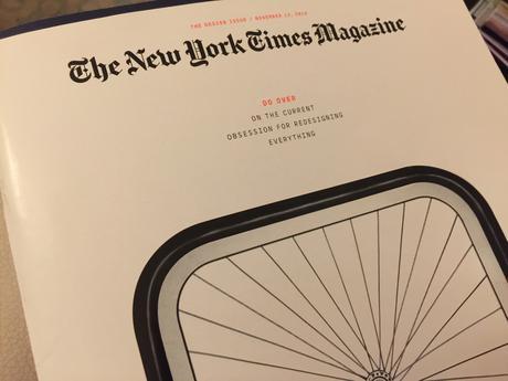
I always look forward to the Times’ Magazine Design Issue, and this one is packed with some good design philosophy, plus some real design exercises where six designers were challenged to conceptualize new designs for such things as bicycle lock, toilet seats, a prescription handout, baggage claim and hospital gown.
While it was fascinating to see how these designers faced their challenge: Loved how those too-revealing of a derriere hospital gowns could be turned into more discreet T-shirt like garments, reimagined with the gown’s back opening specifically targeted to the areas of the body most frequently examined by doctors and nurses.
This is where design and functionality come to the rescue of often embarrassed patients! Good thing.


Design truths
Design truths
While I urge you to read this great issue, I have decided to
highlight some takeaways from it that I think, while generally known, it is always good to reread and to reflect upon:
In theory, the redesign begins with a problem
Redesigns fail when they address the wrong problem — or something that really wasn’t a problem in the first place.
The platonic ideal of the redesign: A designer sees a problem, proposes a solution, makes a difference. Such tidy narratives fuel a reigning ideology in which every object, symbol or pool of information is just another design problem awaiting some solution. The thermostat, the fire extinguisher, the toothbrush, the car dashboard — all have been redesigned, whether anybody was clamoring for their alteration or not.
All redesigns have something in common: They end. This does not happen at the moment the redesigned symbol, object or interface is implemented. It happens when that redesign is replaced.
….legacy, tradition, and the big elephant in the room
An issue devoted to design—and, especially, redesigns—had to, of course, include some anecdotal references to projects in which the designer thought that his solution would be so creative, essential and functional, that the client would immediately take to it.
What designer can’t identify with the sound of rejection in the presentation room, that moment when the “monstrous” idea you are presenting meets with a lukewarm reaction. We have all been there. For some of us, many times, indeed.
That is why I could totally identify with Karim Rashid, who tells the story of how his project for Delta Airlines never really took off and explains why.
Rashid is so right when he says that we begin to design in an environment in which the point of reference already exists, or
bear cumbersome vestiges of the past. “The world is full of this kind of kitsch history — history that has nothing to do with the world we live in now,” he says.
That’s what happened with his Delta project: a complete rethinking of the business-class tableware for Delta Air Lines.
His proposal was bold: His bowls had sharp angles that echoed Delta’s triangular logo, his trays had subtle recesses that anchored dishes in place and his wineglasses skipped the stem in favor of a tapered shape with a wide base.
“The stem on a wineglass is meaningless,” Rashid says. He dismisses the conventional argument that it prevents the drinker’s hand from interfering with wine’s ideal temperature; to have the slightest such effect, he claims, you’d have to wrap your palm around the bowl for 20 straight minutes. The stem is actually a leftover artifact, he says, from centuries ago, when goblets made of metal had high stems to signal status and wealth. This design quirk remained after we switched to glass, Rashid says. Making wineglasses look a certain way because that’s how they have always looked is a classic example of privileging form over function. “I’m sitting in first class or business class on an airplane with turbulence,” Rashid says, “with a wineglass with a stem on it — do you understand? It’s so stupid, isn’t it?”
His proposed redesigns were striking, but they had to pass muster with the service-item maker, the flight attendants’ union and Delta itself — which ultimately declined to move forward with the concepts Rashid proposed. “It was all rejected,” he tells me, with a sigh. “Because it doesn’t look like domestic tableware.”
Every newspaper and magazine designer reading this can identify with this element of legacy, of people in the room reacting to your prototype, your new creation, but basing opinions on what they know, what they are familiar with. It never ceases to amaze me that we do these presentations of new designs for newspapers and magazines in conference rooms usually well stocked with memorabilia of that titles’ history. One is presenting how the new logo could be, for example, but the ghosts of logos and pages past, stare, and not always with a friendly look.
I imagine that for the Delta execs in charge of the decision making , a wine glass for a Business Class traveler had to have a stem to lend the wine, the cabin and the occasion a sense of old time gravitas.
By the way, it is the word gravitas that editors usually bring up when they are trying to tell you that your idea just does not have enough of it.

