TAKEAWAY: The 154-year-old Norwegian daily, Aftenposten, embraces a new philosophy to remain vibrant and essential in a digital world.
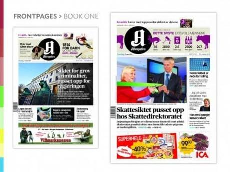
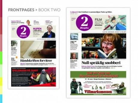
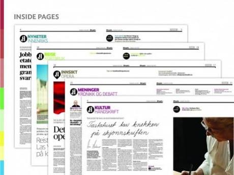
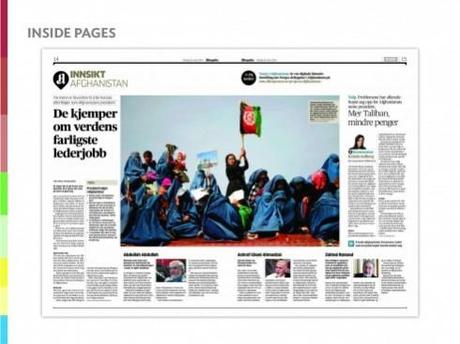
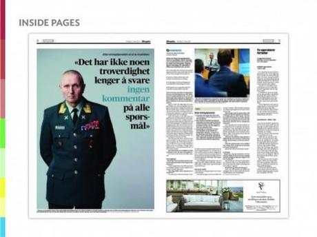
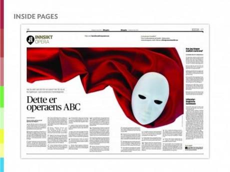
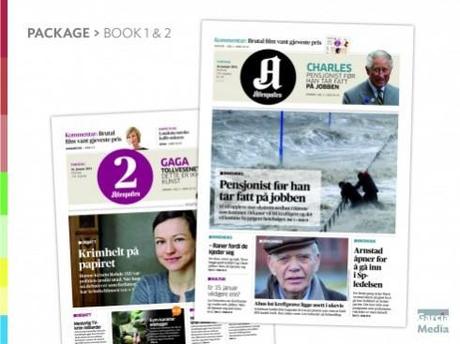
The readers see a 2-section Aftenposten each day
Aftenposten is the newspapers that many Norwegians have come to trust and expect to have as their breakfast companion each day.
It is, in a sense, the authoritative, respected and classic newspaper that some call The New York Times of Norway. And rightly so. With a rich history that expands 154 years, Aftenposten has covered the daily occurrences of Norway, Scandinavia and the world with excellent journalism provided by the newspaper’s journalists who are often reporting from major cities globally.
Aftenposten is also a newspaper where photography plays a key role. Excellent photos get displayed big, and so are information graphics.
Why a rethink for Aftenposten?
We want to make sure that this is not referred to a redesign at all. In fact, Aftenposten was redesigned (in the more traditional definition of the term), in 2011, by the excellent designing team of Ally Palmer and Terry Watson. Ally’s team brought a typographic palette and a sense of visual distinction to Aftenposten that remains intact.
From the start, we at Garcia Media knew that our work with the Aftenposten team would be to rethink it in terms of the following:
1. Content flow.
2. Creation of new content.
3. A definition for the role of digital.
With that as a blueprint, we went to work.
Enter new editor Espen Egil Hansen
I have known Espen Egil Hansen, the new editor in chief of Aftenposten, for several years. We often found ourselves as speakers in the same media conferences around the globe. We would sit and talk about the impact of everything digital in how we communicate information, or we would agree to disagree on the role that tablet editions should play (Espen feels very strongly about making tablet editions as newsy as possible. While I agree, I also think there is room for more curated content along the way!). Sometimes we imagined what it would like to work together.
That opportunity came in December, when Aftenposten announced that Espen had been named the new editor in chief. Great news, I thought: here is a journalist who understands print, with a background in visual journalism, via photography, and who until the day he arrived to occupy his new office at the Aftenposten building with a view of the sea, had been in charge of all things digital at VG+, which is Aftenposten’s sister newspaper, and a more popular-oriented daily, with big and bold headlines.
From the start, Espen brought his own brand of journalism for the digital age to the front.
Quality now
Espen is not necessarily interested in proclaiming the virtues of a digital first mentality, although he is a digital first type of editor. Instead, he emphasizes “quality now”, and demands that his team provides constant updates of the news, not just the words, but the photos, too.
His morning meetings start with references to how certain stories have played online, which becomes the springboard to the discussion of the day’s news agenda.
He is also quick to point out how the competition handled a story, vis a vis how Aftenposten covered it.
The core of Aftenposten’s philosophy
Espen had heard me speak about our Garcia Media Latinamerica project of rethinking Colombia’s El Tiempo in 2010. This, as readers of the blog may know, has been one of the most revolutionary projects in which I was ever involved.
Remember that this was a 6-section paper that we rethought to be three: What you must know, what you must read, what you must do.
El Tiempo abandoned the usual sectioning of the newspaper in favor of the more common sense approach. It worked, and four years later, it has been enhanced with much success.
While editors everywhere praised El Tiempo and even told me they would consider such a move at their newspapers, it never truly happened, until Espen assumed the editorship of Aftenposten.
He figured that that is exactly how he wanted to guide the process of creating content and making page one decisions for the new Aftenposten.
And he added a fourth element to the mix: Surprise me.
“During the last few weeks we have slowly increased the visuality of the paper, using layout, pictures and other elements that are close to the new redesign,” says Espen. “At the launch today we were careful not to use all the new possibilities. I think this is why the readers received the new paper so positively - the look and feel is still Aftenposten. On the same time we now have a platform for a much more dynamic presentation and variation in the content. The plan is to slowly modernize our paper - not to do everything in one day.”
The task at hand
So, working closely with project leader Ronny Ruud, and our own Garcia Media Europe art director, Constantin Eberle, with Aftenposten experienced designers Tone Jorstad and Trond Myklebust, we conducted a series of workshops to identify the centerpiece elements of what would be the new Aftenposten.
These workshops always included key people from the newsroom, both print and digital.
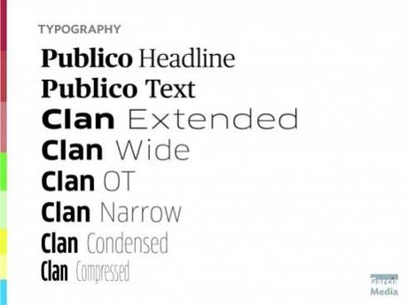
We knew from the start that we liked the way Aftenposten looked, and decided to leave in place the typographic palette that Ally Palmer’s design had incorporated. But we knew that the hard work would be in the review of content flow, and that is where a lot of our effort went. In addition, we collaborated with those in charge of digital, including multimedia storytelling, to craft ways in which stories and platforms would find the perfect fit.
“The new Aftenposten is a starting point that makes it easier for us to plan for development and change while our readers become more and more digital and mobile. I have for a long time had a dream to make a newspaper inspired by the Colombian El Tiempo. When it turned out that our new Editor in Chief also was intrigued by the idea, there was no doubt in my soul. We probably have a more sober and Scandinavian version of the concept, but still largely followed the pattern “must know - must read - must do”,” says Ronny.
The typography
The logo
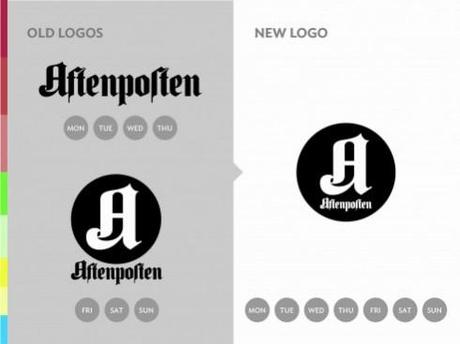
One interesting change for the new Aftenposten is the treatment of its brand on Page One and beyond.
Until this week, Aftenposten used a traditional logo in its daily editions, but used a circle during the weekend. We have opted to use the circle for the daily and then move to the full title concept for the weekend editions.
The front page
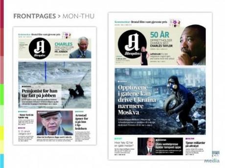 These are prototype front pages as we created the concept
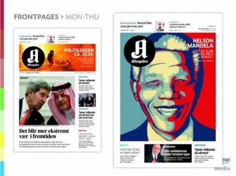
Our front page philosophy for Aftenposten: allow for flexibility and surprise
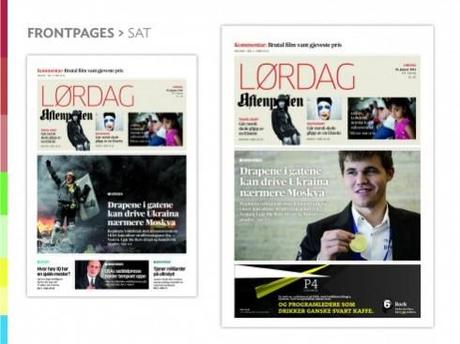 Prototype for the Saturday front pages
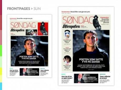 Sunday front page prototypes
We emphasize elegance, directness and good navigation in the new front page of Aftenposten.
We want the reader to get news priorities on that Page One. With the what you must know, read and do, plus the surprise me element, this is easy to accomplish each day. Hierarchy gives way to a pleasant and more intelligent reader decision for all.
The weekend edition
For weekends, our concept calls for a more feature/magazine oriented look, but with templates that allow for a more newsy page when necessary.
Dancing into the newspaper
We know how important it is to have a Page 2-3 that entice and hold the reader.
We tested various ways of doing this: should we do a 24-hour summary of the news on Pages 2-3, we asked ourselves?
We did prototypes and decided that in the digital age, nobody would truly come to a printed newspaper to read summaries of news. More meaty, text driven stories to sink your teeth into would be more likely.
Eventually, we arrived at a sort of destination page with tons of possibilities: a repertoire of content that can be constantly revolving, surprising the reader. Not two days may be alike.
We also kept Sports at the end of this first book of the newspaper.
Aftenposten and the media quartet
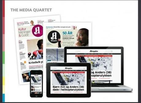
Enhancing content
Providing a better reading experience also came via a different approach to the presentation of news.
In the past, Aftenposten tended to include long texts that moved across two pages. When Espen became editor, he decided that, for major topics, there would be three components: the story, the data that accompanies it, and a commentary. This is a “template” that can be followed with any topics.
A new page
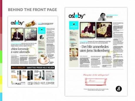
For readers, a daily surprise with the “Coffee with….” page, a short interview with someone of interest, not more than one page.
The second section

The second section includes Culture, Debate and Oslo news/entertainment.
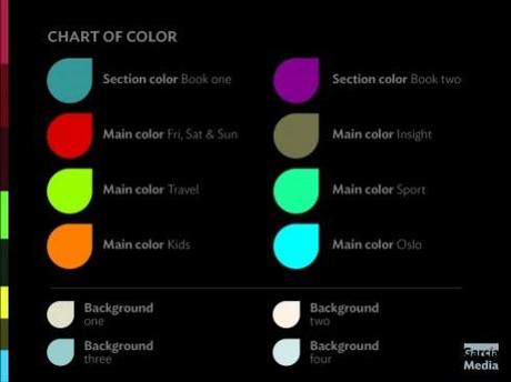
The color palette
The reaction so far?

Even Norwegian Prime Minister Erna Solberg made a surprise visit to Aftenposten newsroom to “open” the new paper. Here she is seen with Editor Espen Egil Hansen
Aftenposten and the Media Quartet
According to Ronny Ruud:
“Reader reactions on the first day suggests that readers have quickly settled. There are clear positive messages that readers like the new emphasis and prioritization of stories in a more compact newspaper. Among quite a few negative comments, two stand out: Those who read sports do not like that the section has a somewhat secluded location in book 1 after the classifieds, and many missed our Wednesday double crossword page. The consolation is that this crossword will come – in the Sunday newspaper.”
Of related interest:
Aftenposten in TheMarioBlog—
http://www.garciamedia.com/blog/articles/story_first_morning_meeting_energizes_the_newsroom
El Tiempo

