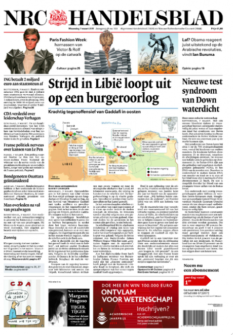
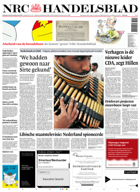
TAKEAWAY: In the Netherlands, this week NRC Handelsblad switched from broadsheet to tabloid. We show you before and after, and more to come with the revamped weekend edition as it premieres Saturday in the compact format. To be updated when NRC produces its first weekend edition as a tab.
One less broadsheet in the Netherlands

The new NRC Handelsblad front page (daily), six column format, tabloid format

Last edition of the NRC Handelsblad in broadsheet format
With all the hoopla about iPad apps, we don’t hear much about broadsheet newspapers converting to tabloid format these days.
But, indeed, it is still happening—-as it should—-and this week another of the grand dame broadsheets, the Dutch financial daily, NRC Handelsblad
, abandoned its eight-column large format page for a fresh six-column tab.
Design director Jan Paul van der Wijk shares the before and after pages shown here, with the farewell edition of the broadsheet and the arrival of the new tabl.
I was invited to participate in this project, conducting a one-day workshop with the editors/designers in Rotterdam, where the newspaper is published. My involvement was more with the weekend edition, a very full, content driven package with various sections. Our task was how to pace the content of such a monumentally large product in a tabloid format where the natural divisions created by “separate sections” was not going to be a choice.
Jan Paul will send me materials on that weekend edition and we will update this blog to bring you the weekend product plus additional information.
For now, we do like what we see.
Notice that a decision was made here NOT to go with a miniposter cover on the daily front page. Instead, readers will find that the tabloid format front page is still familiar to what they saw in the broadsheet: stories to read that begin and end there, identical typography and just an easier to manage, less cluttered look all around.
More to come.

