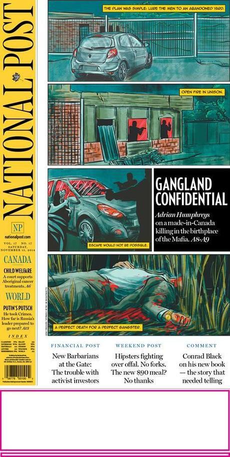

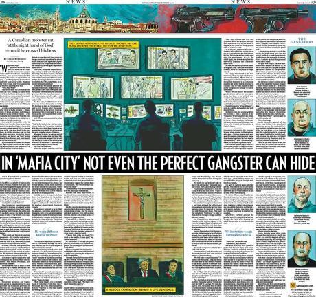

The National Post's treatment of the story in its print edition

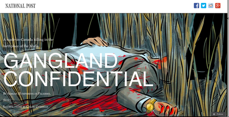

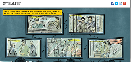
The story in its web presentation

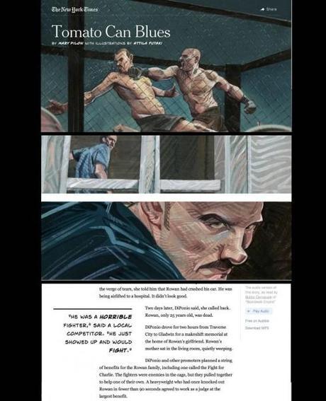
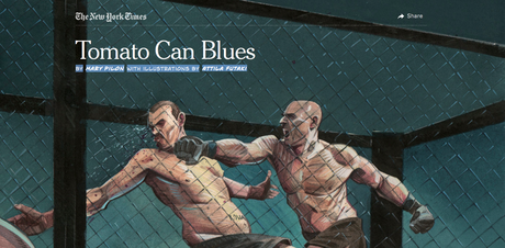

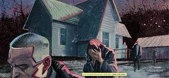


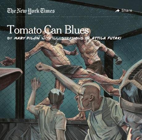
This is how The New York Times presented the multimedia story Tomato Can Blues
The National Post’s treatment of this story reminds me of a recent piece in The New York Times titled
Tomato Can Blues, written by Mary Pilon with fabulous illustrations by Attila Futaki. As it happens, I understand that Tomato Can Blues was a source of inspiration for the Post's story.
As in Tomato Can Blues, the Post’s story relies on illustrations to tell the story of a murder visually. The illustrations have a comic book character that increases their appeal. The Post devoted its entire front page to this story, with a generous double page spread inside to carry the long narrative, breaking it up with photos and other secondary readings.
This is an excellent way to take the story across platforms with the same visual signature elements. The New York Times, on the other hand, did not reproduce the look and feel of the multimedia Tomato Can Blues in its print editions. In those, the story ran following the traditional typographic style of the printed newspaper. So we like how the Post was able to carry the design across platforms in such a seamless, consistent manner.
A chat with deputy editor Julie Traves
Mario:
How did the project develop?
Julie:
The idea came about when I was mulling a way to present a great yarn by an in-house mafia expert - but in a way that would stand out from his other coverage.
I was absolutely inspired by Tomato Can Blues - I thought a riff on the noir-ish, comic book approach they used could be a fit and give this visual flair.
I approached the production head to suss the idea and who might be appropriate to illustrate. We then got our illustrator Chloe Cushman involved. She had the NYT piece as a reference, as well as photos from the writer to work from (with creative license).
Mario:
How was the dialog between writers and editors and the designers?
Julie:
Once we had draft illustrations we mocked up proofs for our creative director Gayle Grin to look at and tweaked them with her supervision.
In parallel, we worked with the head of digital to plan an enhanced feature presentation - more magazine-y in feel - and our creative director consulted on the execution.
We also showed the illustrations to our video chief and he tied in the feel of them, as well as select images, in the clip he put together with the writer.
The goal was to give all this pop and a coherent design across platforms. I am very lucky everyone was on board - and talented at realizing a half-baked idea!
A chat with Design Director Gayle Grin
I chatted with the Post’s award winning design director, Gayle Grin, about the process involved in the making of this story, especially the dialog between writer, editor and designers. I was also interested to see how the multimedia online version of this story that Gayle refers to as a "stunning yarn" came to be.
"It was a superb interaction of our deputy editor, Julie Traves, writer Adrian Humphreys and illustrator, Chloe Cushman, designer Paolo Zinatelli. I jumped in when I could and was consulted all along. It was decided from the beginning to have a noire comic book style…," Gayle says.
Mario:
How did the process go from concept to publication?
Gayle:
I urgently made sure our web snow fall template was updated for this.. The print layout was in process and had been held because of news. This week before it ran we looked at illustrations and asked for more, attempted to get a real double truck and won so we could actually have a color spread. Decided to have words within the illustrations to add to the intrigue. Also the yellow background matched the nameplate. Made sure typography and layout in print and online had some resemblance yet respecting the needs of different media presentation.
Mario:
How about details of the online edition that appeared on the web?
Gayle:
The online version went up on Friday during the day to get the Friday web readers. It was at the top of the page all afternoon and evening.The sell on the home page hanged midnight last night as an attempt to nudge internal traffic back up after the first round dies off. Style remained the same, just different illustration, different headline.
And the credit goes to.....
Story by Adrian Humphreys. Illustrations by Chloe Cushman. Print layout by Paolo Zinatelli. Web layout by Joe Rayment. All under the guiding eye of Post's veteran Design Director Gayle Grin and deputy editor, Julie Traves.
Pages We Like


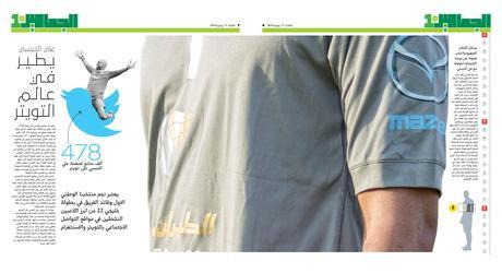


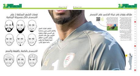

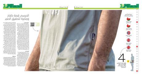
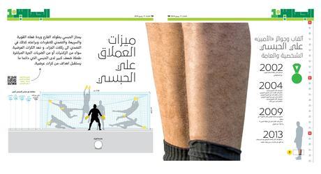


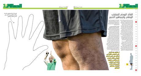

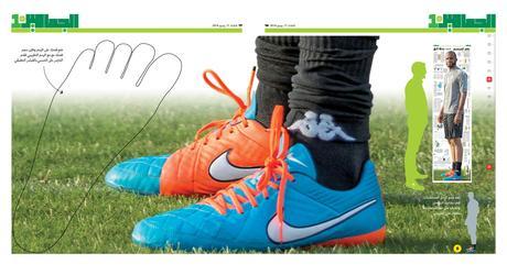
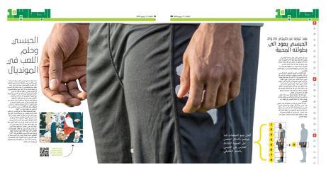


It's those talented guys of Al Shabiba and Times of Oman with a page that I know readers of TheMarioBlog will enjoying looking at.
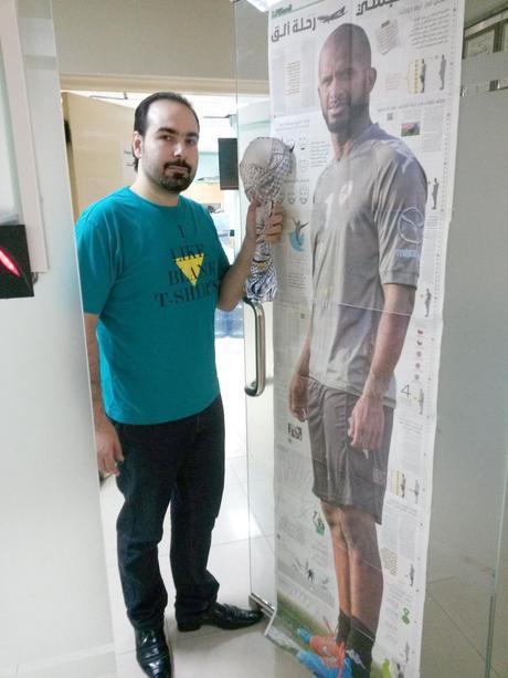
It's not just one page, but a series of pages that, when you pull them together, reveal a giant poster with the image of Ali Al-Habsi, an Omani professional goalkeeper who plays for English club Brighton & Hove Albion, Wigan Athletic. He is also the star of the Oman national team.
It's obvious that art director/designer for this package, Osama Aljawish, had tremendous fun preparing this. So did the readers, I am sure.
The Al Shabiba, Times of Oman design team for this project, in addition to Osama:
Design director Adonis Durado
Infographic: Marcello Cello
Illustration :Lucille Umali and Isidore Carloman
Photograph: Cio Datan

