
womenstennisblog.com

elveinto.com
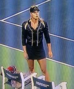
Image and product placement have become very important elements of today's sports. Endorsements from athletes is not a new concept, but it's more prominent than in decades past.

John McEnroe
clay-court-tennis.com
Back in the 1970's, there was much less emphasis on style, rather practicality and appropriateness for the event. You can still see the company logo, but it's subtle, not demanding to be in the forefront of an athlete's identity. It was in this decade that bright colours were introduced to the uniforms by way of headbands and shirt designs. This was a direct result of fans complaining that the usual bland colours made it difficult to distinguish between players.

Early 20th Century
clay-court-tennis.com
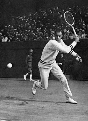
In the early 20th century, tennis players were indistinguishable from Cricket players. The men were very warmly and formally dressed in white, flannel trousers, white shirts and v-neck cable knit sweaters. How they could play a very active sport dressed in this manner, boggles the mind!
This player looks like he was on his way to the country club rather than looking like an elite athlete at a top level tournament. And at this angle, I don't see any product branding.

Today, some of the labels have become literally larger than life,dominating the shirt front of a player, chair umpire, lines person and ball kids. Polo Ralph Lauren was one of the first sponsors to really shake up their polo pony brand by oversizing it.

Lacoste has also jumped on the bandwagon by enlarging their alligator symbol, which hasn't changed in color or design in many decades. It looks like the mouth of the beast is going for this model's underarm!
I like that the sport of tennis continues to be very compelling with talented athletes from around the world. But in our current world of commercialism, there is a secondary battle going on during every match - the battle of the brands.
My alligator can eat your pony! No way! My pony can stomp on your alligator! No Way! Grrrrrrr!

