English Premier League:
Everton (Home)
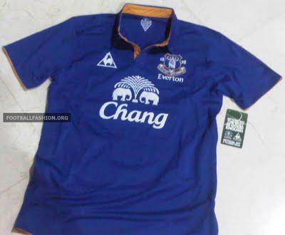
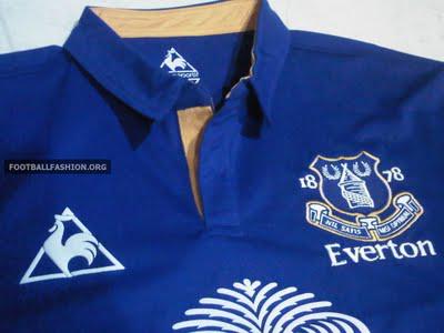 5/5 Stars
I've always been a fan of Le Coq Sportif, and I'm happy to see them producing a very nice, very classic Everton shirt next season. Although I'm not usually a fan of collars, this one fits perfectly with the shirt. The accent color around the collar is also a nice, subtle touch. It's a good thing Tim Howard's keeper jersey is going to be different or else this would be another $100 or so of my money down the drain..
Everton (Away)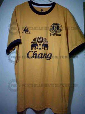 Thank God it's not pink/5 StarsYou read that right.. "Thank God it's not pink out of five stars". It's hard to get a feel for the new color scheme with the quality of this picture, but still, anything is better than this.Manchester United (Away/Third?)
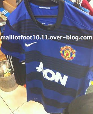 4/5 StarsHonestly, I'm not convinced this is real. Parts of this photo (specifically the crest and nike swoosh) seem photoshopped to me, and other parts seem legit (the sponsor and club name inside the collar). This shirt has been leaked as an "away" jersey, but if this photo turns out to be legit I wouldn't be surprised if it turned out to be a third jersey or training shirt instead. That being said, I hope this turns out to be an away or third jersey. I definitely see myself purchasing this one when it drops. I love the color and the horizontal stripes (whether they be blue or black, it works). Liverpool (Away)
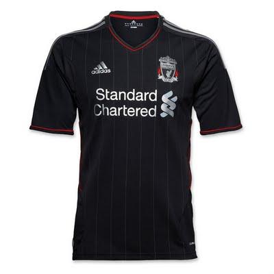 4/5 StarsOk, so this technically isn't a leak given that it's already launched, but it's still worth talking about (arguably more so since it's official). Liverpool doesn't typically get too creative with their shirts, and they stayed true to form. This is a very understatedly cool kit. I like the thin pinstripes, the V-neck, and the red trim around the collar and sleeves. They only reason it doesn't get a full 5/5 stars is the Adidas stripes down the shoulders. Note to Adidas: STOP FORCING TEAMS TO INCLUDE THE TACKY THREE STRIPES DOWN THE SLEEVES OF YOUR SHIRTS. I get it, you want to be different, you want to stand out amongst the Nikes, Umbros, and Pumas. But really, honestly, it doesn't work. For the sake of kit-junkies across the world, I beg you.. drop the stripes. I only take solace in the fact that I would never under any circumstances purchase a Liverpool jersey. Sunderland (Home)
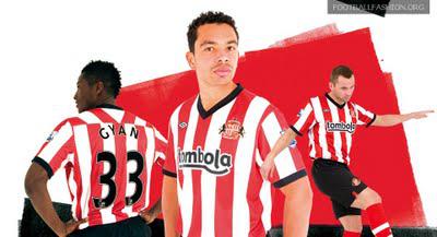 Same as usual/5 StarsPretty much status quo for Sunderland. They've been rockin' essentially the same shirt since 1887, so why change now? Really the only noticeable difference from this season's kit is the black collar and sleeve trim (compared to this year's red trim). I wouldn't say there's much of a reason to purchase the 2011/2012 edition of the Sunderland kit if you have any past shirt from the last 124 years. La Ligua:Barcelona (Home)
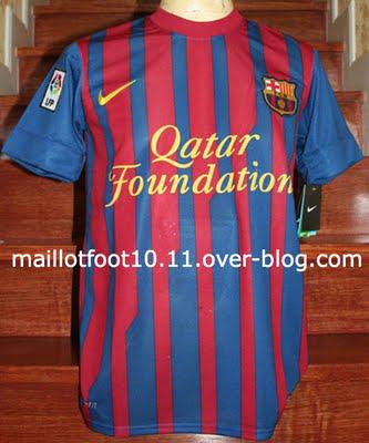 0/5 StarsBarcelona managed to take an already tacky shirt and make it even tackier. I mean really, I don't understand why I see this club shirt around town more than any other. It's ugly. It's really, really ugly. And if this is indeed what the new sponsorship is going to look like, Barcelona decision makers should really be kicking themselves. Call me crazy, but I would take a million or two dollars/euros/pounds less per year to have a better looking sponsor at the center of my club's shirt. I have to move on, this thing is hurting my eyes..Real Madrid (Away/Keeper?)
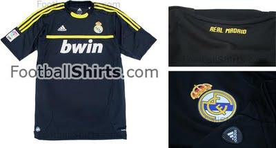 Not too shabby/5 StarsI like it, Adidas stripes and all (even a broken clock is right twice a day, for all you cliche lovers out there). This is another shirt I could see turn out to be a training kit, but I could get behind this being the real deal. Serie A: You really just have to see this to believe it..
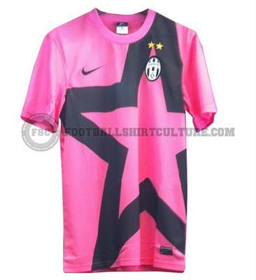 Too dumbfounded to come up with a rating/5 StarsReally, Juventus? I mean, what? Maybe this shirt will help distract the fans from all the diving.. err, excuse me, "showmanship", in the Italian game. *Yawn* - Just talking about Italian soccer is putting me to sleep.- Zach