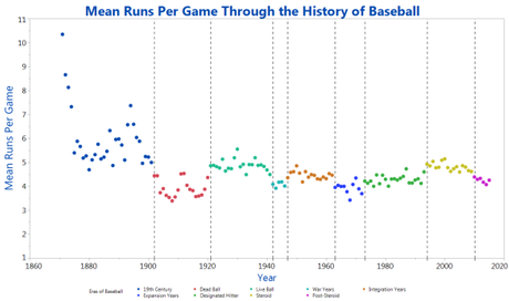
I posted another graphic several weeks ago that included the same information that can be found in this one. I do think that this chart is easier to read than the last one, however, which is what makes it worth the added share. I think this one better depicts things like the dip in runs scored through the Dead Ball era and the relative leveling-off of run production in more recent years.
I’m not sure of the author of this chart, other than it is posted somewhere on a statistical software site, JMP.com. Click on the image below to link to a larger version.


