TAKEAWAY: The first iPad app for India’s Malayala Manorama premieres this weekend. We take you through the steps leading to it and show you early sketches of our trials and errors.
This blog post will be updated throughout the weekend
Malayala Manorama is published in one of India’s most scenic regions, Kerala.
It is read by over 12 million readers daily. We have accompanied the Malayala Manorama team with their print redesign, and now we were honored to be called upon again to assist with the creation of its first iPad app, which premieres this weekend (Saturday).
Here is how Mariam M. Mathew, chief operating officer - Manorama Online, describes this historic moment for Malayala Manorama, and the process that led it to its new iPad app:
For the 123-year old Malayala Manorama the transition to the iPad was easy. We have been pioneers in adopting new story telling techniques and technologies. The Malayala Manorama has a huge presence in the Online medium as well as the Mobile space. Tablets are closest to the newspapers in the digital world and allow readers to have a richer experience newspaper with a flick. We are a journalism focused company and we feel the iPad presents a wonderful opportunity to be great storytellers We are really excited to work with Mario to launch Malayala Manorama’s iPad edition. Mario understands us because he redesigned the Malayala Manorama some years ago. Mario brings his rich experience to the iPad and is easily able to capture the newspaper strengths to the iPad.
For the talented team of Malayala Manorama, it all began, as is usually my practice, with a two-day workshop.
What happens in this workshop?
Each project is unique and special, but some of the agenda items we follow when we conduct these workshops for news app creation are the same. I usually start with an overall presentation (constantly updated) of how news iPad apps develop globally. This sets the tone, allows for discussions of “what may work for us in this particular case” and offers a larger view of the excitement, challenges and solutions ahead.
Here is my list of workshop items that I want to make sure we get through by the end of the two-day workshop:
1. What is the DNA of the existing publication that will now have an iPad app?
2. Review of the content to single out specific areas of interest that will transfer to the app.
3. Storytelling: how will the content be displayed on the app?
4. First, the information architecture component of the app is discussed, planned and mapped out.
5. Second, with the help of the technical people in the workshop, we try to create some screens to see how information architecture would carry.
6. Grid creation for both horizontal/vertical
7. Navigation is diagrammed
8. Once we have some screens to look at: landing page, article page, multimedia pages, we have a discussion.
9. Advertising modules created.
10. End of the workshop: we have a working digital document from which to start the task of creating the rest of the app.
The workshop images
Here I will show you our early stages of developing the app for Malayala Manorama.
The grids
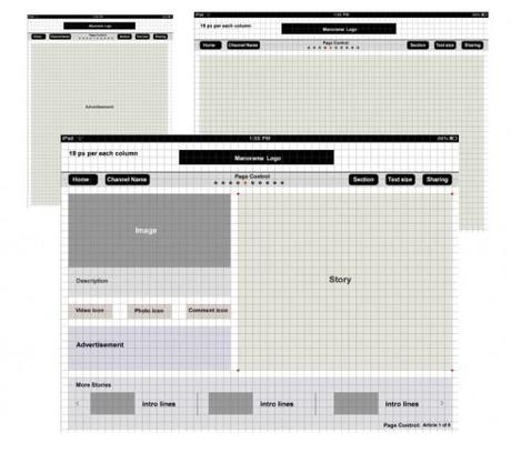
Notice that one early step is the creation of grids to guide the design process. This is imperative, just as it would be in print, but even more so here, a technical necessity to facilitate placement of elements on screen.
The navigation
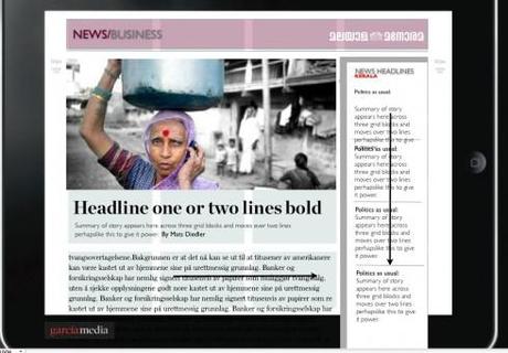
From the start, we begin to experiment with navigation techniques: will this app allow the user to go to top news updates at any time? If so, how will that window appear? At this stage in the workshop, we were thinking that perhaps there would be a latest news pop up window, an idea that was abandoned much later in the process.
Putting flesh on the bones of that grid
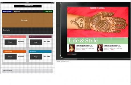
By now, we are happy with the initial grid, so the designers start putting boxes on the screen, for a first glimpse at look and feel; how would it work vertically and horizontally?
Screen design starts
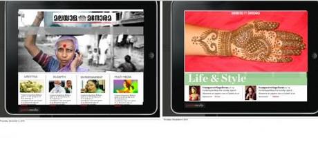
Now we begin to experiment with look and feel: what would the user see first, second and third; hierarchy, ease of navigation; interplay of elements all begin to be part of the discussion
Color palette
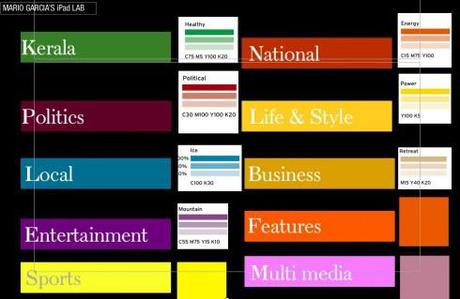
The color palette is important, and here we start a discussion of how various colors may be used to identify specific sections of the app.
Multimedia screen
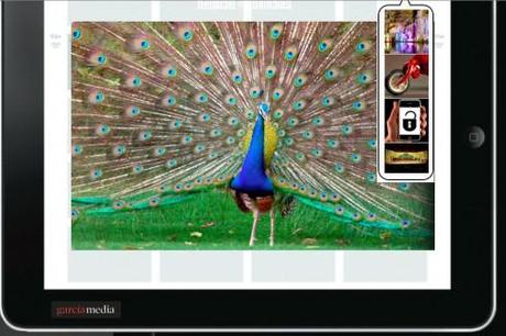
First glimpse at how a multimedia page would look, and how we would navigate the user to other multimedia components within the app.
One of the prerequisites to make sure that the iPad creation runs smoothly is the appointment of a project leader. At Malayala Manorama, it was Santhosh George Jacob. He coordinated all efforts, from editorial to technical to advertising, and he was the point man for all communications with me, as we were exchanging emails, reviewing pdfs of screens and continuing the dialog daily throughout the process. Here Santhosh summarizes his experience:
For me working for the I Pad project was all about getting back to the basics. As someone who was a print journalist in the early days of profession and later migrated to the web, I view the tablet as something very close to print. It is the ultimate convergence experience by conceiving the good things from both print and online.
However, the tablet is something which gives you a chance to rethink and redefine the old school journalism for the benefit of the new gadgets. Its fun, touch, feel and involvement.
The workshop directed by Dr. Garcia gave us a chance to be exposed to the new world. He understands user requirements fast and design product accordingly.
TheMarioBlog post #748

