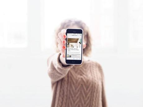
I finally did it; I finally went mobile.
I do everything on my phone. Talk, text, pin, Instagram. My first experience with the internet was on a computer, but today, most people first experience it through a mobile device. Isn’t that crazy? I am very picky about the visuals on Madalynne, and I have spent weeks thinking about and working on the layout, graphics, and photo(s) of a particular blog post. Why? Because I really care the aesthetic of my blog. Have you ever been into an Anthropologie store? Even if I don’t have money to spend, I go in and browse just because the products are so pretty. I want Madalynne to do the same thing. Even if I don’t post for a day, I want you to want to come to my site. So, because of the amount of people that are using their phones as a primary reading device, I want to make sure that my aesthetic translates to your iPhone, iPad, Android, etc.
Enter Marfeel, a Spanish start-up that I wanted to share with you in case you’re looking to do the same thing – go mobile. They’ve created mobile sites for newspapers such as Sport, Gala.fr, News.va, and bloggers such as Belleamour. What I liked most about Marfeel is that their focus is to improve the reading experience for a website and/or blog by creating a clean, interactive, and very visual layout. And as proof, Madalynne’s average reading time increased to 8 minutes and 22 seconds since the mobile site went live. They transformed Madalynne from a site that needed to be zoomed in and out in order to read clearly into a site that was easy to navigate and see on any device.
So, please keep Marfeel in mind if you’re interested in creating a mobile site, and please let me know if you have had trouble accessing my site (commenting directly on the mobile site will be a feature in the next coming months).
Thank you Marfeel!

