May 10, 2013
Over time, a corporate logo may change according to market trends. You may not be aware of some of these changes because they are minimal, while others are more drastic.
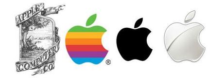
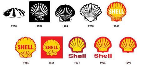
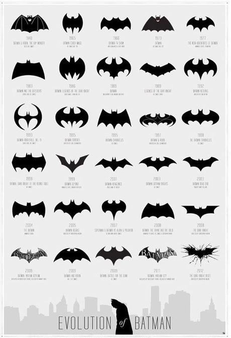
We were surprised to see that the earliest Apple logo was, well, ugly. The BP logo has been changed seven times, and the Shell logo more than ten times now. One of our personal favorites, the Batman logo, has 30 designs archived.
Apple Logo

BP Logo source: http://calmtheham.com/products/batman-evolution

Shell Logo

Batman Logo source: http://calmtheham.com/products/batman-evolution

Other Corporate Logo Source: http://thelogocompany.net/blog/logo-design/corporate-logo-evolution/

Logos War source: http://thelogocompany.net/blog/infographics/logo-wars-battle-brands/

