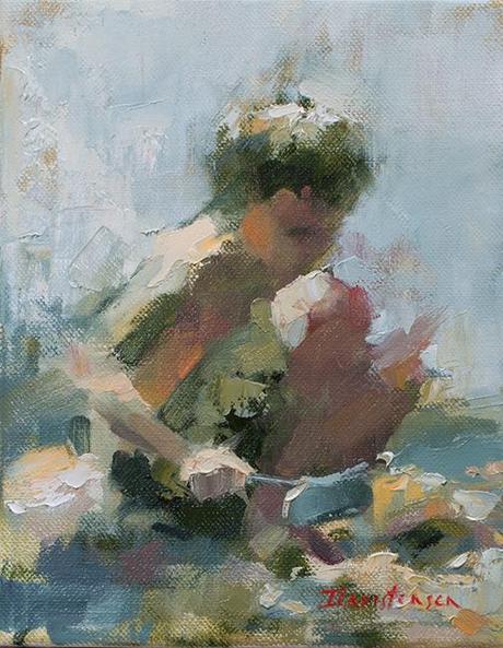
Tending the Beach
14 x 11
Our brains like complimentary colours and will create them for us given a bit of encouragement. The orange in the sand and on the boy's torso and cheek are enough to allow the viewer to interpret the black and white mixture as blue, the compliment of orange. If an actual blue were placed into this picture it would relegate this mixture to plain old cool gray. Here's a piece of paint cropped inexpertly from the child's hoe. Out of context, it looks less like something that you'd call blue, although, if asked to mix it, you'd probably start with a blue and diminish its chroma with complimentary orange and some white.

Limited palette work sharpens my painting skills; I do it when I feel I've become too color dependent. Since value and temperature are the most important elements of these paintings, I always go back to the full palette refreshed; grateful for all those lovely colours, but aware that I can be quite content with much less.
Happy painting!

