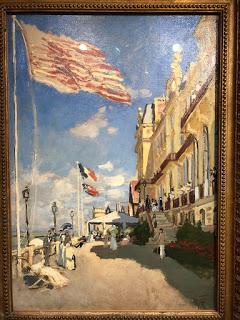
Hôtel des roches noires, Trouville
Monet
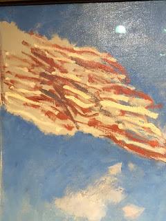
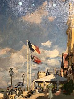
The flags in the Monet above are clearly fluttering, and just as clearly, he didn't use a photo reference to paint them. He took no pains to connect the rough, broken stripes on the foreground flag, and, instead, dashed them onto a sienna-toned ground with all the vigour of the brisk wind that they describe.


Monet's flags show how we actually see motion. When we look at a moving object, person, or animal, we can't stop their motion and analyze what each component is doing during any given millisecond. Looking at a fluttering flag, we don't see stripes so much as flickering colours and tones flashing against the sky.
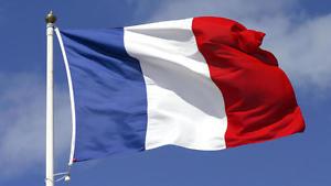
A camera view, however, freezes movement and shows us exactly what's happening to those stripes. We can see each fold and wrinkle and even the reflected light within each fold. And that's not a good thing! It's too much information. The flag below doesn't describe motion so much as look like a sculpture frozen into a horizontal arrangement. A faithful painted copy wouldn't convey movement or wind. It would be a solid lump against the sky.

I'm not suggesting ditching the photo reference altogether, but I'd certainly avoid high resolution whenever possible. My favorite work has come from blurry, small images, and my most stilted from high quality photos in which I could see every last detail. So now I go through a few steps in a photo editing program before I use a photo reference. I blur it or introduce graininess, and I avoid zooming in on any part of the image; I keep it in a small, thumbnail view on my computer, or put a hard copy print far away from my easel. The less I can see, the better the painting that I make.
Photo references have their place, but unless photo realism is your goal, I'd use them cautiously. Cameras don't see the world in the same way that we do, and by copying them you'll create dishonest works: paintings that don't actually convey your own vision and experience of the world around you.
Happy painting!

