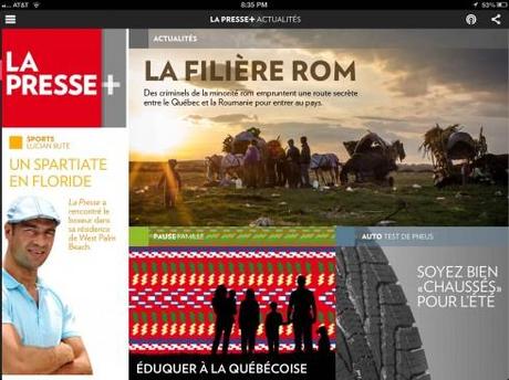
TAKEAWAY: Canada’s La Presse has unveiled a new app edition: it is aesthetically beautiful, it is free, but it is not too newsy. Striking a balance when creating a newspaper tablet app.


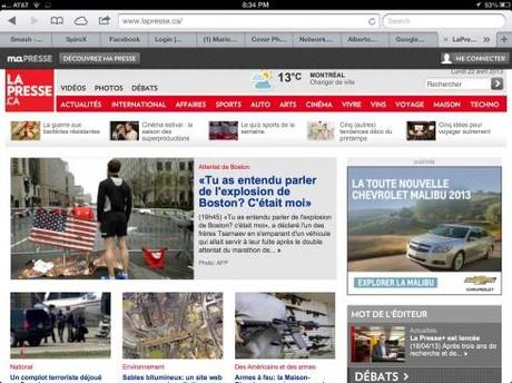
Case in point about La Presse’s new app: while it is aesthetically quite inviting, it remains static thru the day. Monday afternoon, there was breaking news in Canada, as a possible terrorist plot was foiled. The LaPresse.com website had updates of the story, but not the app.

Opening of opinion (debate)

Opening of the cultural Arts section

Opening of special Auto supplement

Opening of news article
Gorgeous and free, that is how an article describers the new tablet app for Montreal’s La Presse, a project that, according to official reports took three years and cost $40 million to bring to market. La Presse is the largest French language daily in the Americas.
Another report went as far as to say that the new La Presse’s app is “brilliant”.
Gorgeous? Brilliant? That is for users to decide. Free, it is.
What this app is not, in its early version, is newsy, and that is difficult to explain for an app that observers believe is a possible eventual replacement for the newspaper’s print edition.
I now have had a chance to take a look and navigate La Presse’s new app. As it stands right now, this app cannot duplicate the printed newspaper and its sense of urgency. It looks like a total lean-back experience, even a Sunday newsmagazine. Of course, a more magazine-style app can be a great addition to a news organization’s offerings, but as a putative substitute for the daily printed newspaper itself, this does not quite strike the needed newsy and immediate tone.
In those first ten seconds, you do like the aesthetics of La Presse here. Pictorial, in a Flipboard-like mode. Easy to read once you are inside. Clearly defined sections, such as Sports, Arts, Debate. Not a lot of pop ups yet, but tablet-friendly advertising, especially the one for Air Canada.
Some sure-footed moves:
Editioning: Each of the daily editions will be delivered every morning at 5:30 in a heavy file: the file for the first edition is 102 MB.
Latest news: There is an icon to check the latest news online at LaPresse.ca, although some readers may not like that the home page remains with that one early morning look, static if you will, and not changing with latest news.
Print edition content: whatever is published in the print edition is available in the iPad, although perhaps not given the same sense of urgency.
The La Presse digital edition today for the iPad is being offered on a free subscription basis, with readers able to access their daily edition through the Apple Newsstand app each day by 5:30 a.m., seven days a week (the paper dropped its Sunday print edition in 2009).
Advertising innovation
Perhaps this is one of the most experimental areas in the La Presse app. More than 100 ads were created to demo ad capabilities within the app. A portfolio of demo ads is available online here:
http://troussecreation.lapresse.ca/en/
The ads are not quite advertising suites (where storytelling is enhanced for the ad, which goes beyond banners and full screen images), but they are also not static banners. Some ads occupy only one fourth of the screen, but react to the touch.
“After three years of research and development, we are proud to offer users an innovative digital edition that will redefine the way they get their information, while maintaining La Presse’s DNA in terms of content quality. La Presse+ is an exceptional tool that enriches and expands upon the quality and depth of the news experience,” said Guy Crevier, President and Publisher, La Presse in the company’s launch announcement.
In the end, La Presse is still in the business of news,isn’t it?
The newsy side: I miss a newsier first impression on that home screen. In those first ten seconds I see the texture of a very lean back, read-me-later type of visual presentation. Aesthetically quite pleasing. And, perhaps for an evening edition, this hits the spot, although I am learning quickly that as tablets become more popular as news dispensers any time of the day, the look & feel needs to convey that sense of immediacy. For example, the new and, indeed, beautiful home page of La Presse could use some three to five headlines, perhaps under the logo unit, to remind us that it is morning, and something happened while we slept.
Those of us designing news tablet apps must remember that, while the printed newspaper may have lost its time advantage for news, it is mobile editions that gained such advantage. Users want that mobile device in their hands to be as updated as possible.
Yes, I know that by going to lapresse.com I can get updated, but it should not be the only way to do so.
I have a feeling that La Presse users will remind the editors about this, and it will be a quick and easy fix to make.
I would be very hesitant to describe the La Presse app as the newspaper app of the future. Not while it is missing that very important element of headlines and updates right on home page that are still important to users.

