TAKEAWAY: While preparing for my series of tablet workshops here in South Africa (for Media 24 group) I was looking for models of apps that go the extra mile. I found a lot of what I was looking for in the new German app, Junction. Take a look
Simple, direct and fun to use: Junction

Contents page

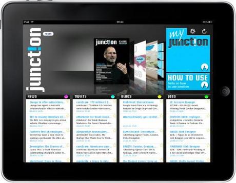
The Junction “cockpit”

Article opener page

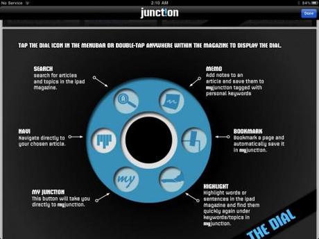
Dial a function
When conducting tablet development workshops for media groups, I believe it is not good just to show what other media-related apps do. In fact, I always try to find that one app that was created without the constraints of thinking with a print mentality.
For this workshop, my good find was the German app Junction, published in English and full of interesting details that all of us should look at.
As you can see here, the app has been created to reflect all the functions that we traditionally associate with reading a printed magazine or newspaper: marking the page, highlighting a sentence or two, etc. But, more importantly, the creators have thought of extra functions like if you wish to recall something you know you read in an article in the app, simply write a couple of key words and the article appears.
A “dial” appears upon recall anytime on the screen to allow you to perform any of the functions above.
But, as I told the workshop participants yesterday, Junction is NOT over the top, it does not have “explosions” on every screen, and, in terms of the design, it is more vanilla than passion fruit ice cream. However, the navigation is functional; the content flow is impeccable, and the information architecture makes it very easy to follow the main baskets of information: News, Blogs, Tweets(yes, there is a full section devoted to Tweets of interest), Jobs.
The creators call the landing page “the cockpit”, and on the right hand side of the screen one sees feeds settings, relaod feeds and my junction, where user can personalize the app with chosen feeds, memos, bookmarks, etc.
Published by Werben & Verkaufen, Junction is a free magazine targeted at business and online professionals, available exclusively for iPad. The topics have a global focus and include business, technology and lifestyle. Junction is a synergy of articles with real-time-feeds from the (social)web.
It is the extra functions, the ease of navigation and the fact that Junction does not attempt to replicate what we associate with the look of a printed journal that makes it special and worthy of study by all of us developing tablet apps.
And, in my view, the name Junction is most appropriate here: the perfect intersection of bringing the most intuitive functions that we associate with print, with the magic of what a true app can do.
A Junction where all of us should meet often——and soon.

