This is the weekend edition of TheMarioBlog and will be updated as needed. The next post is scheduled for Monday, January 21.
TAKEAWAY: It’s a new logo and livery designs for American Airlines. Gone is that eagle sitting between the two As that we have seen for years. But, wait a minute, isn’t that an eagle there in the new logo?

The new American Airlines livery

American Airlines new logo—and new eagle

American Airlines launched its redesigned look today, just on time to paint it on dozens of new aircraft that are going to be joining the airlines’ fleet in the months ahead. Yes, the body of those AA birds will still be silver, but this time painted so, as in silver mica paint.
Both the logo and livery (airplane paint scheme) have undergone big changes. On the tail, instead of that skinny eagle that stood erect between the two AAs of American Airlines, we now have a series of lines. But the eagle remains in the logo, if you look close enough, you do see what seems to be an abstract eagle.
It took two years to come up with this look.
How I wish “redesign” projects for publications were two years again. Try two months?
And I also wonder how the folks at FutureBrand, who did a splendid job here in rebranding the iconic American airline (which may soon merge with US Airways, by the way), managed to dethrone the old eagle for the more modern abstraction of one.
Eagles and me go back, as readers of this blog know, and it ain’t easy to eliminate them. Something to do with legacies, patriotism and the fervor that so many feel for them. We may never know the story behind the change of the eagle at American Airlines, but I bet there are some interesting tales: those who wanted the old eagle to stay, the ones who favored something more modern (I am glad that group won!).
Wonder if anyone voted for NO EAGLE. It is 2013, a new year, new times, no need for eagles.
As for the tail design, perhaps a little too busy, but I must see it in the flesh before passing further judgment.
So, I look forward to seeing the next new American Airlines silver bird (or, silver mica) parked perhaps next to plane in which I am a passenger.
One fellow designer, good friend and frequent traveler who will probably be happy NOT to see the silver mica bird parked near him is Roger Black, based on what he is Tweeting about it. In case you missed it, here are some Rogerisms about the AA redesign:
@AmericanAir trashed brand equity
@AmericanAir Never mind the hideous eagle. WTF is that red-white and blue piano keyboard
@AmericanAir Not since UPS has a big company been so dumb.
Ouch.
Of related interest
For more on the redesign of the *American Airlines* brand, go here:
http://skift.com/2013/01/17/american-airlines-redesign-launching-today/
And for the FutureBrand story of their involvement:
And for tales of dethroned eagles in newspaper nameplates:
http://garciamedia.com/blog/articles/40_years_40_lessons_6eagke
Where’s Mario?

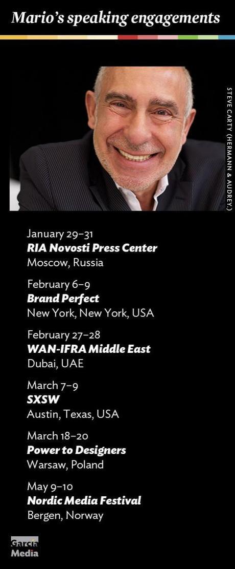
Mario’s upcoming speaking engagements

Take advantage of our iPad Design/Ad Lab workshops

Do you want to take your brand to the next level by creating a tablet edition? Garcia Media can help. We now offer one- to two-day iPad Design Lab workshops on demand to jumpstart your presence on this exciting new platform. We also offer iPad Ad Lab workshops to develop engaging advertising models for your app. Contact us for more information.

Purchase the book on the iBookstore
iPad Design Lab has been given the QED Seal

The QED (Quality–Excellence–Design) Seal is bestowed by the judges of the Publishing Innovation Awards after “a thorough, professional 13-point design review with an eye towards readability across multiple devices and in multiple formats.“
Learn more about the QED Seal here.
The EPUB version of book is HERE:
Now available: The EPUB version of iPad Design Lab: Storytelling in the Age of the Tablet, ready for download via Amazon.com for Kindle:
Here is how you can get iPad Design Lab book:
The original version of the book is the multitouch textbook version available on the iBookstore for iPad (iOS 5.0 and up): https://itunes.apple.com/book/ipad-design-lab/id565672822. This version includes video walkthroughs, audio introductions to each chapter, swipeable slideshows, a glossary and a sophisticated look and feel.
Apple only sells multitouch textbooks in certain countries at this time, unfortunately. Copies are available in at least the following countries: Australia, Austria, Belgium, Canada, Finland, France, Germany, Great Britain, Greece, Italy, Latvia, Luxembourg, The Netherlands, Poland, Portugal, Romania, Slovakia, Spain, and the United States.
For those in other countries and without an iPad, we have made the book available in a basic edition for other platforms. This basic edition includes the full text of the original, along with the images and captions, but lacks the other features such as audio and video. It is available on the following platforms in many countries:
Amazon Kindle:
http://amzn.to/SlPzjZ
Google Books:
http://bit.ly/TYKcew
Take a video tour of iPad Design Lab
“iPad Design Lab” trailer on Vimeo.
Read the Society of Publication Designers’ review of The iPad Design Lab here:
http://www.spd.org/2012/10/must-read-ipad-design-lab.php

Keep up with Mario Garcia Jr.. via Garcia Interactive: helping transform online news since 1995.
www.garciainteractive.com

