TAKEAWAY: It’s the 166-year-old newspaper that we identify with Singapore, read by 1.4 million daily. This week, the Singapore Straits Times has introduced its new iPad edition. It has impressive as well as disappointing moments. We take an early look.

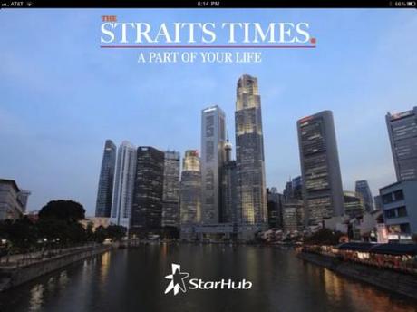
The door to the iPad edition: slick, sophisticated and inviting; the inside of the app lacks this polished look, but it may be a matter of time before the two are more synchronized

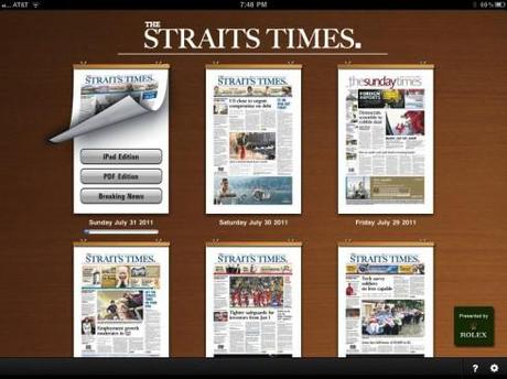
At its best, the landing page allows user to lift the miniature front page of the newspaper to choose from three options: iPad edition, PDF edition, Breaking News

The iPad edition uses a four column grid: not too inviting yet, rather primitive in presentation

It helps when a photograph is added to the article page
Obviously, it paid for the Singapore Straits Times to wait until now for its iPad edition to appear.
The reason I say this is because after checking the first edition of it, I see that there are three features that will win big time with users.
There are three options available on the iPad:
-A curated iPad version, which has been customised for tablet computers and includes photo slideshows and videos from the newspaper’s video arm Razor TV.
-A PDF version, which presents the newspaper exactly as one would see it in print, advertisements and all.
=A ‘breaking news’ version, which is updated throughout the day with the latest news breaks.
The iPad edition is published at exactly the same time as the printed newspaper in the morning (6:30) Singapore time.
This, as we know, is what many users of news app want, and the ST apparently knew it too.
A certain flatness prevails in the iPad edition
Having said that, I think that we need to give this project time to mature a bit.
I simply wanted to check it out and when I found the three features that are the highlight of this app, I felt I wanted to share with you.
The actual curated edition does not seem to be fully developed yet. In fact, I find it rather flat, with a simplistic four column grid, and, in Monday’s edition, a Rolex ad that would not open up for me. In some cases, when I tried to read a story, a message popped up asking me to return later. It is possible that, as I am reading the edition in the US, maybe this is the time that the edition is actually changing in Singapore, but there seem to be problems with the app itself, nothing unusual for a first day edition.
In terms of a business model, the ST iPad edition offers users free access until Sept 7, including stories in all the sections of The Straits Times as well as supplements like Digital Life and Urban. After that, a payment plan will be announced.
We promise to revisit it, as we are sure that the problems will be tweaked in no time at all.
By the way, the animated introduction showing the skyline of Singapore is quite inviting. But, I admit, there is a visible gap between the sophistication of that introduction and what follows in the iPad edition.
Knowing how the folks at the Singapore Straits Times, perhaps one of the most savvy media houses in the world, always do things in a first class manner, I have no doubt that this iPad edition will mature with time.
Right now, the best it offers is the three choices it allows users with iPad edition, PDF edition and breaking news options. The iPad edition itself appears rough and primitive in presentation, lacking in layers and texture to present the information and desperately in need of a unique style—-something that a little tender loving care of the design kind can change!
Time will tell. We will revisit it here.

