Reporting this week from Hong Kong.
TAKEAWAY: It is a new iPad edition for The Miami Herald: with a Flipboard inspired home page, clearly defined navigation and still plenty of room to become a truly functional news app. In another segment of the occasional series, The iPad Lab, we examine and review the Herald’s app PLUS: Today’s designer must be trans media. Are the schools up to the task? AND: Report from Hong Kong: something for the eyes while window shopping. When well known brands collaborate with well known designers.
The iPad Lab: we review The Miami Herald’s new tablet app
Take a mini video tour of The Miami Herald’s new iPad app
What a surprise, while on the way to read a column by one of my favorite Miami Herald columnists, Fabiola Santiago. Just before her column appeared on the Herald’s website, a window popped up suggesting that perhaps I wanted to read Fabi’s column on the Herald’s new iPad edition.
Fabiola’s columns continue to campaign strongly against the stubborn idea a group of foreign capitalists insisting to turn our dear Miami Herald building at One Herald Plaza into a gambling casino and resort on the bay. (By the way, I can’t find the Fabiola Santiago column in the app, but still looking.)
I was quite surprised about this Miami Herald app, so I immediately went to download it for free, but upon trying to read a full story, another window popped up asking if I am a Herald subscriber, or of I need a subscription. I opted to subscribe and did so for 99 cents a month, automatically renewable.
The new app
Only last week we reviewed the new Denver Post iPad app.
It does many things well, but, most importantly, it gets away from the typical 2010 notion of the tablet edition that duplicated the printed newspaper look.
Good thing, we wrote.
I am happy to say that the Miami Herald’s app follows the same path, with a Flipboard-inspired navigator that is photo based and easy to follow. There is no resemblance beyond the logo between the printed Miami Herald design (a Garcia Media project) and the new app edition.
I like how the user can navigate the app through a carrousel or through a more so plastic vertical pop up menu, which in my view is easier to read than that of The Denver Post.
The article reading page is simple and follows a wide one column grid (see sketch).
Like The Denver Post’s app, the Herald’s tablet edition is in its beginnings and not yet providing for a lot of activity for the finger. There are stories and there are plenty of photos, although not many videos and a total absence of pop moments.
In that sense, the American news apps that are launching remain rather linear and static, but, of course, I am aware that pop up moments require staffing levels that these newspapers may not have yet. It is all part of the tablet edition and its evolution. The good thing is that these newspapers now HAVE a tablet presence. The rest will come, too.
The Miami Herald has a wonderful food component in the app edition I reviewed this weekend, with good narratives and recipes, and it is here that I would envision videos and a little more “finger food”. But the same would apply to those great Rene Rodriguez film reviews, and so many of the local stories that lend themselves to some special tablet treatments.
I also see great potential for pop up moments in the sports section.
All in all, however, I applaud the Miami Herald’s team for this new effort.
Since I will always call Miami, the city where I grew up, I am quite excited to be able to read all about newsy and beautiful Miami on my iPad each day, no matter where in the globe I may wake up. For 99 cents a month (so far!), not a bad deal.
Reason to cheer.
The Herald’s app and advertising
The app opening shows a sponsorship ad from Baptist Health South Florida
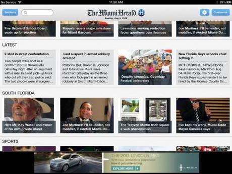
Several screens show a traditional banner ad
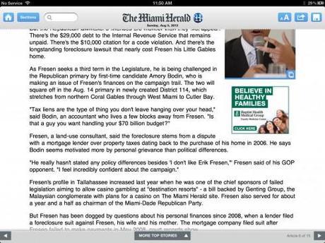
The article reading page includes a small boxed ad under the illustration that belongs to the text
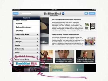
A traditional website silent ad under the pop up navigator
It is good that the community has offered support in the way of advertising for The Miami Herald’s app. From the sponsorship ad on the landing page, to a variety of local ads through the app, it is obvious that the advertising/marketing departments of The Miami Herald have done their homework.
What is missing is more tablet-created ads, or the advertising suites, which are what the tablet editions need. These ads here are a good start—-and revenue producing!—-but they are static and more like what one would expect to see in a website, not a tablet edition of a newspaper.
But everything comes with time, and I look forward to all the exciting advertising possibilities, especially with Miami’s vast offerings in fashion, food and entertainment that are waiting to be included here.
For more about tablet advertising, go here:
The iPad Lab: creating the advertising suite
http://garciamedia.com/blog/articles/the_ipad_lab_creating_the_advertising_suite/
Ralph Lauren and The Times: A Marriage Made in Tablet Advertising Heaven
http://garciamedia.com/blog/articles/ralph_lauren_and_the_times_a_marriage_made_in_tablet_advertising_heaven/
A Fun Valentines Game from Galaxy Samsung
http://www.garciamedia.com/blog/articles/a_fun_valentines_game_from_galaxy_samsung/
The grids
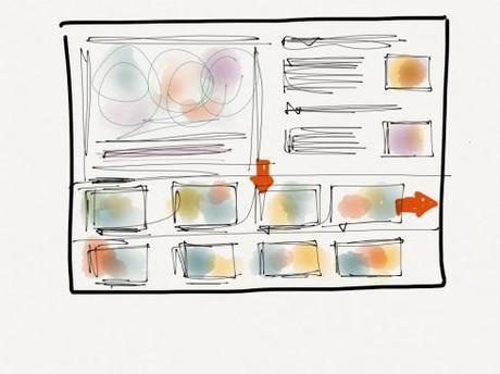
The home page grid: a Flipboard approach
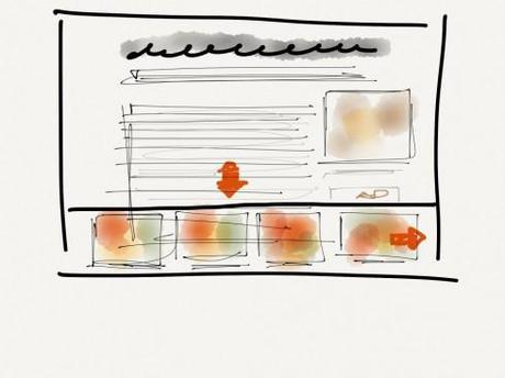
The article read grid: one wide column
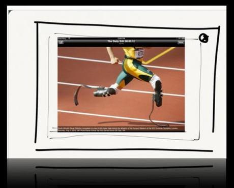
The photo highlight grid
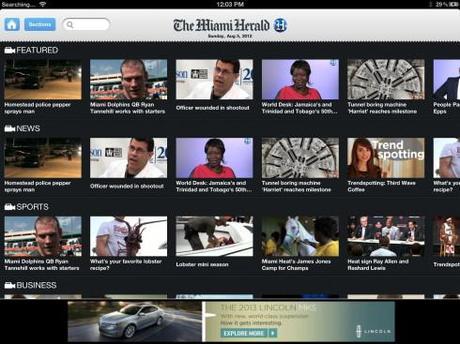
The video navigator page grid
The Miami Herald’s tablet app is based on about four simple grids, as illustrated in my sketches here. This is the way to go, with templates that are easy to follow and to produce on a daily basis. Readers of news apps do not expect dramatic changes in the functionality and look of their apps. Let the surprises come via the stories, photos and videos selected, NOT by dramatic changes of the grids. I have identified about four grids in the Herald’s app, and I imagine that eventually they may have up to 10 or 12, as they develop more pop up opportunities, info graphics and finger-happy opportunities for the users.
For more iPad Lab entries about tablet grids:
The importance of look and feel in that app
http://garciamedia.com/blog/articles/the_ipad_lab_the_importance_of_look_and_feel_in_that_app/
Kronen Zeitung of Austria’s new iPad edition launches
http://garciamedia.com/blog/articles/kronen_zeitiung_of_austria_new_ipad_edition_launches/
Kronen Zeitung’s tablet: beyond the news, a special event app
http://garciamedia.com/blog/articles/kronen_zeitungs_tablet_beyond_the_news_a_special_event_app1/
Why reading the New York Times on th eiPad gives me print envy
http://garciamedia.com/blog/articles/why_reading_the_new_york_times_on_the_ipad_gives_me_print_envy/
Wanted: well trained trans media designers
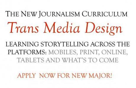
Schools need to start thinking of training trans media designers. Several colleges/universities I know are already doing so.
The journey to becoming a trans media designer involves, like almost everything else, a personal desire to do so. I know many print designers who wish to stay just that, and not move to digital, for whatever reasons. While I respect that, I think it is unrealistic to do so.
Frequently I receive emails from college students who dream of becoming newspaper designers, or news app or web designers. I usually encourage them to study all about design, then prepare themselves to be able to design across platforms: trans designers for whom visual storytelling becomes a passion, regardless of platform.
Even if the curriculum of the school where they study is still centered around the traditional classifications that separate print from digital, for example, the students must attempt to craft their own majors, mixing courses and experiences. Of course, there isn’t probably such a thing as a Trans Media Design 101 course, although I think it would make a lot of sense to have such a course. I would take it in an instant!
Instead, the students must create their own mix of courses not just from the journalism curriculum, but the fine arts school as well. History of art, elements of architecture, color theory, photography and video should constitute strong areas to support the training of the trans media designer. In addition, technology-related courses and , of course, editing and reporting. And, no, we are not really talking of a new major here. It is one that I wish more universities had created and incorporated a long time ago.
The new breed of trans media journalistic designers can be found in many newsrooms worldwide already. When I talk to them, they relate tales of training themselves on the job, which
instantly raises my level of admiration for them.
They all wish their colleges and universities had prepared them better.
It’s time those in charge of curriculum at centers of higher education address this issue, and expedite the process. Part of the problem with colleges and universities with which I am familiar is that it takes a long time for curricular changes to go through the process. Well, our media world moves much faster than that. If those colleges and universities wish to better serve the next generation of designers/journalists, their administrators should start thinking of that Trans Media Design major pronto.
The time is now.
Know of any programs doing this? Let me know
If your college/university is already doing this or on the way to do this, let us hear from you and your program. Write me at
Window shopping in Hong Kong
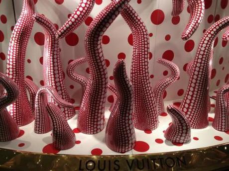
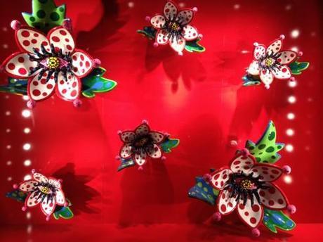
Louis Vouitton in a collaboration with Japanese artist Yayoi Kusama
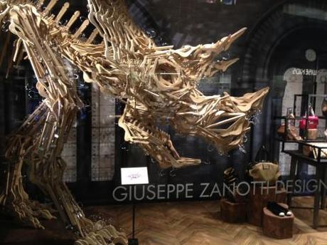
Giuseppe Zanotti Design’s window, wood hangers and the Triceratop Dinosaur
It’s a treat to walk down one of those huge and luxurious Hong Kong shopping malls, such as Pacific Place, and enjoy the windows of the stores.
This time, Louis Vouitton’s windows are show stoppers, for sure.
Louis Vouitton has joined forces with 83-year-old Japanese artist Yayoi Kusama, one of the hottest commodities in the contemporary art scene. This collaboration yields some of these smashing window designs. Color is the key, but also texture and form and, of course, Kusama’s signature dots.
These windows don’t seem to be selling a specific product, just the brand, attracting passersby, many who, like me, took out their cameras or phones to record the view.
But the Kusama touches are to be found in shoes, handbags, shirts, skirts, sunglasses and other accessories. Let’s hear it for those dots.
Two doors down Giuseppe Zanotti Design impresses us with a dinosaur made totally of wooden clothes hangers .Amazing. And, apparently, the art of the store window is dear to Giuseppe Zanotti. For more read this piece about Modelizing: The Art of Window Shopping: http://blog.modelizing.us
And you don’t have to spend a penny to enjoy these! Welcome to the shopping museum walk of Hong Kong.
Designers and popular brands
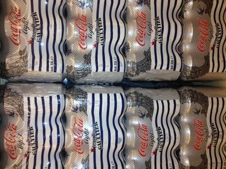
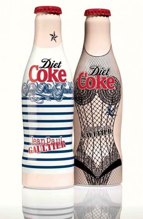
While on the subject of collaborations between well known brands that seek the collaborations with well known designers: Fashion icon Jean Paul Gautier has put his style signature in“Night and Day”¬, the first campaign in his role as creative director for Diet Coke. The campaign reflects many of Gaultier’s famous collections and will run throughout 2012. Take a look at the cans or bottles of Diet Coke and you will see the famous Gautier corsets with a lace and fishnet design. Day was inspired by the designer’s signature Breton stripes with the red bottle cap resembling a French beret. And, Tattoo, a third design, will be released later in the year.
Happiness times six on the front pages
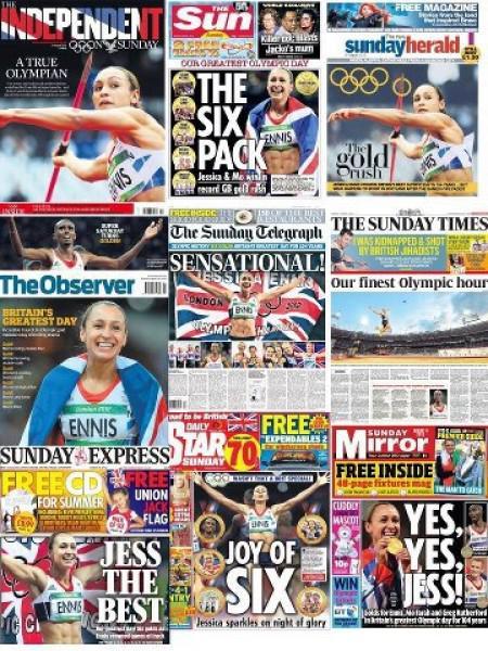
Happiness is six Olympic gold medals in one day for the British, and, boy, did they celebrate, including on the front page of all these newspapers.
As The Guardian put it, the newspapers went to town in “ their celebration of six gold medals for Team GB in a single day at London Olympics with poster-style fronts and many news pages inside plus the sports coverage.“
A highlight from The Guardian’s analysis of newspaper coverage of the magnificent day for the Brits:
Few superlatives were missed. We were told of the achievement being extraordinary, awesome, sensational, amazing, astonishing, unforgettable, special, remarkable, spine-tingling and glorious. It was the best, the greatest, the finest. It was “a perfect end to the greatest night of British athletics,“ said a Telegraph headline.
We like to see front pages that reflect national pride. These certainly do, each in its unique style.
Best headline: The Sun’s The Six Pack
Pages we like
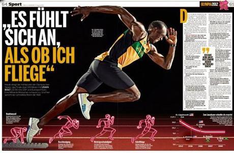
Headline :Usain Bolt: It is almost like flying
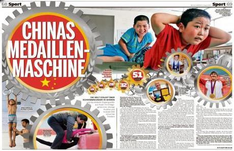
Headline: The Chiinese (Olympic) Medal Machine

Headline: Marilyn Lives!
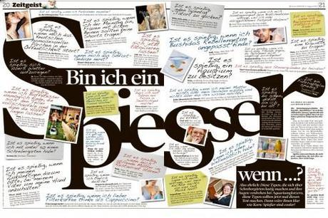
Headline: Am I too stuffy and bourgeois?
Frank Deville, our Europe blog correspondent, sends us these double page spreads from the Sunday edition of Germany’s Bild.
Most are about the London Olympics, but the other two deal with Marilyn Monroe and the 50th anniversary of her death, and a headline that reads: Marilyn Lives, and one that asks the question: Am I too Stuffy?
The iPad Design Lab: Storytelling in the Age of the Tablet
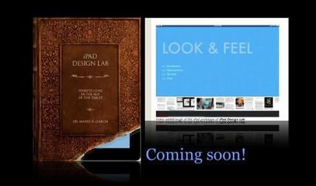
Video walkthrough of the iPad prototype of iPad Design Lab

Mario Garcia’s upcoming speaking engagements:

WAN-IFRA World Editors Forum, Kiev, Ukraine, Sept. 2-5
http://www.wan-ifra.org/events/64th-world-newspaper-congress-19th-world-editors-forum
Cumbre Mundial de Diseño en Prensa 2012: Mexico City; September 24-26
http://www.cmdprensa.com/mx2012/
SND (Society of News Design) Cleveland; Oct. 11-13

