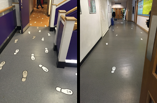
Directing people through environments is a common design problem. Designed solutions work best when they work with perception, rather than in competition (which of course implies designers need to know about perception; see Andrew Hinton's excellent book Understanding Context for much more on this). Typical solutions involve providing intermittent signage; the assumption is that you only need information at decision points such as intersections and will be able to happily move from one such point to the next with no additional help. My personal experience is that as soon as I'm out of view of the sign I can feel the panic rising, as if I had just closed my eyes (similar to the problem I have with staggered and especially puffin pedestrian crossings). Leeds Beckett University has a bunch of construction on the go right now, and the simplest route from the Portland building to the Rose Bowl is currently blocked. The alternative route winds through multiple corridors and down two flights of stairs. There are two sets of instructions: intermittent and dense.The intermittent signage is fairly standard: signs with arrows at various key points (see Figure 1)
Figure 1. Intermittent signage
This signage is fairly useless. It contains little information, and I lose access to that information as soon as I move away.Luckily, they also now have this version: (Figure 2)
Figure 2. Dense signage
All along the path, there are footprints. The ones heading towards Portland are labelled 'University Buildings' and the ones leading out are labelled 'Exit'. But more usefully than words, the footprints are oriented in a particular way, they follow lanes that stick to the left (this is the UK, after all) and they are densely packed for most of the way. I am in perceptual contact with these at all times through the building. They do get less dense as the trail nears the end, which signals that the trail is coming to an end and you will shortly no longer need the help. See the embedded video for a walk through:(About 10s in, a guy walks by in the 'wrong lane'. This is a nice example of a desire line overcoming a designed solution - he's about to take a 180° turn and the wide approach provides the smoothest (least change in acceleration) path. I love desire lines :)Another example of this style of design is the new terminal at Atlanta Airport, not usually known as a building you want to spend any time in. Listen to this 99% Invisible podcast to hear all about how the design simply and effectively continuously guides people through to where they have to go without any signs at all. SummaryThis kind of designed, dense information flow works well because it works with perception. The dense signage is much more like the continuous information flow vision typically works with than the intermittent signage. We control our movements in real time, in the moment, as a function of the current state of the information we are embedded in. Anything less and the system becomes less stable, which we experience as frustration, hesitation and error.


