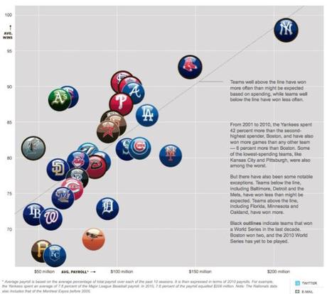
Here is an infographic developed by the New York Times in 2010, depicting the average payroll and average number of wins by teams around Major League Baseball from 2001 to 2010. As one would expect, there is a direct correlation between the two.

New York Times


