TAKEAWAY: The Economist has described Mint as India’s best financial newspaper. We revisit our experience creating the look and feel for Mint and trace its meteoric rise. PLUS: La Nacion uses an inverted-U ad configuration
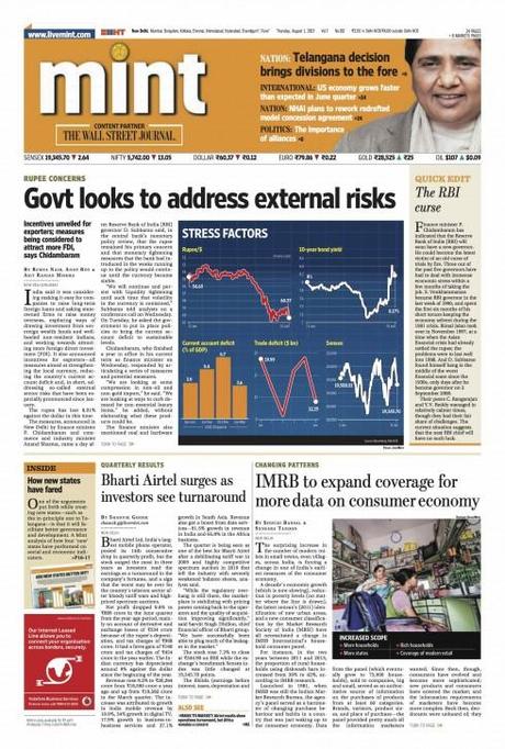
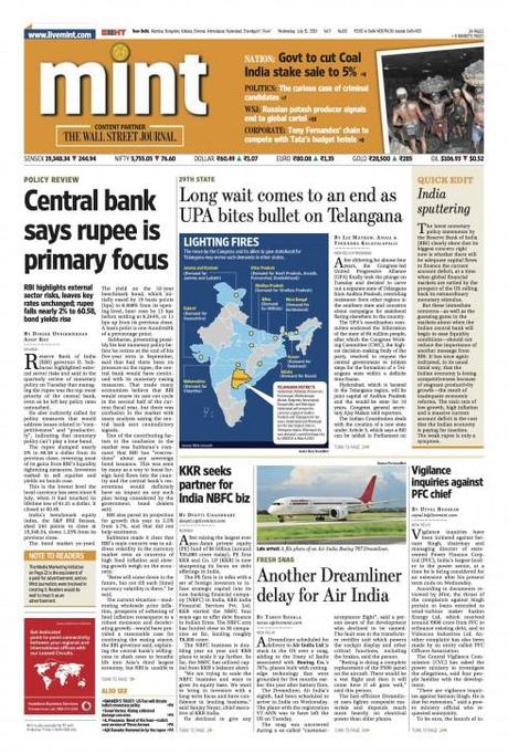
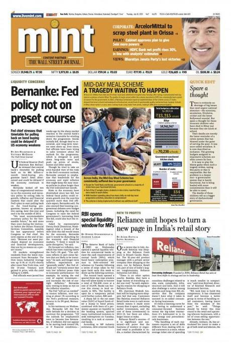
Recent front pages from Mint: it became the first newspaper to go Berliner in India. From the start we knew that, as a financial daily, Mint would have to carry plenty of content on page one, including text for various stories. This is not a formulate that may work for all, but has proved successful here. We had to keep in mind that Indian newspaper readers tend to be conservative, and accustomed reading broadsheet format newspapers, where stories are ready to be consumed on page one.
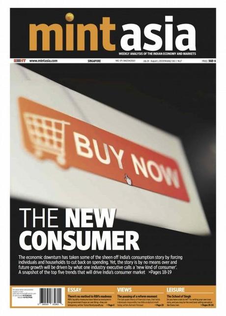
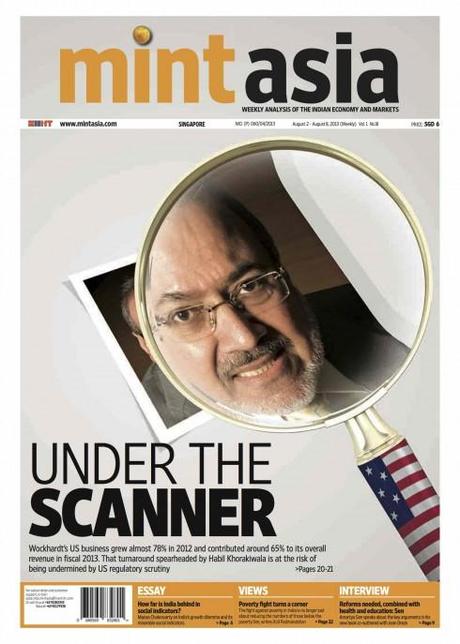
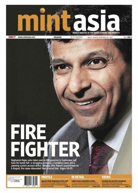
Front pages of the latest Mint brand extension, MintAsia, published weekly in Singapore. Here the front page takes on a poster look, quite appropriate to the Berliner format, and practical for a weekly publication.
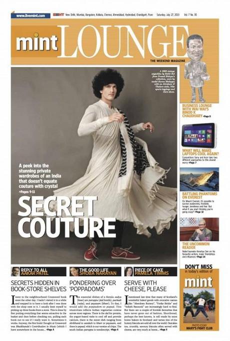
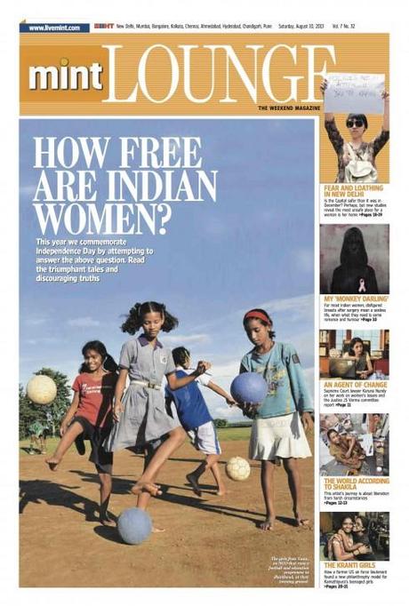
The supplement Lounge has become India’s favorite weekend read, with lifestyle content that is highly localized and emphasizes personalities, fashion, food and the good life.
The Economist’s nod for Mint, coming from such a respected global financial publication, is something to be proud of. It is even more impressive when you realize that Mint is only six years old.
Indeed, a young 6, which is why this week, when we read that statement in The Economist, both Raju Narisetti and I exchanged emails to share our pride.
We both were there for the delivery of this baby in Delhi. Birth date was Feb. 7, 2007. Raju, who was the first editor in chief of Mint, invited me to join him and his team to create the look and feel for what would be the first Indian newspaper in the Berliner format.
It was an exhilarating time, a new newspaper born in the digital age, but with the foundation of sound financial journalism, and guided by the spirit of catering to a new and young generation of Indian entrepreneurs.
The results were as shiny as the coins which inspired the name Mint. Although we always thought that for those who thought Mint referred to the fresh smelling herb the title applied as well. Mint hit the streets Feb. 7, 2007 shining and smelling fresh. Looking at these new pages sent by art director Abel Robinson, that freshness and shine are still there.
This is what I wrote at the time of Mint’s launch:
I remember the excitement of “creating” Mint, the first ever Berliner format daily in India, and choosing orange as the color that would make it stand out in the midst of that multi-hued fabric of all things Indian. Naming the newspaper Mint was not easy. Why Mint? Isn’t that about a sweet taste? Not really, we said, it is about coins, money, making it, taking care of it, writing about it.
Here is how Raju Narisetti, who is now Senior Vice President, Deputy Head of Strategy at News Corp, sees Mint’s success:
Mint’s continued success and resulting reputation is rooted in its founding principles—a clear and unbiased chronicler of the Indian dream—backed a living Code of Journalistic Conduct. Mint was always about providing fresh clarity in business journalism and its editors, many from the founding Editorial Leadership Team, remain wedded to that principle. Like any organization Mint has changed and evolved and still remains a work-in-progress. And in that very notion that it is a work in progress, lies its constant desire to not measure itself against the lowest common denominator’s of Indian journalism but to make business and financial journalism accessible and meaningful to its readers.
Mint has expanded the brand by capturing the imagination of the country’s young, savvy business people, who access it also online or on their mobile . Today, Mint, which has an exclusive partnership with The Wall Street Journal,has extended its run into eight key cities nationally, and it is now published in Delhi, Mumbai, Pune,Chandigarh, Bangalore, Chennai,Kolkata and
Ahmedabad.
Mint has also gone global with a weekly edition in Singapore, called MintAsia
In addition, Mint publishes a weekend supplement, Lounge, which is, in many media critics’ opinion, one of the best weekend reads in India. We were proud to be involved with the development of that project as well, with a talented team that included Priya Ramani; deputy editors - Sanjukta Sharma and Seema Chowdhry and a design team led by Manoj Madhavan, Sandipan Das, Pranab Jyoti Gogoi, Raajan.
Mint editor Sukumar Ranganathan recognizes that Mint was born at a difficult time for media products globally.
The foremost challenge continues to be economic
we have to get people to pay for the product (both print and online and I am sure you remember how newspapers are almost given away for free in India) and that’s a challenge that has both internal and external elements to it.
Advertising is still the revenue model for Mint. However, editor Sukumar tells me that a pay model for online is being validated.
The good news for Mint is that, as a financial newspaper, its audience is more willing to pay for subscriptions, as its content is essential and needed.
Of related interest:
From The Economist
Case studies of Mint and Lounge
http://garciamedia.com/blog/articles/in_india_mint_premieres_new_lounge_mag/
http://garciamedia.com/blog/articles/indias_mint_turns_three
Online edition: About livemint.com
(The concept for the online edition was created by Mario Garcia Jr. with the Mint team)
http://garciamedia.com/blog/articles/have_a_live_mint/
About Lounge
On November 27, 2010, the publishers of Mint premiered the first edition of Lounge magazine, which has been warmly received by readers and advertisers alike.
In India: Mint premieres new Lounge mag
http://garciamedia.com/blog/articles/in_india_mint_premieres_new_lounge_mag/
The inverted U-ad configuration
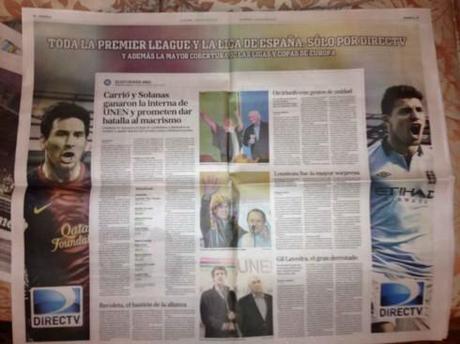
Double page inverted U ad as it appeared in Argentina’s La Nacion Monday
We are always alert for interesting advertising configurations in printed newspapers.
Monday’s edition of La Nacion of Argentina carried an inverted U ad for Direct TV, covering two of its broadsheet format pages. But, in the middle, coverage of the country’s Primary Elections that were held Sunday. I am certain that Direct TV paid for the full two pages and returned part of them to the editors for their election coverage. Win win situation for everyone.

