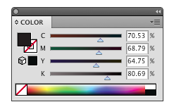
Now that we’ve peeked behind the color prints to see the four important inks known as CMYK, let’s consider all the fun that can be had with just one of them.The K…black ink.
Putting your image on paper in a single black ink sounds pretty easy, and it is, if the file is created correctly. A color photograph such as the pumpkin picture below should first be converted to grayscale in Photoshop and then be used in InDesign to create the print ready PDF for printing.
A grayscale is a percentage of a 100% solid image which consist of a continuous form of dots. So the larger the dots the darker the image. The smaller the dots the lighter image you see.

Another aspect to consider is how you create the text. If you have text that you want to print in black ink, make sure you create as 100% K (black) and not composite K which is actually CMYK. If it’s created 100% K, only black ink will be used in the text and it will print solid and with clean edges. If the text is composite K, all four colors (CMYK) are used at different percentages to achieve a black color. The difference is shown below.


