I just read a great Steve Jobs quote. It comes by way of Ian Leslie from his book, Curious:
“… (Some people think) that a really great idea is 90% of the work… (and if you just tell it to other people), they can go off and make it happen…
the problem with that is that there’s just a tremendous amount of craftsmanship in between a great idea and a great product…
Designing a product is keeping 5000 things in your brain and fitting them all together…”


It also sums up why you should avoid content mills like Fiverr (Get a logo for $5!!) and hire professional designers, illustrators, writers, et. al., for creative work.

Because collaboration, shared goals, and a commitment to craftsmanship are what’s required for an end result that works.
What do collaboration and craftsmanship look like? Here’s a good example:

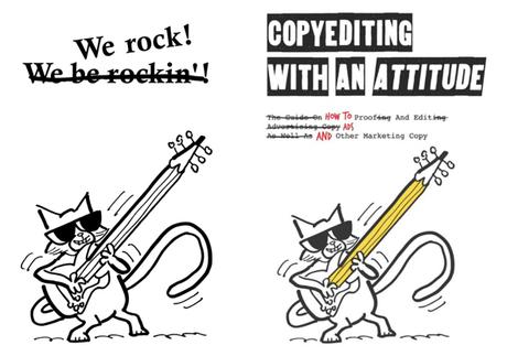
I recently illustrated Copyediting With An Attitude by copywriter and USC marketing professor Freddy Nager.

Freddy loves cats, and wanted a cat character for the illustrations (“You can’t have a book on attitude without them.”). Specifically, he requested “a cat wearing sunglasses holding a large pencil.”

I began by reading the book (Freddy sent me the manuscript). Then I let my mind roam free and made some thumbnail sketches.

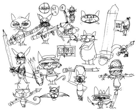


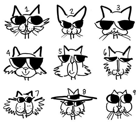
Things started to get more fluid at this point. The cat’s not necessarily holding the pencil.

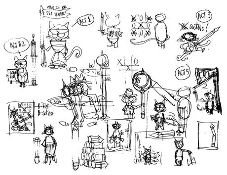




The book contained an Introduction and 4 “acts” or chapters.

One of the tips that jumped out for me in the Intro was: “Proofread, edit, then wait at least 24 hours to proofread once more.”
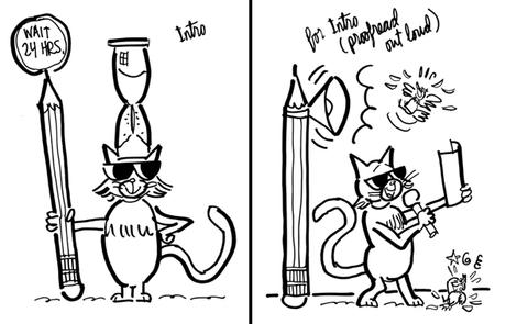
So my first rough sketch was based on that idea: cat with a hourglass on his head, holding the kind of sign used by a flagman.

Freddy liked it, but asked to see an idea for a different tip: the wisdom of proofreading your copy out loud.
That second sketch is on the right below; that’s the concept we used for the final illustration.



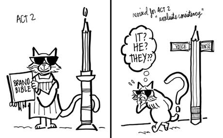
My first rough for Act 2 referenced the brand bible concept.

Act 2 also talked about the importance of consistency: formatting all items in a list the same way; sticking with the same tense (past, present, future); the same voice (first, second, third), etc.

Freddy asked to see a rough for “evaluating consistency” (below, right); that’s the concept we used for the Act 2 illustration.





An illustrator (or a designer or a writer, or any outside contractor) should be an invested partner. A collaborator who shares the client’s goals (in this case, producing a book that stands out, attracts readers, and racks up sales).

A client can proceed with confidence when he knows the artist will do all he can to achieve that shared goal.


